- NewspaperThe Newspaper Mobile Theme: Introduction
- NewspaperThe Mobile Theme
- NewspaperModules Builder in Newspaper Theme
- NewspaperFilters and sorting for taxonomies
- NewspaperHow to Add a Logo in Newspaper
- NewspaperBig Grid Flex Settings
- NewspaperHeader Builder
- NewspapertagDiv AMP Plugin Tutorial
- NewspaperNewspaper theme documentation
- NewspaperBest Of Forums
- NewspaperCache plugin – install and configure
- NewspaperFont Customization
- NewspaperTheme Colors Introduction
- NewspaperBackground Introduction
- NewspaperHeader ads
- NewspaperPost template ads
- NewspaperCustom ad spots
- NewspaperMain Menu
- NewspaperHow to Install Newspaper via FTP
- NewspaperHow to Install Newspaper via WordPress
 Raj Kumari
 Hello Anamaria,
I’m happy to inform you that I fixed the above issue.
I want to close pagination on all of the pages:
https://socialmaximizers.com/author/deepika-aggarwal/
Replace pagination with load more button. after 4 post load more button showing on the page.
here is another issue which is also showing on the website.
https://socialmaximizers.com/automobile/
When I click on category page then lots of pages are open. Please check this link: https://socialmaximizers.com/automobile/
I want after 4 posts showing load more button on all the categories pages of the website. Please check this link: https://prnt.sc/dIioGYgf8Wn8
 Kieran
Hi,
We keep encountering an issue where our users are being prompted with this broken home page for mobile, we’ve designed a clean mobile one and for some reason, this page sometimes shows but then proceeds to switch back?
What we are being shown on mobile: https://www.awesomescreenshot.com/image/44568000?key=ff610497b1d71b55c021de9ca0450bb7
What it should look like: https://www.awesomescreenshot.com/image/44567999?key=40b22d67d534e3eb211f8422f04a6960
Connected to our landing page: https://www.awesomescreenshot.com/image/44568010?key=6f1c3a98662cf277a121ab3369eeb1f5
We’ve done everything we could, but we are unsure on why this issue keeps occurring,
We hope you can help us.
 JustOneForTheRoad
Hi
My website is http://www.justonefortheroad.com and I have done an audit and unsurprisingly have encountered a few issues. Some I am able to sort and others are beyond my levels of expertise.
The two that are concerning me just now are as follows:
Canonical Issue
I believe my homepage is suffering from an issue here however when I try to set up a 301 redirect through YOAST Redirections I am unable to redirect the http:// version to the https:// Obviously I am doing something wrong and maybe its not this URL that needs redirecting. Can anyone shed some light on what actions I need to take. Remember I am no expert!!
Mobile Header
When viewing some POSTS on Mobile I am getting a giant search magnifying glass or large white space in the header area. Its strange because I had a couple of URLS suffering from this but they now seem to be working. One that currently is not right (however who knows it might change) is on my mobile https://www.justonefortheroad.com/autumn-in-berlin/ (search magnifying glass issue) and https://www.justonefortheroad.com/the-authentic-tenerife/ (space issue)
I did not create this website and I have asked the technical guy who did and he cannot see anything wrong and suggested I raise this ticket.
Any help appreciated so thanks in advance
Rupert
 marty84
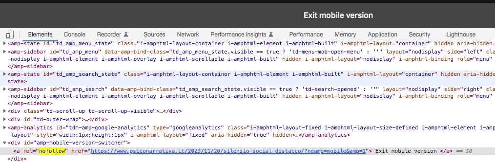
 Hello, I cleared the cache. Both from Wp Super Cache and directly from the hosting. But the nofollow and “exit mobile version” doesn’t disappear!
This problem hinders my acceptance to adsense
 info@simonebarbone.net
 So if a website has dozens of pages, each page has to be edited with tagdiv for mobile fonts, that’s weird. I have to do a lot of times a job that can be done 1 time…
 Anamaria
 Hi,
You need to set the layout on the row on the mobile viewport -> https://i.imgur.com/p3gRBPR.png
Thank you!
 dlicoppe
Hello,
We can’t envy advertising banners on mobile, we can’t find where it comes from and your guide here is not accessible: https://forum.tagdiv.com/article-ads/
We cannot delete this on mobile from our articles:
https://share.cleanshot.com/wZLYFWKS
thank you for help
info@simonebarbone.net I need only 1 thing: I did the 4 inner columns with a 40% 20% 20% 20% it shows fine for all viewports except of mobile.
What can I do there? Is there a way to keep it 100% each inner column for mobile? In which way?
info@simonebarbone.net Ok I changed Page title and content font-size for pages in Theme Panel > Theme Fonts > Page but it applies for Desktop viewport only, where I change for other viewports (tablet, mobile)?
marty84 Ok, I solved it. You had to activate it in Post Settings > Featured images > “Show Featured Image”. But, the “Exit Mobile version” problem, nofollow and noamp, persist!
marty84 HI,
Thanks for the reply.
I have disabled it as shown in the image. I did this yesterday following other forum threads. However, the “Exit mobile version” entry does not disappear and neither do the nofollow and noamp.
https://i.postimg.cc/8z0dZ0qg/Schermata-2023-11-29-alle-10-00-18.png
 SamW2023
 Apart from the one mentioned above, now the mobile is showing different post pictures, and the article headings from other posts. This is only happening in responsive mobile.
Anamaria Hi,
It is not recommended to use more plugins for cache.
Also, please check if you have on nginx plesk an option for mobile cache.
Thank you!
Anamaria Hi,
In order to disable the option “Exit mobile version”, you need to disable this setting: https://i.imgur.com/LxpDtB2.png
Please provide more details about image and nofollow.
Thank you!
 nitrofox
 Hi Anamaria,
I did numerous tests and couldn’t solve it definitively, the problem always comes back.
I have Super Cache active with cloudflare, ngnix cache plesk, I didn’t have this problem before the last updates.
I’ll try to downgrade the version of the super cache plugin and see if it works, but one thing is for sure, there were updates with the latest version of wordpress and even on your part in the mobile plugin, and something may be wrong and forcing this.
Thank you,
 DJ Promotion
 I don’t imagine to reduce to 4 blocks / modules incl. mobile, but I try to optimize it. Thanks.
 kastyle
Hi,
on our website the search icon on desktop and the search icon and menu button on mobile doesnt work.
karlsruhe-insider.de
Thanks for help
marty84Hello,
I would delete from my page (example: https://www.psiconarrativa.it/2023/09/10/viktor-frankl-crescita-sofferenza/?amp)
Exit mobile version
an I would understand because the image modal not appear in ?Amp
I have activing in my theme only AMP, not mobile+amp
And I wuold delete in code on my page for example: https://www.psiconarrativa.it/2023/09/10/viktor-frankl-crescita-sofferenza/?noamp=mobile& and attribute: “nofollow”
 Bettina
 Hello @gekkies !
Do you use the posts loop element? Also, without any value in the offset field.
Check on your mobile viewport:https://www.screencast.com/t/XDQJedlggSB
Thank you!
Bettina Hello Paul!
Change that from the theme panel settings: https://www.screencast.com/t/PbU3hQpDqHh
The social icons from the mobile menu are coming from the Theme Panel -> Social/Apis -> Social Networks -> https://i.imgur.com/kKYIECB.png remove/edit them after your needs.
Or you can delete that element and create a fully customizable page there using the modal popup: https://forum.tagdiv.com/modal-popup/
Thank you!
 Gekkies
 Hi Bettina, i know it changes but it wont show the results but just the homepage: Again, This only happens on mobile. Check the video to see what i mean: https://www.youtube.com/shorts/GQQOfE19Zh4
 Paul EV
Hello,
I tried to change some option on my mobile menu but i can’t click on element when i click it’s oppening a news page. (in tag div builder).
How can i edit the link and remove the background on this menu ?
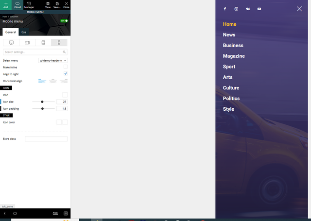
Thank’s for your help.
Paul
Gekkies Hi Bettina,
I only have the problem on mobile. Please check again because is does not work. I have no cache plugin.
GekkiesHi, mobile search wont work on my website http://www.gadgetgekkies.nl. It will show the results in but if i hit ‘search’ the URL changes in https://gadgetgekkies.nl/?s=test but im just getting on my homepage.
The same happens on my website http://www.internetgekkies.nl.
What can i do?
Anamaria Hi,
Please disable the tagdiv mobile theme plugin.
Using our theme you can choose from 3 mobile versions
-> mobile responsive => https://www.screencast.com/t/oJ2ShOp47
-> mobile theme plugin => https://forum.tagdiv.com/the-mobile-theme/
-> mobile page => https://tagdiv.com/newspaper-10-3-7-update-brings-customizable-and-fast-mobile-pages/
If you created the mobile pages with tagDiv Composer, then when you install the Mobile Theme plugin, your pages will be overwritten by the plugin (the mobile theme comes with its templates for page, post, category, etc so your current templates from the desktop theme will get converted to the mobile theme layout, the page content is made without builders in mobile editor => https://www.screencast.com/t/xbgZG8kH also, the options that are provided to edit the mobile theme version are limited (this keeps the things simple)).
This is a video about Responsive Newspaper Theme, AMP & Mobile Theme, Mobile Pages & Templates -> https://www.youtube.com/watch?v=SpGkOnJeNZY
So, the mobile responsive is what you see when that you select the viewport on phone => https://www.screencast.com/t/matV17hH, so some settings may apply for each viewport(where is the border blue), and others are not(where the border is black).
The mobile page has the mobile templates from Cloud Library => https://www.screencast.com/t/YCcZ8rL8
The Mobile responsive version of the theme and the mobile page editor can be edit with tagDiv Composer, the mobile theme plugin cannot.
For example, you can have the mobile theme plugin activated and use the mobile page/mobile responsive version for the homepage/pages, but for the categories pages/404 page, you can’t use the mobile page/mobile responsive version if you have the mobile theme plugin activated.
So, if you want to design the pages with tagDiv Composer, you can use the mobile page or mobile responsive version.
Thank you!