
- NewspaperThe Newspaper Mobile Theme: Introduction
- NewspaperThe Mobile Theme
- NewspaperModules Builder in Newspaper Theme
- NewspaperFilters and sorting for taxonomies
- NewspaperHow to Add a Logo in Newspaper
- NewspaperBig Grid Flex Settings
- NewspaperHeader Builder
- NewspapertagDiv AMP Plugin Tutorial
- TutorialsFrom WPBakery to tagDiv Composer
- NewsmagSmart list ads
- NewspaperNewspaper theme documentation
- NewspaperBest Of Forums
- NewspaperCache plugin – install and configure
- NewsmagIntroduction
- NewsmagMain menu
- NewsmagLogo & Favicon
- NewsmagHeader ads
- NewsmagSmart sidebar
- NewsmagSharing buttons
- NewsmagCategory tag on modules/blocks
 PKramik
Hello,
when creating a new post via META, there is a problem with loading the photo (illustration) that is on the article page, nothing is visible in the preview on desktop devices, the preview on mobile devices has a thumbnail of the illustration. How to properly set links in WP and the template itself so that you can easily add an article to FB from the link?
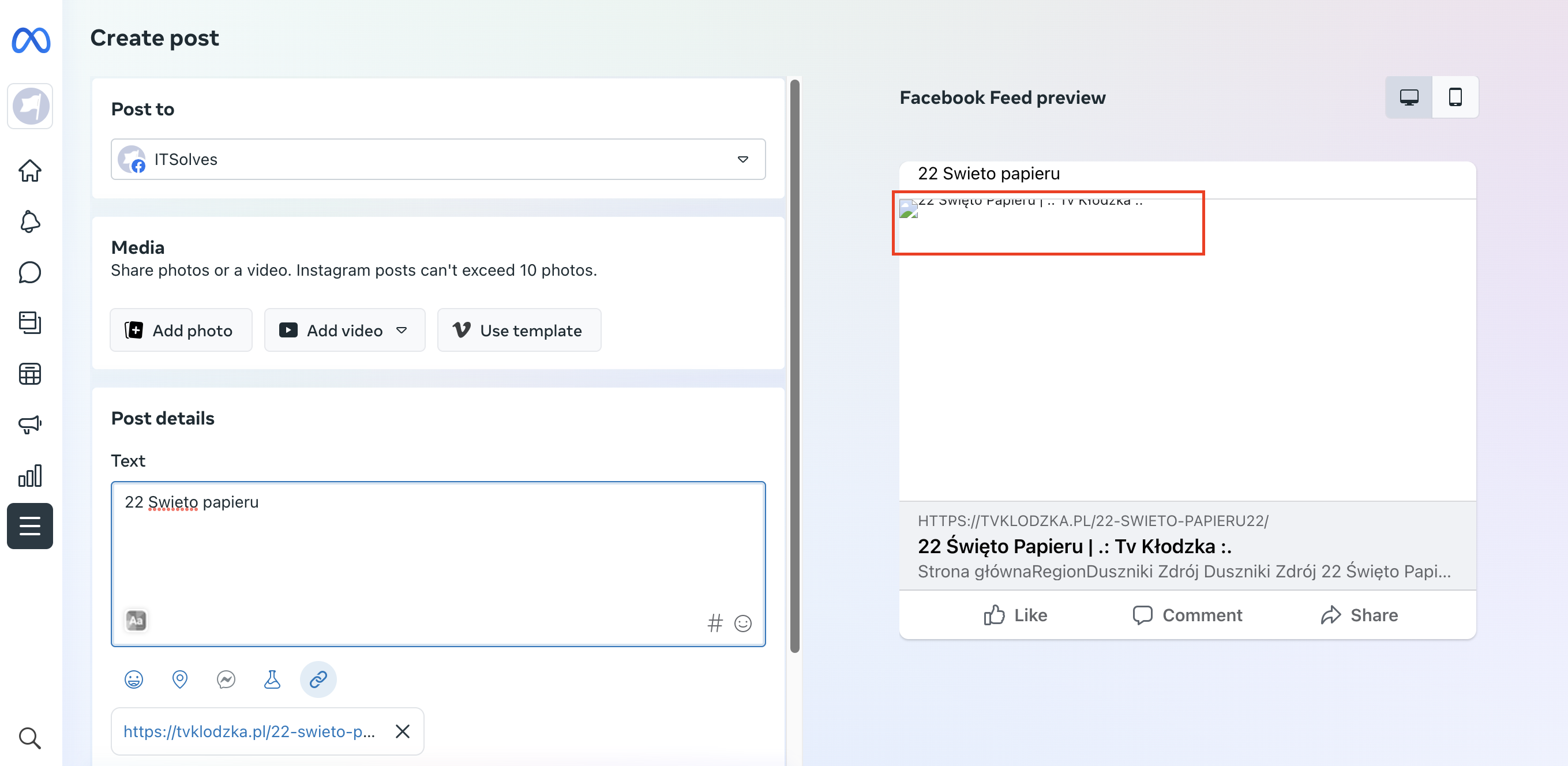
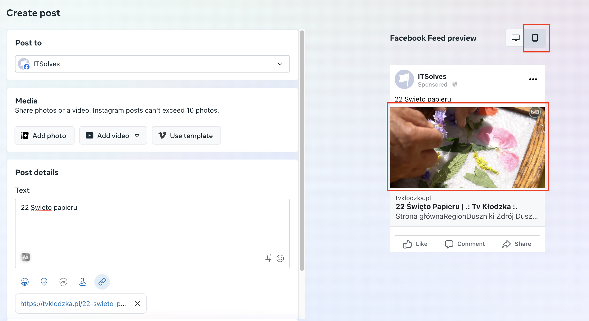
For example: https://tvklodzka.pl/22-swieto-papieru22/
BR
 Bettina
 Hello @unheardvoices !
You use cloud templates on desktop view, and mobile theme + AMP on mobile view. So, you need to set the menu in the theme panel -> Mobile theme in order for it to be displayed in the mobile viewport as well.
Actually, we have 3 options for mobile versions that you can use:
1. Responsive version: A responsive version of your website looks similar to the desktop version. TagDiv Composer is used to edit the page.Click on the mobile viewport: https://www.screencast.com/t/XDQJedlggSB. There, you can see your mobile version and edit or adjust the elements to look better.
2. Mobile pages: https://tagdiv.com/newspaper-10-3-7-update-brings-customizable-and-fast-mobile-pages
3. Mobile theme plugin: The Mobile Theme is a performance-optimized theme included in the main Newspaper theme that only loads on mobile devices. It comes with its own templates and designs for pages, posts, categories, etc., so your current templates from the desktop theme will get converted to the mobile theme layout. Please see https://forum.tagdiv.com/the-mobile-theme/ and https://forum.tagdiv.com/mobile-theme-introduction/ for more information.
A full explanation is here: https://www.youtube.com/watch?v=SpGkOnJeNZY
If you need to use the mobile version 1 or 2, then you need to disable the Mobile Theme plugin.
Thank you!
 Anamaria
 Hi,
You can change the order of columns on mobile and after the block, after the post content -> https://www.screencast.com/t/kbLa0WnN
Thank you!
Anamaria Hello,
You can disable the back to the top from Theme Panel -> Template Settings -> ToTop button => https://www.screencast.com/t/JVYklvqk (if you have the mobile page or mobile resposive)
Also, for the mobile theme plugin, you can only hide using a Custom Code CSS
.td-scroll-up

{

display: none;

}
Set the code in Newspaper -> Theme panel -> Mobile Theme -> Custom code.
Thank you!
PKramik Hi Calin,
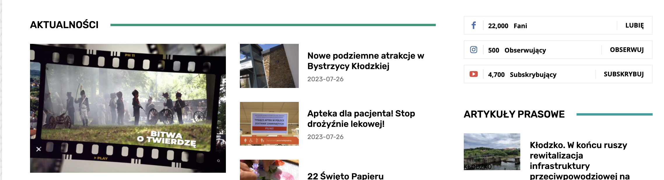
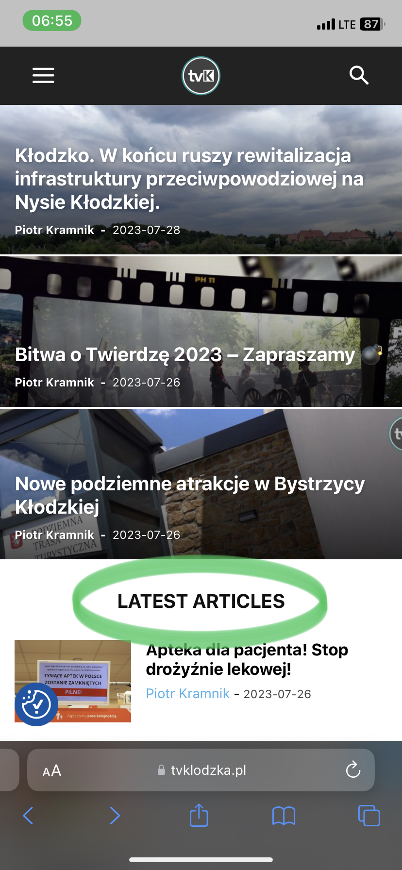
we didn’t create a separate template, rather the responsive version is used. Exactly, it’s about a few small things that I show in the pictures.
The point is that things like the headlines are in English and the entire site is in Polish. It’s not about translating entries:
– PREVIOUS ARTICLE
– NEXT ARTICLE
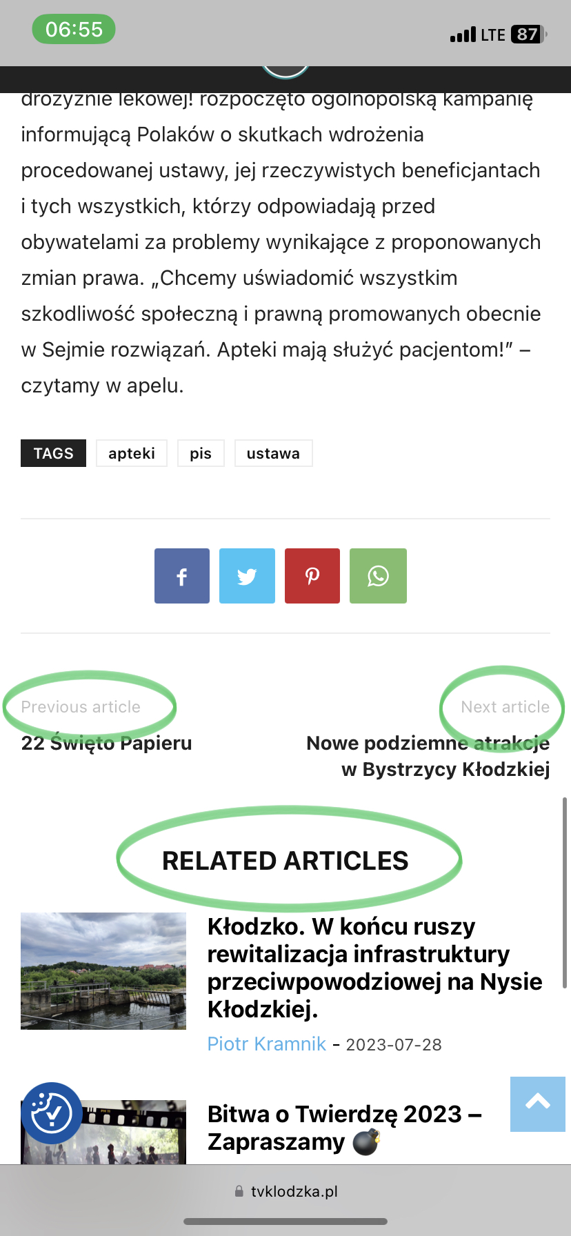
Anamaria Hello,
The app listsing will not be implemented for mobile theme; you can only disable it for pages.
Please check those guides https://www.scratchcode.io/how-to-change-custom-post-type-slug-in-wordpress/ -> https://codexcoach.com/how-to-remove-slug-from-custom-post-type-in-wordpress/
Thank you!
 amrit.atc.in
 Hi,
As you suggested, I deleted the cache and also tried to remove and re-add the mobile logo and retina logo. But it still not showing. https://prnt.sc/Ms9oBJ1ycW-a
Can you please try to do this from your end?
Waiting for your response.
Thanks.
 saurabhk
On mobile view , related posts module and ad module shows before the actual post content.
see this page https://getretailnews.com/2023/07/26/former-first-lady-melania-trump-launches-her-own-nft-platform/
on desktop it works fine . however on mobile, the post content shows much later after related posts module and ad module
 Lalit
LalitHello there,
I am using this tracking code in the Mobile theme => AMP Analytics of Theme panel: https://prnt.sc/9x0cgmpVReBE
And, these are the AMP plugin settings: https://prnt.sc/Ea3xNDKJp9Jp
I have configured GA4 with Google tag manager and added the code on my site using the theme’s panel and Analytics 4 tracking pageviews from desktop and mobile versions without any problem.
But, the problem is that the pageviews from AMP pages are not tracking.
Please help me to fix the issue without referring to other forum’s posts.
Thanks
 ozgunozakyildiz
Will there be a “mobile theme” adaptation for the app listing theme?
 discdemo
 Hi.
I could use a lifeline on this one in order to remove the white space, primarily on mobile.
I’ve tried some @media for bottom margin in custom css, as well as non mobile, similar attempts to no avail.
Any ideas on what code to try would be so helpful.
See screen shot for an idea of where i’m seeing the space and the inspector is open, as well. Thanks, again.
Anamaria  tola999
 Like I said, I have checked on my phone, it weirds structure. I want to keep it default and responsive on mobile.
Anamaria Hi,
You activate the mobile theme plugin, deactivate it, and clear the cache.
Using our theme, you can choose from 3 mobile versions
-> mobile responsive => https://www.screencast.com/t/oJ2ShOp47
-> mobile theme plugin => https://forum.tagdiv.com/the-mobile-theme/
-> mobile page => https://tagdiv.com/newspaper-10-3-7-update-brings-customizable-and-fast-mobile-pages/
Suppose you created the mobile pages with tagDiv Composer. In that case, when you install the Mobile Theme plugin, your pages will be overwritten by the plugin (the mobile theme comes with its templates for page, post, category, etc so your current templates from the desktop theme will get converted to the mobile theme layout, the page content is made without builders in mobile editor => https://www.screencast.com/t/xbgZG8kH also, the options that are provided to edit the mobile theme version are limited (this keeps the things simple)).
This is a video about Responsive Newspaper Theme, AMP & Mobile Theme, Mobile Pages & Templates -> https://www.youtube.com/watch?v=SpGkOnJeNZY
So, the mobile responsive is what you see then that you select the viewport on phone => https://www.screencast.com/t/matV17hH, so some settings may apply for each viewport(where is the border blue), and others are not(where the border is black).
The mobile page has the mobile templates from Cloud Library => https://www.screencast.com/t/YCcZ8rL8
Mobile responsive version of the theme and the mobile page editor can be edited with tagDiv Composer, the mobile theme plugin not.
For example, you can have the mobile theme plugin activated and use the mobile page/mobile responsive version for the homepage/pages, but for the categories pages/404 page you can’t use the mobile page/mobile responsive version if you have the mobile theme plugin activated.
So, if you want to design the pages with tagDiv Composer, you can use the mobile page or mobile responsive version.
Thank you!
Anamaria Hello,
I have checked and the logo is displayed well -> https://i.imgur.com/JYkePIM.png You have the mobile theme plugin activated. The mobile theme comes with its own templates for page, post, category, etc so your current templates from the desktop theme will get converted to the mobile theme layout, the page content is made without builders in mobile editor => https://www.screencast.com/t/xbgZG8kH also, the options that are provided to edit the mobile theme version are limited (this keeps the things simple)).
Thank you!
Bettina Hello @vedappan!
From my point of view, if you don’t use the Mobile Theme plugin, then there is no reason or benefit to AMP. Please note that if a page is made by Composer, than the content won’t be displayed on Mobile theme version. You should create the content with the Mobile Editor.
Actually, we have 3 options for mobile versions that you can use:
1. Responsive version: A responsive version of your website looks similar to the desktop version. TagDiv Composer is used to edit the page.Click on the mobile viewport: https://www.screencast.com/t/XDQJedlggSB. There, you can see your mobile version and edit or adjust the elements to look better.
2. Mobile pages: https://tagdiv.com/newspaper-10-3-7-update-brings-customizable-and-fast-mobile-pages
3. Mobile theme plugin: The Mobile Theme is a performance-optimized theme included in the main Newspaper theme that only loads on mobile devices. It comes with its own templates and designs for pages, posts, categories, etc., so your current templates from the desktop theme will get converted to the mobile theme layout. Please see https://forum.tagdiv.com/the-mobile-theme/ and https://forum.tagdiv.com/mobile-theme-introduction/ for more information.
A full explanation is here: https://www.youtube.com/watch?v=SpGkOnJeNZY
If you need to use the mobile version 1 or 2, then you need to disable the Mobile Theme plugin.
Thank you!
Bettina Hello!
Yes. Or else, you can use other mobile version:
1. Responsive version: A responsive version of your website looks similar to the desktop version. TagDiv Composer is used to edit the page.Click on the mobile viewport: https://www.screencast.com/t/XDQJedlggSB. There, you can see your mobile version and edit or adjust the elements to look better.
2. Mobile pages: https://tagdiv.com/newspaper-10-3-7-update-brings-customizable-and-fast-mobile-pages
Thank you!
 freshmademedia
 Hi Calin,
now it`s working – I deactivated al plugins without tagdiv. Mobile version was okay and the problemms with the gallery are also soleved. I only actived additionallly the WP Bakery Page Builder, Iframe and All-in-One Event Calendar by Time.ly. An I updated Newspaper Theme 😉
Thanks, with best regards
Michael
 consumerista
I see 4 main different viewports–desktop, landscape, portrait, and mobile. What are the default pixel dimensions for these?
 WordDom
 So since i have a single composer page, i have to edit all articles to create a content with mobile editor ? I have more than 5000 articles !
 danielpaixaobr
“I am using the following code to hide non-responsive ads on mobile devices and add specially formatted ads.
#pc {display: block;}
#celular {display: none;}
@media screen and (max-width: 768px) {
#pc {display: none;}
#celular {display: block;}
}
<div id=”pc”> </div> to display it only on PC, and <div id=”celular”>
</div> to show the image for mobile devices.
Can you program something similar regarding the blocks of the Newspaper theme? Sometimes, some blocks look good on PC but not on mobile devices.”
Anamaria Hello,
Unfortunately, you can’t create a page for mobile theme using rest API.
Thank you!
 usc-shift
 Hi, i need mobile version so my question is how can i put content to this field https://www.screencast.com/t/xbgZG8kH via rest api? Thank you
 alicestudio
Hi,
after upgrading to 12.5 something weird started on our website.
everytime the home-page is loaded, a bunch of connections from mobile devices (with referer: “android-app://com.google.android.googlequicksearchbox/” or “https://www.google.com/”) flood the website.
we deactivated any plugins and now just Newspaper is running, but the strange behaviour keeps happening.
To avoid Dossing our website we started to filter out IPs of the mobile devices connecting with those referer, but it’s just a temporary workardound and not a solution.
Can you help me with it?
thank you
Anamaria Hi,
The mobile theme comes with its own templates for page, post, category, etc so your current templates from the desktop theme will get converted to the mobile theme layout, the page content is made without builders in mobile editor => https://www.screencast.com/t/xbgZG8kH also, the options that are provided to edit the mobile theme version are limited (this keeps the things simple)).
So, if you want to use the cloud templates, then you need to disable the mobile theme and AMP plugins, and then use the responsive version.
You can disable the mobile theme plugin on the pages from the Gutenberg editor using the following option => https://www.screencast.com/t/axXRJsWby
Also, please check this topic where I explained each mobile version -> https://forum.tagdiv.com/topic/mobile-version-not-working-properly-2/ -> https://forum.tagdiv.com/topic/amp-pages-not-working-well-with-this-theme/ and choose what mobile version you want.
Thank you!


