
- NewspaperThe Newspaper Mobile Theme: Introduction
- NewspaperThe Mobile Theme
- NewspaperModules Builder in Newspaper Theme
- NewspaperFilters and sorting for taxonomies
- NewspaperHow to Add a Logo in Newspaper
- NewspaperBig Grid Flex Settings
- NewspaperHeader Builder
- NewspapertagDiv AMP Plugin Tutorial
- NewspaperNewspaper theme documentation
- NewspaperBest Of Forums
- NewspaperCache plugin – install and configure
- NewspaperFont Customization
- NewspaperTheme Colors Introduction
- NewspaperBackground Introduction
- NewspaperHeader ads
- NewspaperPost template ads
- NewspaperCustom ad spots
- NewspaperMain Menu
- NewspaperHow to Install Newspaper via FTP
- NewspaperHow to Install Newspaper via WordPress
 Anamaria
 Hello,
To hide this subtitle, you need to use a custom code css
.td-category-siblings

{

display: none;

}
Set the code in Theme Panel -> Mobile Theme -> Custom Code -> Custom CSS.
Thank you!
 geoffreyjames25
Hi I would like to remove the To Top Button on the mobile theme but seems like its not possible. I already check on the theme panel and its off but its still showing up on the mobile website.
Any help on this problem?
 PetCompanionMag
Hi, I have a template problem that I can’t figure out. When viewing any “articles” on my website, there is a large blank gap between the feature image and the start of the text. It appears that way on desktop or mobile device. Help!! Here’s a sample page of what I am talking about: https://www.petcompanionmag.com/degenerative-myelopathy/ All articles have the same problem, so I believe it is a template problem, thanks.
 nachtwache
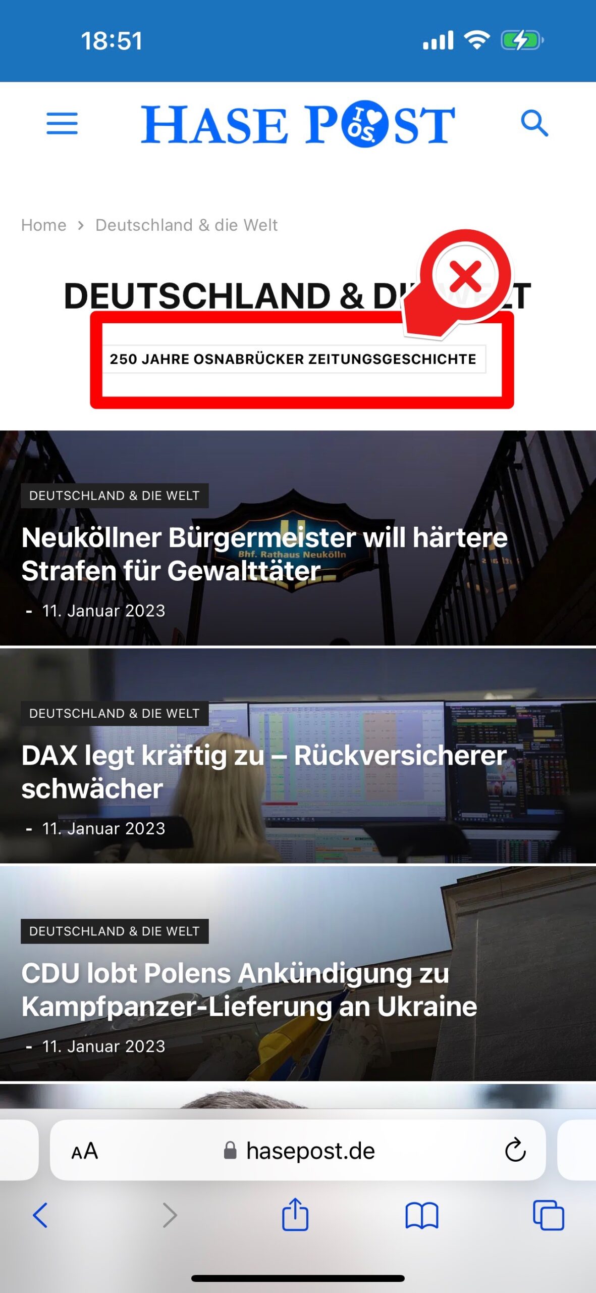
I recently switched to present my mobile content via the plugin (for loading speed reasons).
But I always have this Subtitle on Category Pages (actually this is one existing category “250 Jahre Zeitungsgeschichte”). http://www.hasepost.de
 ilouie
Hi, does anyone if it’s possible to display two separate pages for mobile and PC? I’ve tried making a mobile template from a Homepage template. I am able to edit the new Mobile template but, when I go view it, it still displays the same page set on the PC Homepage. Sometimes it shows the edited version, but then it’ll also display it on the PC Homepage version. Also, I still can’t get both, the mobile and PC to make header sticky. If I se the PC header sticky, it doesn’t show on the mobile or vice-versa. Any help would be appreciated. If you visit the page https://emprsario.com and both the mobile and PC you’ll see the same version although the mobile has been edited, and you can also see that the header on the PC version is sticky, but not the mobile. Thanks.
 WordDom
 Hi, i found it’s the xtremcache from my host server with varnish.
I read on your forum it’s the same problem for everyone who use mobile theme.
I suggest you add it in your documentation in red because i spent to much time to find the issue. Not compatible with varnish cache !
Anamaria Hello,
Usually, this happens with cache plugins.We recommended WP Super Cache plugin and activate these settings (especially the mobile device support): https://forum.tagdiv.com/cache-plugin-install-and-configure/
Also, please make sure you have enabled the mobile cache if the plugin has this option and check if you don’t create an object cache file on the backend -> https://forum.tagdiv.com/general-options-may-interfere-newspaper-theme/
Thank you!
 wellspc23
 Thanks for the reply. They are NOT the same on mobile devices. I do have the tag division Shop plug-in activated.
The shop pages have a snowman picture background while the other pages have a beach background.
Then the pages with the beach background in the footer go to the snowman background when rotated to horizontal on mobile.
I want the footer background to be the same all of the time on all devices.
I actually deleted the snowman picture from my media files and it is still showing up.
Your help is appreciated.
Thanks!
WordDomHi,
I installed mobile theme and i can see it’s the mobile theme used on iPhone.
But if i do a pagespeed test, it’s the responsive version of newspaper, not mobile theme.
 SP1
SP1 Hi Ana,
The mobile theme is working fine.
Apologies I was not clear, the website breaks when you open it up on a Desktop/Laptop.
Please check there.
You will see first – https://prnt.sc/c5K28R5i1hpm
Then the website loads.
Thanks
Anamaria Hello,
I checked now, and the header and footer are the same for desktop and mobile.
For shop, you need to have the tagdiv Shop plugin enabled, and after you can import the template for products -> https://cloud.tagdiv.com/#/load/Woo%20Product
Thank you!
Anamaria Hello,
If you add the text there, it will not be displayed. You must add it when editing the page in the mobile editor.
Thank you!
 Nagarig
 @Anamaria but what about a featured image in a desktop/mobile single post template? (Please check the links at the start of this thread. Waiting for ur guidance. U can make a video. It was very helpful.)
wellspc23I am having a problem editing the header and footers to match my desktop version to the mobile versions.
The WooCommerce product pages will not match up at all and I am not sure how to edit those. The WooCommerce product pages do not have a tagDivComposer edit option.
Also, none of the page’s headers and footers match the desktop version or mobile version when I rotate the phone from vertical to horizontal. It changes to an old version of the footer that I deleted. The image has even been deleted from my media files.
I have deleted the cache AND turned off caching while I try to correct this.
I am using the Newspaper Default Pro template.
Your help is appreciated!
Website is beachlifelovers.com
 CoastalFox
 Hello,
I have added the content in a mobile page but it still is not showing up
https://www.screencast.com/t/LbNKJgThwreC
Thank you
 Calin
Calin Hi,
Maybe I misunderstood, but the only element with a video that I can find on the site is the playlist and it seems to be ok on mobile. I actually tested it on Android. Or is this problem strictly on iOS?
Thank you!
Anamaria Hello,
For mobile theme + Amp the content need to be added in Mobile Editor -> https://www.screencast.com/t/xbgZG8kH
Thank you!
Calin Hi CT Lab,
There is no a problem that you do not have the mobile theme plugin installed, you’ll use the responsive version.
As I said, the big grid that you use display5 posts in a left-right slider – https://i.imgur.com/oxEQyom.png – https://i.imgur.com/2HXM4tN.png
Thank you!
Anamaria Hello,
In version 11.5.1 was a problem with the mobile template for the category, this was fixed in version 12 -> https://i.imgur.com/MPhJfpx.png
I recommend that you update the theme,if possible disable extra plugins during the theme update to avoid any problems that may arise and make sure that you have activated the tagDiv Standard pack plugin to keep the website’s look. You can try to update the theme on a staging website.
After you update the theme, you need to update the theme plugins too.
In the worst cases, the settings in the theme panel may be lost (there have been isolated cases), in these cases, after the theme plugins that were previously used are activated, you will have to use a backup for the theme panel -> https://forum.tagdiv.com/import-export-theme-settings/
Thank you!
Anamaria Hello,
To make the mobile menu Smart snap, then you need to enable it to be sticky and in its settings to set to Smart snap => https://www.screencast.com/t/zlfVmcjXZ
Hope this helps you!
Thank you!
 tritue
 Hi Anamaria.
I disabled all plugins, but this issue still happening.
Clear all cache, incognito, mobile, visit from other computer … got same resutls.
Thank you.
 lastory2006@gmail.com
If you go to this url: https://gossip-stone.com/
From desktop all the youtube video cover images are visible, but from mobile (iOS Safari and Chrome) none of the images show up. Please let me know what can be done about this. Thank you.
 CT Lab
 Thank you for your reply. We are using WP Bakery. Your mobile plugin used to break our site so we disabled it a long time ago. Please advice.
 jasm90
 on mobile it shows the “phone viewport” layout, not the mobile template.
> https://imgur.com/undefined
Anamaria Hello,
The problem is that are used two separate elements for login/register.
So, if you want the menu login element, you need to disable the Sign in/join from Theme Panel -> Header -> https://i.imgur.com/YwttygP.png and set the element where in the header mobile.
Thank you!



