
- NewspaperThe Newspaper Mobile Theme: Introduction
- NewspaperThe Mobile Theme
- NewspaperModules Builder in Newspaper Theme
- NewspaperFilters and sorting for taxonomies
- NewspaperHow to Add a Logo in Newspaper
- NewspaperBig Grid Flex Settings
- NewspaperHeader Builder
- NewspapertagDiv AMP Plugin Tutorial
- NewspaperNewspaper theme documentation
- NewspaperBest Of Forums
- NewspaperCache plugin – install and configure
- NewspaperFont Customization
- NewspaperTheme Colors Introduction
- NewspaperBackground Introduction
- NewspaperHeader ads
- NewspaperPost template ads
- NewspaperCustom ad spots
- NewspaperMain Menu
- NewspaperHow to Install Newspaper via FTP
- NewspaperHow to Install Newspaper via WordPress
 thelastpoet
Hello,
I had requested some info on bypassing mobile plugin here
I can do that, but when I do it, the theme breaks that post’s responsive or mobile theme.
Check the mobile version here: https://nasonga.com/e-learning-advantages/
When I completely disable the mobile plugin, it shows fine as expected. I have cleared the cache and disabled all plugins until I identified the problem only happens when I bypass the mobile theme.
 clemenza
 Yes, I do it and in Mobile, but not run. Menu is white all time
clemenza Hi @bettina,
It does not work here. I have tried in Chrome and firefox, the dons links. I have also tried on my mobile phone and it doesn’t work either.
Can you please use another platform for the image?
 Bettina
 Hello!
Please click on the zone: https://prnt.sc/5LnJs4fhDqA2 of the mobile menu and see if there is not a background color set up.
Thank you!
Bettina Hello!
This won’t work like that. You’re using 2 different templates. When you install and activate the Mobile Theme plugin, then the cloud template won’t display.
We have 3 options for mobile versions that you can use:
1. Responsive version: A responsive version of your website looks similar to the desktop version. Edit the page with TagDiv Composer. Click on the mobile viewport: https://www.screencast.com/t/XDQJedlggSB; there you can see your mobile version and edit or adjust the elements to look better.
2. Mobile pages: https://tagdiv.com/newspaper-10-3-7-update-brings-customizable-and-speedy-mobile-pages/
3. Mobile theme plugin: The Mobile Theme is a performance-optimized theme included in the main Newspaper theme that only loads on mobile devices. It comes with its own templates and design for pages, posts, categories, etc., so your current templates from the desktop theme will get converted to the mobile theme layout. Please see https://forum.tagdiv.com/the-mobile-theme/ and https://forum.tagdiv.com/mobile-theme-introduction/ for more information.
Note: If you want to use version 1 or 2, then you need to deactivate the mobile theme plugin and see the results.
Thank you!
 Anamaria
 Hello,
I recommend you to use the Single Post Template from tagDiv Cloud Library and there you can edit the template with tagDiv Composer. Please try to edit the Single Post Content and set the font-size for default blockquote => https://i.imgur.com/603Qupg.png and set the color -> https://www.screencast.com/t/7OeUEnYsO
Also, I saw that you sue AMP, but this is not configured like in our guide, please check the documentation
-> https://forum.tagdiv.com/tagdiv-amp-plugin-tutorial/
Also, please check this topic where I explained each mobile version -> https://forum.tagdiv.com/topic/mobile-version-not-working-properly-2/ and choose what mobile version you want.
Thank you!
 sklbc72
 Hi Bettina,
Thank you for the clarification. When I toggle on the mobile theme toggle for the homepage, it populates as the homepage for both desktop and mobile AND my posts show up as the mobile theme when in desktop mode too.
So it seems that something isn’t right, where the mobile theme is either not working on the homepage, or overrides everything including when viewing the site on desktop.
I intend to set up a staging site to further test and see if a plugin is causing this problem or something else.
I also wanted to know if there is a way to fully delete the mobile plugin, rather than just deactivate it. My intention is to reinstall the mobile plugin, not just reactivate it—just in case a setting is causing the issue or something is corrupt.
I will reach out via the email you sent for further assistance if I am still unable to solve this.
Thank you
 davixstudio2022
 Hi there,
I have a problem with my mobile theme template, it’s not responding with the AMP and it gives me a blank page. How can I set up it so my modified template will show up on the mobile devices?
Here is the Mobile Theme Page https://prnt.sc/lkJ5AOHkUbps
Here is the page, everything is done correctly – https://prnt.sc/7GBNHX_N2HZe – https://prnt.sc/wcRj7AuivLuX
And now this is the page that is loaded on mobile devices https://prnt.sc/fnLqIZcmbJRe instead of this https://prnt.sc/raRUBmuVVoni (my template)
Can you help me with how I can set up my mobile theme to load on mobile devices with the AMP plugin, just don’t send me those forum links with docs, I go thru them and nothing helps me.
I can even give you my login info on email so you can log in and fix this for me, cuz it’s’ easy for you.
Thank you.
clemenzaHello,
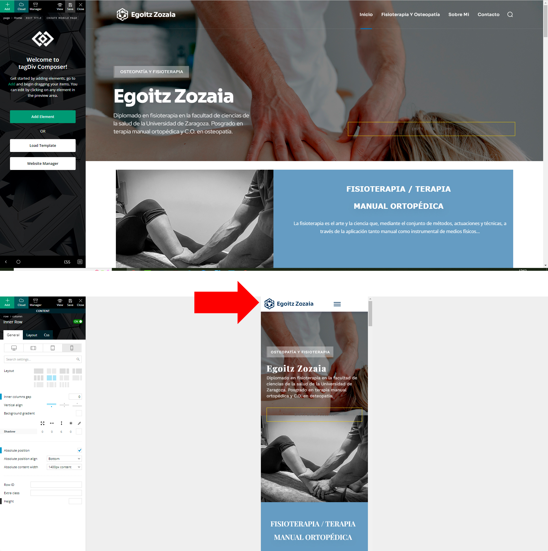
I am creating a website, on PC the menu is transparent, but on mobile the menu has a white background.
How can I make the mobile menu also transparent?
 sil2
sil2Newspaper version: 11.5.1
I have templates set for my main site language. How I can copy them to other languages I have for my website?
I don’t see templates in Pages section, only ‘footer mobile’ (don’t know why).
If I change the language, Cloud templates pave shows me no templates and I have the only one option – download from cloud, but I dont need to download, I want to translate mine.

 newlind
 Hi,
I can confirm that i am not using WPBakery on the site.
I have deactivated all plugins except tagDiv plugins (you can see in the screenshots below).
I have deactivated WP Super Cache & cleared all cache.
I then uninstalled & reinstalled the Gossip Pro pre-built website.
It is still the same situation.
This time, it also displays the following text below the footer:
y-campaign/” rel=” bookmark” class=”td-image-wrap ” title=”These Fabulous Photos Will Have Astonishing Impact for Any Campaign” >
I note that this is not an issue when viewing the site on a mobile device but shows on a desktop/laptop.
2 x screenshots: https://imgur.com/a/wFaRW4r
Additional screenshot: https://imgur.com/a/h9EjxqX
 sanjeev
Hello,
I am unable to use Sticky bar properly on my website http://www.agniveer.com. For example, if you can see here where I have used sticky bar – https://agniveer.com/vedic-deeksha-copy/ , Screenshot – https://ibb.co/tZskN8Y), it works well in Desktop version but once I check in Mobile version, when I scroll up the page after scrolling down, the header area where the logo of Agniveer is placed, disappears. Example – https://ibb.co/VVYLFcz (see the red arrow. It is pointing towards disappeared logo once I scroll up after scrolling down the page).
Please help me to resolve the issue as I am unable to use the sticky feature for this reason.
Waiting eagerly for your active support!
Thanks,
Team Sanjeev
Bettina Hello!
The settings you applied to the mega menu from the desktop won’t be applied to the mobile menu. They can’t be changed there.
Thank you!
Bettina Hello!
Please make a test and switch the theme to another one, and check the amp pages with your stories.
AMP is faster and works better only with the Mobile Theme plugin. From my point of view, if you don’t use the Mobile Theme plugin, then there is no reason or benefit to AMP. Please read all about AMP here: https://forum.tagdiv.com/tagdiv-amp-plugin-tutorial/
It comes with its own templates/design for page, post, category, etc so your current templates from the desktop theme will get converted to the mobile theme layout. Documentation here:
– https://forum.tagdiv.com/the-mobile-theme/
– https://forum.tagdiv.com/mobile-theme-introduction/
Thank you!
Bettina Hello!
We have 3 options for mobile versions that you can use:
1. Responsive version: A responsive version of your website looks similar to the desktop version. Edit the page with TagDiv Composer. Click on the mobile viewport: https://www.screencast.com/t/XDQJedlggSB; there you can see your mobile version and edit or adjust the elements to look better.
2. Mobile pages: https://tagdiv.com/newspaper-10-3-7-update-brings-customizable-and-speedy-mobile-pages/
3. Mobile theme plugin: The Mobile Theme is a performance-optimized theme included in the main Newspaper theme that only loads on mobile devices. It comes with its own templates and design for pages, posts, categories, etc., so your current templates from the desktop theme will get converted to the mobile theme layout. Please see https://forum.tagdiv.com/the-mobile-theme/ and https://forum.tagdiv.com/mobile-theme-introduction/ for more information.
A full explanation you can find here: https://www.youtube.com/watch?v=SpGkOnJeNZY
You can choose to use whichever one is more affordable and useful for you.
If anyone doesn’t fit as you created, then make a test and deactivate ALL plugins except tagDiv ones. Also, if you are using a cache plugin, deactivate it, clear all cache and try again.
Note: If you want to use version 1 or 2, then you need to deactivate the mobile theme plugin and see the results.
Thank you!
sanjeevHello,
I have just created a Page https://agniveer.com/jeeva-test/ and here, I have embedded a video from media file. It looks fine in Desktop version – https://ibb.co/VmHYxYm
But when I try to see this in Mobile version, it stretches out too far and I am unable to see the video as screen shows only 20-25% of the video – https://ibb.co/NNBM2zb I can’t find anything in element section to resolve this as it has very limited option.
Kindly help us to resolve this as earliest as possible. Thanks.
Bettina Hello!
I can see that you solved the issue, right? The mobile page looks similar to your desktop page without any missing elements.
Thank you!
Bettina Hello!
Click on the mobile viewport: https://www.screencast.com/t/XDQJedlggSB. There you can see your mobile version and edit or adjust the elements to look better. Drag and drop the element into the place you’ll need it.
Thank you!
 grezako
Bonjour.
We are using “Newspaper The Rimont Pro” Theme (https://demo.tagdiv.com/newspaper_the_rimont_pro/).
In fact we try to do like exactly how the news site of “New York Times” (https://www.nytimes.com/) on Desktop and on Responsive Design (Mobile Device). So for this fact, we had already contacted you previously (via this link: ) on the Newspaper Forum:
TO ASK YOU THE FOLLOWING QUESTION: How to create a new Menu Bar located just above the Logo exactly like on the screenshot of the New York Times home page that we have “circled in RED” just above the Logo: https://imgur.com/a/yv7fFHK ???
AND YOU ANSWERED US BY SAYING: A workaround there could be this one: https://www.screencast.com/t/qJZARQex3.
So, it works well, but our problem is that it does not appear on small screens i.e. on mobiles as you can see in the following screenshot of our website on Mobile: https://imgur.com/a/e7QLWod.
How to display this Top Menu Bar on small screens (mobile screen) ???
In other words, how does this Top Menu Bar appear on Mobile phone screens as it already appears on computer screens since it does not currently appear on small screens as you can see in the screenshot? following screen: https://imgur.com/a/e7QLWod ???
Please help us step by step.
We are blocked on the use of “Newspaper The Rimont Pro”.
Please, answer us through sample demonstrations in screenshots because it will help us best to quickly understand and solve our problem.
Awaiting your reply.
 Norua
NoruaHi,
I have this website running your latest theme version
https://www.ihwjournal.com/
Already after update to WordPress latest version it wasn’t working properly on the mobile version and the only way was with your dedicated theme which the client doesn’t want.
I deactivated the mobile theme plugin and AMP but the problem still remains especially when in WordPress back-end is still showing the column for mobile tagDiv composer when I don’t want it.
On the home page there is no issue because I made the mobile page, but with all the threads or secondary page the loading is infinite and I’m pretty sure the reason is that your theme doesn’t see a dedicated mobile page (which it’s ridiculous if I have to go change hundreds of articles for this).
I need a way to remove any mobile version or redirect of your theme to the website. Can you help, please?
 robertsimo
 Hello guys,
I found out the problem, was 2x logos on mobile version for a reason, that was the problem, can you delete my post, thanks!
 Zanardi87
Hi everyone,
the created website version is not the same in the mobile version, a lot of parts are missed. In the homepage it is possible to see only the articles, the mobile version doesn’t load the page with the logo in the top, images in the background, menu, ecc.
I use WordPress 6.0, theme Newspaper version 11.5.1
Thank you in advance for your help.
My website is : https://www.tiportoinmoto.it/
 tmckee007
Hi,
I am not using the Mobile theme.
How do I move the mobile menu to the right side instead of the left side?
 Breinblik
 But is it then possible to assign a template to an individual page? Because i can’t seem to do that either. I can only assign a mobile template.
Anamaria Hello,
Please try to use a header template, to can set on the logo width and height => https://i.imgur.com/GcyAdcr.png -> https://forum.tagdiv.com/add-logo-newspaper/ For logo size for desktop we recommend using is 272 x 90px, and for mobile 140 x 48px
Thank you!


