
- NewspaperThe Newspaper Mobile Theme: Introduction
- NewspaperThe Mobile Theme
- NewspaperModules Builder in Newspaper Theme
- NewspaperFilters and sorting for taxonomies
- NewspaperHow to Add a Logo in Newspaper
- NewspaperBig Grid Flex Settings
- NewspaperHeader Builder
- NewspapertagDiv AMP Plugin Tutorial
- NewspaperNewspaper theme documentation
- NewspaperBest Of Forums
- NewspaperCache plugin – install and configure
- NewspaperFont Customization
- NewspaperTheme Colors Introduction
- NewspaperBackground Introduction
- NewspaperHeader ads
- NewspaperPost template ads
- NewspaperCustom ad spots
- NewspaperMain Menu
- NewspaperHow to Install Newspaper via FTP
- NewspaperHow to Install Newspaper via WordPress
 adityabansal
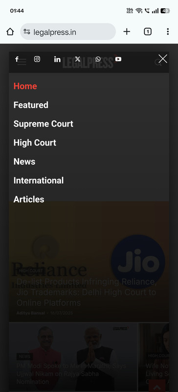
How can I rearrange or edit these social icons links.
 bporciuncula
 Hi,
The website is https://fatobahia.com.br/
Browser version is ok, but mobile, not ok
 Simion C.
 Hi,
Such issues are most likely caused by the caching configuration. When using the options mentioned above for the header, the caching must be configured to create separate caches for desktop and mobile. Most caching plugins have a setting for it. Litespeed has this setting https://prnt.sc/Fq7cLtLU-HWS If you use litespeed, please activate that option, clear the cache and the problem should be solved.
Please try it. Or in case you use something different for caching, or you already activated that setting and the problem remains, please send us an email with the website link and admin login and we will take a closer look.
Thank you!
 bluedot
 Hi Calin,
That’s great to hear. Unfortunately it’s still not working for anyone on our team (tested on Chrome and Safari both desktop and mobile).
 kalacosolutions
I have the header set to mobile view so I can create my own mobile header. The Header Logo is not displaying the logo image I have set for it. I have the logo and tagline text entered; however, the logo does not display, regardless of whether the logo and tagline text are there or not. Please advise how to resolve the situation for the logo on the mobile view to display. Site is BYLocalNews.com
View screenshot: https://www.dropbox.com/scl/fi/qoi1ds3m04hbx2wxtm7is/Screenshot-2025-08-13-121216.png?rlkey=q91666dvxnf4r236rr2lgm9mv&st=yufdtu67&dl=0
 Calin
Calin Hi,
What you can do is use tagdiv Composer, edit the header and on the tablet, where you want the mobile menu to be displayed, not the desktop one, hide the current menu – https://i.imgur.com/JsdDBGu.png and add the mobile menu element https://i.imgur.com/PoNW2hd.png (this must be hidden on the viewports that you do not want to display, such as the desktop) https://i.imgur.com/wuLyNXM.png
Thank you!
Calin Hi,
Newspaper theme has a responsive version, a mobile page (a separate page only for mobile) and a plugin tagDiv mobile theme (this will not display the sidebar and the content for pages should be set in the mobile editor).
However, because you are using widgets for the sidebar, the above solution will not work. If you want to have a different order of the elements in the sidebar widget, what you can do is:
– create a new widget that will be displayed only for mobile on hompages (hide it from the css tab so that it is not visible on other viewports)
– use the mobile page, here you can replace the current widget with the one you want, or you can remove the widget and add the elements with the composer tagdiv in the desired order
Thank you!
bporciuncula I delete tagdiv mobile. My mobile site is now responsive (https://imgur.com/a/QpztHuC). I put AD in all devices (https://imgur.com/a/eRwoh72), but the banner is not showed.
thanks!
 arhinehart
 Thank you for this. Much appreciated.
One other question: For the header here – https://polksports.com/volleyball/ – is there a way to force the menu to switch to the mobile menu/hamburger at the tablet viewpoint? I’d rather the header main menu only appear on the desktop viewpoints.
 bdp
bdp Hi Calin, this is what I get in DivComposer

If I click “Create Mobile Page” it create me another Home Page. Is it correct? Is this when you talk about mobile?
If I click on the widget i have this menu on the left, but if click on the mobile icon and i made a change this change is for all the version of the homepage also desktop not only the mobile

 Calin
Calin Hi,
That space is coming from an ad , when you scroll down and up after a few seconds, the ad will be displayed. https://i.imgur.com/a5qIf6p.png
If you want to change the widget position, what you can do is to use tagDiv Composer and use the settings for row and column on the mobile version to reverse the columns inside the row. By doing this, you can make the sidebar display first https://tagdiv.com/flexibility-rows-columns-newspaper-theme/
Thank you!
bdpHi, could you tell me how to change widget position of a widget only in Mobile Home Page PLS
THis is what i get in Desktop:

This what i need in Mobile:

Calin Hi,
For that add this extra css:
.td-header-template-wrap {  display: grid; }

.td-header-desktop-wrap  {  order: 1; }

.td-header-mobile-wrap {    order: 2; }
Thank you!
 yanou12
Hello Where I can add signup to the mobile.
 jaumemerca2
 Thanks for your help Calin. Here is the URL: https://www.merca2.es/
The black topbar is the newsticker I want to also show in the mobile version. I set custom class to the row to newsticker
Calin Hi,
Use tagDiv Composer to change the logo https://i.imgur.com/HgCpJ5P.png select the element and check the text and svg logo – https://i.imgur.com/aC8gVlR.png https://i.imgur.com/8NILLxD.png check it on mobile header too – https://i.imgur.com/2xn9Bba.png
Thank you!
Calin Hi,
Just to make sure that I understand correctly, in the first image provided, you have an image from the mobile version and the tagDiv Mobile theme plugin, to display ads on it you need to set the ads in the mobile theme in the theme panel – https://i.imgur.com/wnGpwtd.png
Also, on desktop, the ad should be displayed using the ad box element that can be set using tagDiv Composer – https://i.imgur.com/nSFvDN6.png
Thank you!
Calin Hi,
If the first video works but the second one doesn’t regardless of the order they’re placed then something else might be interfering, possibly even some iPhone settings.
I tried to investigate further, but now the video isn’t showing on mobile at all; it’s only displaying on desktop.
Thank you!
Calin Hi,
If that code should be run only once in the page ,I think it will not be easy to make the code to work in the header, since the theme is using 2 separate headers, one for desktop and one for mobile.
Please set the code on the desktop version and please provide a link to the website. I will try to see if I can create a custom css to display that row on mobile (please add a custom class on that row to be easier to be trigger – https://i.imgur.com/hofM57F.png ).
Thank you!
jaumemerca2Hello,
I’m having a problem adding a row in my header. I amusing TagDiv composer and looks ok and works OK in the desktop/tablet version but when I switch to mobile version the row doesn’t appear … and If I add manually a copy of that row in the mobile version then the row stops working in my desktop tablet version because the code that is in an element of that row can only be executed once per page.
How can I do that the same row is shown in mobile and desktop versions?
its a custom topbar with a news ticker.
Calin Hi,
There is a difference when the AMP version is used. Also, we usually recommend to use the responsive version and the tagDiv Mobile theme plugin should be used as a template for AMP in case this is desired to be used (choose option AMP only) and make sure that the amp is set only for articles and the redirect option is disabled from it – https://i.imgur.com/IiPreFk.png https://i.imgur.com/6XNP9tX.png
Thank you!
Thank you!
 malmed_wp
 Description of the problem with image display on Facebook
When sharing content from the Malyn.Media website on Facebook, the main image of the post sometimes does not appear.
Problem details:
Occurs selectively: under the same conditions, some posts display the image while others do not.
The issue affects both new publications and previously published ones (where the image used to appear but later disappeared).
The site runs on WordPress and uses the Yoast SEO plugin.
Sometimes, in the desktop version of Facebook, the image is displayed, but in the mobile version it is not. The debugger does not help — it returns code 200, but the image is still missing. I have observed a similar issue on another website using the same template.
-
This reply was modified 1 year by
malmed_wp.
 Faccin
The default mobile theme menu doesn’t display content (links and social icons) on the post page when the Mobile + AMP option is selected. Only the overlay background appears. On all other pages, the menu works normally. There appears to be some incompatibility with AMP, as when I switch to the Mobile-only option, the menu works correctly.
Calin HI,
Please check if the module is displaying when you edit it on the mobile viewport, maybe it is related to some settings that have been made on it. If the situation is the same, please contact us via email contact@tagdiv.com and we’ll check it out.
Thank you!
 dimitrisv
Hello,
Here is a brief video (no sound) of the issue
https://www.loom.com/share/34176e07c7a1450e92d21a3220b1f3e6?sid=dc762317-fa10-4281-99d6-62d7f09ca066
Here is the site:
As you will see Module 2 works fine
Thank you!



