
- NewspaperThe Newspaper Mobile Theme: Introduction
- NewspaperThe Mobile Theme
- NewspaperModules Builder in Newspaper Theme
- NewspaperFilters and sorting for taxonomies
- NewspaperHow to Add a Logo in Newspaper
- NewspaperBig Grid Flex Settings
- NewspaperHeader Builder
- NewspapertagDiv AMP Plugin Tutorial
- NewspaperNewspaper theme documentation
- NewspaperBest Of Forums
- NewspaperCache plugin – install and configure
- NewspaperFont Customization
- NewspaperTheme Colors Introduction
- NewspaperBackground Introduction
- NewspaperHeader ads
- NewspaperPost template ads
- NewspaperCustom ad spots
- NewspaperMain Menu
- NewspaperHow to Install Newspaper via FTP
- NewspaperHow to Install Newspaper via WordPress
 Anamaria
 Hello,
If you don’t want to use the mobile theme plugin, then disable also, the AMP plugin.
Also, please check this topic where I explained each mobile version -> https://forum.tagdiv.com/topic/mobile-version-not-working-properly-2/ and choose what mobile version you want.
Thank you!
Anamaria Hello Roger,
Please let me know what version for mobile you use -> https://forum.tagdiv.com/topic/mobile-version-not-working-properly-2/
Also, if you have a mobile responsive or mobile page, please check the block Filter -> https://i.imgur.com/CF2sQUi.png and set it on what filter you want.
Also, the text is the excerpt?
Thank you!
Anamaria Hello Andy,
If you referring to setting a color for each category, you can check this topic => https://forum.tagdiv.com/topic/mobile-theme-duplicate-titles-missing-categories-category-tag-colour/
Thank you!
 Calin
Calin Hi BarbaraZ,
Unfortunately, for the moment the breadcrumbs element from the page do not have the option to display the path like that, it can display only on this structure home>page name. I made a request to be improved and like this home>parent page>page name.
Also, if you are using the mobile page, then the mobile page need to have the same name as the desktop page, only then the path of bread crumbs will be display the same.
Thank you!
 howmanywon
Theme: Royal pub
Wesbite URL: howmanywon.com
1. Logo on mobile
Although I was able to update the logo on the desktop using the global header, it isn’t updating on Mobile:
2. Blocks under the first section on mobile
There is a dark grey and cream block after the first section on mobile
3. White gaps between sections on mobile
Can I remove these black space gaps on mobile?
https://imgur.com/SpVbn9T
https://imgur.com/tNJ04oB
4. Featured image showing on post/article on mobile
Can I remove this? I was able to on desktop
5. Large blank white space on desktop
On desktop, before the ‘Greatest golfers’ section there’s a large white gap I’d like to remove the size of.
Thank you for your help!
 Rafael
 Hi everyone,
So I have a somewhat similar issue. However, doing what otggamer mentioned didn’t resolve mine. I’m on the latest version of Newspaper 11.4.
Basically, I migrated from one host to another. Now, after the migration, if I go to:
Theme Panel > Header > Logos & Favicon, all the logos (desktop and mobile) are showing a URL of “https://wordpress-722984-2411204.cloudwaysapps.com/wp-content/uploads/2018/…..”.
There are 3 issues with that:
1) The URL points to a temporary Cloudways link. However, I’ve already changed my DNS away from the Cloudways temporary WP name to stluciatimes.com. I’ve already updated my permalink structure. I’ve also confirmed that all URLs are working correctly on my site. Therefore, the URLs should point to “https://stluciatimes.com/wp-content/uploads/…”.
2) The folders that the URLs are pointing to (year of 2018) have all been deleted. However, I have already re-uploaded a new set of logos.
3) Whenever I try to change the logos to the new ones I’ve uploaded and click save, all the URLs automatically go back/reset to the old “https://wordpress-722984-2411204.cloudwaysapps.com/wp-content/uploads/2018/…..” once I refresh the page.
Any assistance or ideas that could help would be awesome.
Thanks so much!!
Regards,
Rafael
howmanywon I have some more issues following on from the above:
1. Logo on mobile
Although I was able to update the logo on the desktop using the global header, it isn’t updating on Mobile:
2. Blocks under the first section on mobile
There is a dark grey and cream block after the first section on mobile
3. White gaps between sections on mobile
Can I remove these black space gaps on mobile?
https://imgur.com/SpVbn9T
https://imgur.com/tNJ04oB
4. Featured image showing on post/article on mobile
Can I remove this? I was able to on desktop
5. Large blank white space on desktop
On desktop, before the ‘Greatest golfers’ section there’s a large white gap I’d like to remove the size of.
Thank you for your help!
 oulyrics
Hi,
Although I selected “Disable dropdown when display inline” from the TagDiv composer for the sibling category in the lyrics category, it doesn’t work. I can’t see all subcategories. Subcategories appear within some Parent categories, but not others. It’s a complex situation. I would be glad if you help. Site http://www.oulyrics.com
The related page with the problem is https://oulyrics.com/category/lyrics/
It’s a weird problem. This part works worse on mobile version. Another detail is that after logging into wordpress on the computer, subcategories in the Lyrics category become fully visible. But it shows some of it when not logged in. It doesn’t show them all. The same is true for the mobile version. The mobile version is important to me.
Thank you for your interest. I wish the problem to be solved as soon as possible.
The template name I use is “Living Pro”.
Related images (after logging into wordpress by Admin): 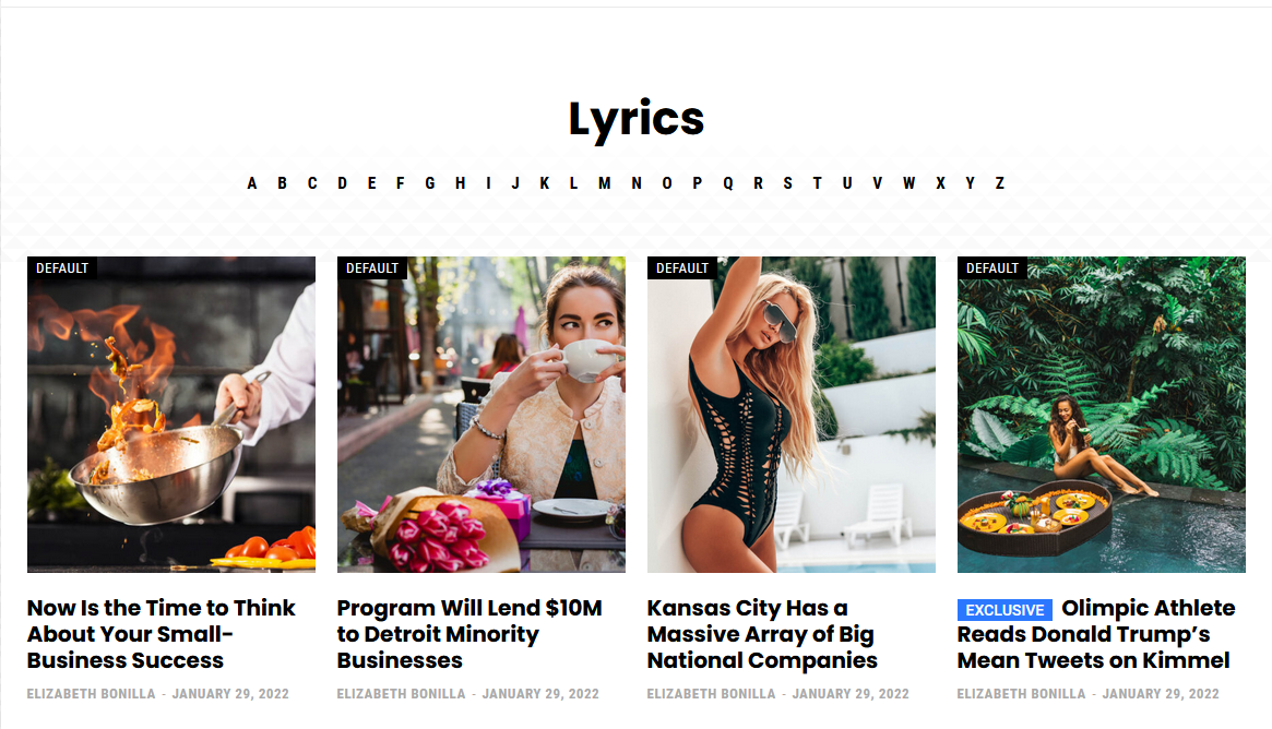
Related image 2 (Not logged in): 
Related image 3 (Mobile version): 
Related image 4 (subcategory page not working correctly): 
Related image 5 (subcategory page working correctly): 
Related image 6 (TagDiv Composer settings): 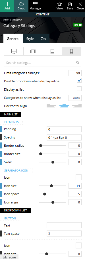
 Lalit
LalitHi,
I have completely disabled the Google fonts from the Theme panel (https://prnt.sc/26lt2x6) and used custom fonts (self-hosted) (https://prnt.sc/26lt2u3) but, still appearing when I am checking on the page speed insight.
Check here: https://prnt.sc/26lt446
I am using AMP with Mobile theme plugin.
Help me to remove google fonts completely from my site. i want to host them locally.
 vikasnangia
For some strange reason, on the blog category page after the pagination, the same content shows again in a loop.
So for example, if we show 10 blogs, after pagination the same 10 blogs show, instead of the next 10.
It breaks when we change it to “Load more” or “infinite load”.
vikasnangia We have had to deactivate your mobile theme. After removing the mobile theme plugin see below :
Home page: https://www.appmysite.com/blog/
Image sizes on mobile: 636×392 and 150×84
Category page: https://www.appmysite.com/blog/category/mobile-app-builder/
Image sizes on mobile: 636×392 and 150×84
Why are 2 sizes being loaded on both the above page types? Are these the expected sizes?
 ehealthiermtoday
Hello There!
Can someone please help – my email opt-ins just randomly stopped working. They actually were working recently and just stopped on both mobile and regular. In short, the button does not work once an individual clicks “submit”. Please help!
I saw the previous thread about the loading pages, etc. and tried my best to fix it myself.
I hope to hear back soon!
best,
Ethan
 iamratnesh
Please help out I have some queries:
1) If I use a separate Mobile theme (not AMP one, am talking about the Newspaper mobile theme) then will it have a bad SEO impact for mobile search results indexing?
2) Please fix this stuff (check video). AMP is not working properly. I want everything to be AMP now except Homepage, because for homepage I”ll set a new mobile theme
I’ve disabled the mobile theme, as a support member said through email said, from the Main Homepage and enabled AMP for all pages except Homepage.
Also, I’ve created a Mobile theme page and assigned it. But still, my Desktop homepage is getting opened on mobile. which is quite weird. And my AMP for posts and other pages is ruined.
Please help me fix these issues
 dimmisel
 I asked you if I can overrdie this template in child theme.
We want to add more data in mobile menu, such as logo and a html block.
Can we do this with a cloud header?
Thanks!
 msakande
Dear,
My website https://owonews.info/ don’t display correctly all the information from the website.
There are some section which are hidden in mobile version.
As you can see using mobile to access the website, a lot of section cannot been display.
Can you help me?
 desirevp
When I create an ad with an ad box in desktop and I select just to show it on mobile on mobile, it hides the image in desktop and tablet, but maintains the gap (actually the gap is seen in tagdiv composer as an empty ad box with the sign: “No image ad or is disabled”, and in turn the gap is there in the page in desktop.
Is there a way to hide an ad from a device type and not have the gap of the ad box?
desirevpThe black top bar (with a menu, social icons..etc) in the Newspaper Pro default template disappears in mobile. Is there any way to maintain at least part of the bar with the menu in mobile in the header?
 sb-2
sb-2 Update: I’ve deactivated the tagDiv Mobile Theme plugin. I am still experiencing display issues on mobile with posts (header loading as plain text, images not displaying, etc.), but the result is much nicer than it was previously.
Please advise on solutions. The blog pages on mobile are still the only ones affected. Thank you.
sb-2Hi,
I’ll start by saying I’m a novice. I may use incorrect terms. Sorry in advance.
On my website (Newspaper Pro theme), I have an issue with blog article pages using the Mobile Theme whereas the other pages do not. I wish to not use the mobile theme as it does not display all my elements (my main issue), and the header/footer are not my preferred style (secondary). The issue is only present on blog articles. When you scroll to the bottom of any blog article on a mobile device and tap “Exit mobile version,” the page then displays as I would like. The home page and other pages properly display with no issues, as in they do not default to the Mobile Theme.
Any suggestions?
My mobile settings are:
USE MOBILE THEME FOR: AMP
MOBILE THEME ON MULTISITE: [not checked]
My website is: https://storybookamusement.com/
Thank you for your time.
 vestroger
Hello!
My website is totally new.
I have a Home page for desktop, a Home page for mobile, and an About page.
And I’ve only made two posts so far.
This is my issue:
On the Home page for mobile, the content you see is one of those two posts. But it seems to be random which one of those two is displayed. And when reloading the Home page it sometimes stay the same, and sometimes it changes to the other post. Why does this happen?
On my Home page for desktop the text is not displaying correctly. Why is this the case?
https://imgur.com/weO1EAy
Thank you for your help, really appreciate it!
Kind regards,
Roger
Calin Hi talkbasket, I think that this problem appear only if you have the mobile theme plugin enabled.
I will inform our developers about this.
Thank you!
 deepak8151Calin
 Hi,
Yes, you can display for a page and posts the responsive version if you are using the Gutenberg editor. For this use the option from the right corner -> https://i.imgur.com/nAGJe7s.png -> https://forum.tagdiv.com/mobile-theme-introduction/
The mobile theme plugin provide 3 options:
To be used only one mobile, to be use only on amp and to be use on both -> https://forum.tagdiv.com/the-mobile-theme/
To see which one you have please check in the theme panel > mobile theme -> https://i.imgur.com/dcOvXdJ.png
Thank you!
Calin Hi,
The mobile theme plugin do not have any options to change the thumb size.
Can you please provide a link to inspect and see what can be the problem with those image, because the mobile theme is using 2 thumbs and those should not be with that size.
Thank you for your understanding!
 BarbaraZ
 And one more question regarding bread crumbs. On the mobile pages, they show the mobile pages names. Can the mobile pages have the same names as the regular ones so that the breadcrumbs don’t show something else than on the computer?



