- NewspaperThe Newspaper Mobile Theme: Introduction
- NewspaperThe Mobile Theme
- NewspaperModules Builder in Newspaper Theme
- NewspaperFilters and sorting for taxonomies
- NewspaperHow to Add a Logo in Newspaper
- NewspaperBig Grid Flex Settings
- NewspaperHeader Builder
- NewspapertagDiv AMP Plugin Tutorial
- TutorialsFrom WPBakery to tagDiv Composer
- NewsmagSmart list ads
- NewspaperNewspaper theme documentation
- NewspaperBest Of Forums
- NewspaperCache plugin – install and configure
- NewsmagIntroduction
- NewsmagMain menu
- NewsmagLogo & Favicon
- NewsmagHeader ads
- NewsmagSmart sidebar
- NewsmagSharing buttons
- NewsmagCategory tag on modules/blocks
 BlackandWhiteTradingLtd
I am trying to display three different ad sizes depending on whether the screen is a PC, Tablet or Phone. I found this link but it’s depreciated
https://forum.tagdiv.com/header-ads-adsense/
I tried changing the view in the editor and pasting different code in the Ad Bock for each view, but it appears to simply show only the last code added and not retain seperate code for each block.
I also tried the Ad Header block – but the settings there don’t allow seperate code for each screen size – just turning off for mobile.
So how can I achieve this please?
 shammi1986
Mobile menu is not opned on mobile but it’s opened in desktop version. Please help
https://dialepunjab.com/
 maxcrandale
How can we make a post sticky in this newsmag theme… mobile and desktop version. Thank you.
 mongreanly
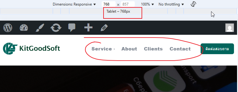
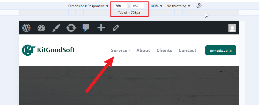
 I already unset the mobile page but it’s still not show mobile menu on the tablet viewports like this. https://t7516229.p.clickup-attachments.com/t7516229/652b3e7d-bf59-4018-830e-2bc65143e57f/image.png?view=open
How to display mobile menu on the tablet viewports?
 Caprold
 I narrowed this latest issue down to the use of the LiteSpeed Cache plugin. I know the theme recommended WP Super Cache, but I installed LiteSpeed in case it was Super Cache causing the articles to not display.
Now I’m trying to figure out how to edit the mobile theme using Composer. It doesn’t display what I see on mobile devices when trying to use Composer, and tagDiv Mobile Theme doesn’t give me any settings or options in the WP menu, just a link to the plugin’s site from the plugin page.
 Bettina
 Hello!
You can create a page with the same design and add it into your modal popup shortcode.
You can also change the background and copy-paste the icons from your footer into the page of the modal popup. See how the background is set for that mobile menu in the Newspaper -> theme panel -> theme colors -> Mobile menu -> background gradient color option.
Thank you!
Bettina Hello!
Unfortunately, there is a problem with the mobile pages and that option. Can you unset the mobile page and make the changes directly on your homepage on the tablet viewports?
Thank you!
 Catalin
 Hello and thank you for your reply.
I would like to customize the icons by adding them manually as images like I did in the footer.
https://imgur.com/9FTUqM9
If I use the Modal Popup how can I keep the same design of the mobile menu as it is now (see first screenshot)?
mongreanly I already assigned the mobile template https://t7516229.p.clickup-attachments.com/t7516229/ff5d9aa2-bdac-41b2-a273-82fb1cc5e1c2/image.png?view=open
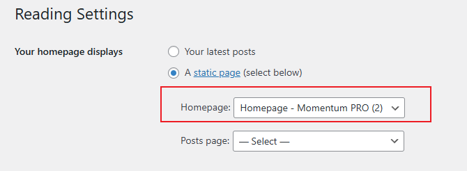
and set up homepage https://t7516229.p.clickup-attachments.com/t7516229/e40b838a-92c4-4ee0-9e5d-d498e0ed0404/image.png?view=open
but it not display mobile menu https://t7516229.p.clickup-attachments.com/t7516229/6ca0ca3d-54e2-49de-9f82-ba62d8145826/image.png?view=open
Bettina Hello!
You did not seem to assign the template and the mobile page you’ve built. Mobile pages: https://tagdiv.com/newspaper-10-3-7-update-brings-customizable-and-fast-mobile-pages
Homepage set up: https://forum.tagdiv.com/homepage-how-to-build-and-set-it/
About Cloud Library Templates: https://forum.tagdiv.com/cloud-library-templates/
Thank you!
Bettina Hello!
First of all enable those options from the Website Manager: https://app.screencast.com/2vO2Dg4wS1s7d
A workaround could be to add the mobile menu to the desktop viewport and hide it from the CSS tab: https://app.screencast.com/ocBb9hWOVZRPs. Access the tablet viewport: https://app.screencast.com/Terq3h8SWoR7P and hide the normal menu.
Thank you!
Bettina Hello!
This issue has already been discussed here, please check: https://forum.tagdiv.com/topic/edit-mobile-menu-social-icons/
Thank you!
Bettina Hello!
We have 3 options available for mobile versions that you can use:
1. Responsive version: A responsive version of your website looks similar to the desktop version. TagDiv Composer is used to edit the page. Click on the mobile viewport: https://www.screencast.com/t/XDQJedlggSB. You can see your mobile version there and edit or adjust the elements to look better.
2. Mobile pages: https://tagdiv.com/newspaper-10-3-7-update-brings-customizable-and-fast-mobile-pages
3. Mobile theme plugin: The Mobile Theme is a performance-optimized theme included in the main Newspaper theme that only loads on mobile devices. It comes with its own templates and designs for pages, posts, categories, etc., so your current templates from the desktop theme will get converted to the mobile theme layout. Please see https://forum.tagdiv.com/the-mobile-theme/ and https://forum.tagdiv.com/mobile-theme-introduction/ for more information.
A full explanation is here: https://www.youtube.com/watch?v=SpGkOnJeNZY
If you need to use mobile version 1 or 2, then you need to uninstall the Mobile Theme plugin and AMP.
Thank you!
Bettina Hello!
The social icons from the mobile menu come from the Theme Panel -> Social/Apis -> Social Networks -> https://i.imgur.com/kKYIECB.png. Remove/edit them as needed.
There are only a few settings for it in the theme panel. For example, you can change the color of the text in the mobile menu from the Theme panel -> Theme colors -> Mobile menu -> Text/icons color.
If you want to customize more, you can create a page and display it here: https://app.screencast.com/d00epUU2ygyXk. More info about modal popup here: https://forum.tagdiv.com/modal-popup/
Thank you!
Bettina Hello!
Do you have the Mobile theme and AMP installed and active? If so, please deactivate them, clear all the cache, and try again.
Thank you!
mongreanlyI try to do mobile menu but it’s not display on tablet device.
 maliyyat
 Proposition Media
I have a mobile page that is finished and looks good. I want the entire mobile page to show up when accessing the site on an iPad as well, but it doesn’t. When I then edit the mobile page for the iPad view, it changes the mobile page, which I don’t want. How can I get around this problem?
CatalinHello, how can I edit the style of the social icons above the mobile menu? My website is: https://ecommercenews.ro/

 tgsmachado2
Hello, I placed the text with image element at the end of the post using the tagdiv composer. On the desktop, the element appears normally in all posts, but on mobile phones and other mobile devices, it does not appear, even though it has the “show” option.
Is there anything else I need to do to make the element appear on mobile devices?
https://drive.google.com/file/d/1g4EzpaeW3lziolV-_SorUHcBGP3y3eH3/view?usp=sharing
 Simion C.
 Checking now.
1. There was some padding there and that caused the menu items to appear not centered vertically. I removed that padding and it looks fine now https://prnt.sc/1doWFdOfs8jq
2. The logo on mobile was already looking fine by the time I checked https://prnt.sc/jYinsehWY0dz I see you corrected the problem in the meantime.
3. The logo is first loaded in full size and then resized by the CSS code. To remove that effect or at least reduce it, the CSS code could be loaded faster, in this panel here https://prnt.sc/RAk9j2_ZLHB8 I moved parts of the code there, and now the header doesn’t even jump on refresh/load. It loads much better. Please check it as well.
Thank you!
 thetraders
 Bettina
 Hello!
There is actually a recycle bin basket for every element: https://www.screencast.com/t/wFYdqgpo6pT
Select the mobile viewport and search about an element, then you can drag & drop the one you want on the page: https://app.screencast.com/x78OK064sdQiY and configure it.
More info here: https://forum.tagdiv.com/tagdiv-composer-tutorial/
Thank you!
Bettina Hello!
Can you please provide your website link or a screenshot and more information about the login feature from your mobile?
Thank you!
thetraders