- NewspaperThe Newspaper Mobile Theme: Introduction
- NewspaperThe Mobile Theme
- NewspaperModules Builder in Newspaper Theme
- NewspaperFilters and sorting for taxonomies
- NewspaperHow to Add a Logo in Newspaper
- NewspaperBig Grid Flex Settings
- NewspaperHeader Builder
- NewspapertagDiv AMP Plugin Tutorial
- TutorialsFrom WPBakery to tagDiv Composer
- NewsmagSmart list ads
- NewspaperNewspaper theme documentation
- NewspaperBest Of Forums
- NewspaperCache plugin – install and configure
- NewsmagIntroduction
- NewsmagMain menu
- NewsmagLogo & Favicon
- NewsmagHeader ads
- NewsmagSmart sidebar
- NewsmagSharing buttons
- NewsmagCategory tag on modules/blocks
 Asida Technologies
 Hi Bettina,
Thank you for the detailed explanation! I have tried all the suggested methods, but I am still facing an issue with the login functionality on mobile. Even after disabling the login option, it remains active.
I have:
✅ Disabled the Mobile Theme plugin and AMP
✅ Cleared the cache (both website and browser)
✅ Checked for conflicting plugins and themes
✅ Verified settings in TagDiv Composer
Despite these steps, the login remains enabled on mobile. Could you suggest any other possible fixes? Is there a specific setting or file override that might be causing this issue?
Looking forward to your guidance!
Thanks!
-
This reply was modified 1 year by
Asida Technologies.
 accursi
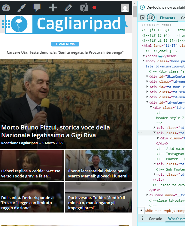
 I moved the custom css-desktop to the top of the style.css file. This is to avoid the full-page zoom effect of the header SVG logo.
Two problems remain.
1) One concerns the topbar: the menu items are no longer centered in the gray bar.
2) The logo performs in mobile resolutions.
Example:
https://assets.cagliaripad.it/wp-content/uploads/2025/03/05085711/SCREEN_0503.png
Many Thanks!
 Bettina
 Hello!
Here is the setting for Mobile theme: https://app.screencast.com/yYhHkpNzYa75u
We have 3 options available for mobile versions that you can use:
1. Responsive version: A responsive version of your website looks similar to the desktop version. TagDiv Composer is used to edit the page. Click on the mobile viewport: https://www.screencast.com/t/XDQJedlggSB. You can see your mobile version there and edit or adjust the elements to look better.
2. Mobile pages: https://tagdiv.com/newspaper-10-3-7-update-brings-customizable-and-fast-mobile-pages
3. Mobile theme plugin: The Mobile Theme is a performance-optimized theme included in the main Newspaper theme that only loads on mobile devices. It comes with its own templates and designs for pages, posts, categories, etc., so your current templates from the desktop theme will get converted to the mobile theme layout. Please see https://forum.tagdiv.com/the-mobile-theme/ and https://forum.tagdiv.com/mobile-theme-introduction/ for more information.
A full explanation is here: https://www.youtube.com/watch?v=SpGkOnJeNZY
If you need to use mobile version 1 or 2, then you need to uninstall the Mobile Theme plugin and AMP.
Thank you!
Asida TechnologiesHello Support Team,
I have disabled the login page on my Windows theme successfully, but the login option is still appearing in the mobile theme. Despite disabling it and trying multiple possible options, I am unable to remove the login requirement on mobile.
Could you please assist me in resolving this issue? Is there a specific setting or workaround I should try?
Looking forward to your support.
Thank you
Bettina Hello!
We have 3 options available for mobile versions that you can use:
1. Responsive version: A responsive version of your website looks similar to the desktop version. TagDiv Composer is used to edit the page. Click on the mobile viewport: https://www.screencast.com/t/XDQJedlggSB. You can see your mobile version there and edit or adjust the elements to look better.
2. Mobile pages: https://tagdiv.com/newspaper-10-3-7-update-brings-customizable-and-fast-mobile-pages
3. Mobile theme plugin: The Mobile Theme is a performance-optimized theme included in the main Newspaper theme that only loads on mobile devices. It comes with its own templates and designs for pages, posts, categories, etc., so your current templates from the desktop theme will get converted to the mobile theme layout. Please see https://forum.tagdiv.com/the-mobile-theme/ and https://forum.tagdiv.com/mobile-theme-introduction/ for more information.
A full explanation is here: https://www.youtube.com/watch?v=SpGkOnJeNZY
If you need to use mobile version 1 or 2, then you need to uninstall the Mobile Theme plugin and AMP.
Thank you!
 hcmbest
Hello,
I added an image to an Ad Box inside a Row in the tagDiv Newspaper theme. On PC, the image fits perfectly without any margins, but on mobile, there are left and right margins.
Above the Ad Box, there is a Grid Block that stretches across the full width without any margins, but only the Ad Box does not.
How can I make the Ad Box use the full width without margins on mobile?

 oasnaw
If I resize the browser to mobile from desktop view, it looks fine, but after I refresh with mobile size, it shows a broken website.
website: https://highents.com
Bettina Hello!
Make sure you assigned the mobile page correctly: https://tagdiv.com/newspaper-10-3-7-update-brings-customizable-and-fast-mobile-pages/ . Also, please ensure no caching issue interferes with how your website is displayed on mobile.
If the problem is still there, then please get in touch with us via email at contact@tagdiv.com and provide the following:
– admin URL and credentials
– cPanel URL and credentials
– a link to this topic to identify you
We’ll check and try to help you as soon as possible!
Thank you!
Bettina Hello!
AMP works best with the Mobile theme. In my opinion, if you don’t use the Mobile Theme plugin, then there is no reason or benefit to AMP. Unfortunately, AMP is not working with the cloud templates because the AMP’s layout is not fully customized.
The AMP version works best with default templates and not cloud templates. That’s why we integrated it with the Mobile theme plugin.
The feedback from our clients about AMP was negative and it is not used anymore, that’s why we didn’t add more customization options. We no longer recommend using AMP because it is deprecated https://developer.bigcommerce.com/docs/storefront/wordpress/platform-integration/enabling-amp
Thank you!
 stemalo
 Hello Bettina,
thanks for your help. Got it. The thing with the mobile view.
I used already a cloud template and created a page which fits for me.
And also there I added the shortcode Single Post Subtitle.
Worked all well. Take a look at the subtitle here, straight under the title:
https://2024.gartenwoche.ch/pflanzen/pflanzenempfehlungen/pearls-of-perfume-ein-bauernjasmin-der-begeistert/
I wanted to know where can I change text color, font size and so on.
Another thing: please take a look at the footer. There are three widgets.
Directory, Event and Jobs. Whilst Footer 1 and Footer 3 are showing up
h4 class td-block-title, the widget Event in the middle don’t so. Any idea
how to fix this?
 DeanLand_OTC
When accessing my site, ourtravelcafe.com, using a mobile phone, the site is not responsive. Instead, users on Android see my 2-column desktop format page.
Today, I confirmed deletion of the Mobile and Amp plug-ins. Then, I set up a new mobile home page following detailed instructions provided in support:
(Support Content.
I double checked the new mobile template and confirmed each element was set in the ROW tab for a SINGLE setting.
I also confirmed on my WordPress PAGES view that the new Mobile page is identified as a mobile template and it has a “published” status.
Still, when I access on my Android device, the two-column desktop format appears.
 Babawomba
 Hi Bettina,
You currently can reproduce the problem when opening these two different pages directly from the Google SERPs, at least I can with incognito mode:
– https://tinyurl.com/4u83xw2r
– https://tinyurl.com/mpmtevue
I have attached two new full page screenshots for you for these two pages:
https://1drv.ms/i/s!AlQHsqtJGzeatY9lkO8LPT26n-sodg?e=wLnhz8
https://1drv.ms/i/s!AlQHsqtJGzeatY9mSXcAdYX9FRN83A?e=zaUWMr
Here is the tagdiv composer view for our posts template:
https://1drv.ms/i/s!AlQHsqtJGzeatY9kLtq2PHDsn4wmrQ?e=KE6lXv
The issue seems to be somewhat related to how “Googlebot smartphone” renders the pages and then stored some data which is now being used when users click on the Google SERPs.
This means the issue appears only for some pages when users come from Google, as some cached version or parts of the code (that had been served on a previous crawl) is being applied
If the user then reloads the affected page the problem disappears. All visits/loads that are not coming from Google appear to render the pages correctly – including from Bing SERPs
My assumption as of now is that some dynamically served image (container/element) code to “Googlebot Smartphone” sometimes produces a flawed cache result – which then affects desktop users when they visit the site from Google SERPs.
In the meanwhile I did some tests with the previously reported page:
– Doing a minor change on the affected article
– Reducing the featured image dimensions and saving the page
– Re-indexing it again manually via Google Search Console.
This removed the problem. But this could be just a random success as in general not all pages are affected.
Further changes I have implemented in an effort to fix things:
I added this custom CSS code to my wordpress theme to force a limit for maximum image size rendering on mobile devices, to target Googlebot smartphone which seems to have some rendering issues with the code it gets:
@media (max-width: 767px) { .tdb_single_featured_image img { width: 100% !important; max-width: 696px !important; height: auto !important; } }
 Anamaria
 Hello,
You have the mobile theme version now, so you can disbale the plugins to check the responsive version.
Using our theme, you can choose from 3 mobile versions
-> mobile responsive => https://www.screencast.com/t/oJ2ShOp47
-> mobile theme plugin => https://forum.tagdiv.com/the-mobile-theme/
-> mobile page => https://tagdiv.com/newspaper-10-3-7-update-brings-customizable-and-fast-mobile-pages/ The option that you need to use.
Suppose you created the mobile pages with tagDiv Composer. In that case, when you install the Mobile Theme plugin, your pages will be overwritten by the plugin (the mobile theme comes with its templates for page, post, category, etc, so your current templates from the desktop theme will get converted to the mobile theme layout, the page content is made without builders in mobile editor => https://www.screencast.com/t/xbgZG8kH also, the options that are provided to edit the mobile theme version are limited (this keeps the things simple)).
This is a video about Responsive Newspaper Theme, AMP & Mobile Theme, Mobile Pages & Templates -> https://www.youtube.com/watch?v=SpGkOnJeNZY.
So, the mobile responsive is what you see when that you select the viewport on phone => https://www.screencast.com/t/matV17hH, so some settings may apply for each viewport(where is the border blue), and others are not(where the border is black).
The mobile page has the mobile templates from Cloud Library => https://www.screencast.com/t/YCcZ8rL8
The Mobile responsive version of the theme and the mobile page editor can be edit with tagDiv Composer, the mobile theme plugin cannot.
For example, you can have the mobile theme plugin activated and use the mobile page/mobile responsive version for the homepage/pages, but for the categories pages/404 page, you can’t use the mobile page/mobile responsive version if you have the mobile theme plugin activated.
So, if you want to design the pages with tagDiv Composer, you can use the mobile page or mobile responsive version.
Thank you!
Anamaria Hi,
If you have a mobile page, you need to have a separate mobile cache.
Thank you!
 bob@mrrogersweborhood.com
 Yes, same cache for desktop and mobile.
 gmodonesi
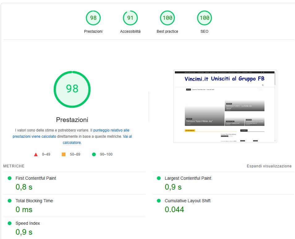
 The site (www.vincimi.it) now has very good scores for desktop but still poor scores for mobile (First and Largest Contentful Paint).
Any idea to fix the mobile scores also?
Thanks
Desktop: https://www.vincimi.it/wp-content/uploads/2025/02/VI-desktop.jpg
Mobile: https://www.vincimi.it/wp-content/uploads/2025/02/VI-mobile.jpg
Anamaria Hello,
Ok, do you have a separate cache for mobile? Can you please edit the both versions, responsive and mobile page to check on each version do you have that title?
Thank you!
Anamaria Hello,
You have a header template from Cloud Library, then you need to edit with tagDiv Composer https://www.screencast.com/t/Y5j6ArY8Ug, select the logo and set there the image, make sure that is set to show and delete the logo text or SVG code-> https://imgur.com/ve11Fwt -> https://forum.tagdiv.com/add-logo-newspaper/ For mobile please edit with tagDiv Composer, select the viewport on phone, select the header logo and change it => https://i.imgur.com/cR7F0v4.png
Also, if the logo is in a modal popup, you need to edit that page to change the logo.
Thank you!
Anamaria Hello,
You have a header template from Cloud Library, then you need to edit with tagDiv Composer https://www.screencast.com/t/Y5j6ArY8Ug, select the logo and set there the image, make sure that is set to show and delete the logo text or SVG code-> https://imgur.com/ve11Fwt -> https://forum.tagdiv.com/add-logo-newspaper/ For mobile please edit with tagDiv Composer, select the viewport on phone, select the header logo and change it => https://i.imgur.com/cR7F0v4.png
Thank you!
bob@mrrogersweborhood.com Yes, the screenshots are of the mobile page. We use caching from our web hosting company WPMU. It’s a server level static server cache.
Bettina Hello!
Please try to reinstall the page from the Cloud Library to have all the elements there, and for mobile, you can order the columns/inner columns: https://app.screencast.com/Tt6i5SOMhh8lH
Please note that you should write 1,2,3 for each column/inner column.
You can also build a mobile page that will be different than the one from desktop: https://tagdiv.com/newspaper-10-3-7-update-brings-customizable-and-fast-mobile-pages/
Or you can have double elements, hide the one you do not want on the desktop, and show it on mobile. Each element has this option in the CSS tab: https://app.screencast.com/NOSucmHCgrxmw so the inner column is hidden there: https://app.screencast.com/zOIFfWefTMz0t
The order should be like this: https://app.screencast.com/jqpfISJpCr86T
I hope that helps you!
Thank you!
Anamaria Hello,
Do you use a mobile page? What cache plugin do you use?
Thank you!
bob@mrrogersweborhood.com
 Anamaria
 Hello,
Please provide some screenshots about your issue and the link to your website. Maybe you have the tagdiv mobile theme plugin activated or a mobile page.
A solution for sending a screenshot/video is this:
Download, capture, and send: https://www.techsmith.com/jing-tool.html
After making the screenshot, you will have a link; paste it here.
Thank you!
 bporciuncula
I tried change the color black to white in header menu mobile, but I can´t. I read how to change it, I put WHITE, but it’s still black, as shown in the attached image
The website is fatobahia.com.br (mobile version). The Logo is white, but the background still black.