- NewspaperThe Newspaper Mobile Theme: Introduction
- NewspaperThe Mobile Theme
- NewspaperModules Builder in Newspaper Theme
- NewspaperFilters and sorting for taxonomies
- NewspaperHow to Add a Logo in Newspaper
- NewspaperBig Grid Flex Settings
- NewspaperHeader Builder
- NewspapertagDiv AMP Plugin Tutorial
- TutorialsFrom WPBakery to tagDiv Composer
- NewsmagSmart list ads
- NewspaperNewspaper theme documentation
- NewspaperBest Of Forums
- NewspaperCache plugin – install and configure
- NewsmagIntroduction
- NewsmagMain menu
- NewsmagLogo & Favicon
- NewsmagHeader ads
- NewsmagSmart sidebar
- NewsmagSharing buttons
- NewsmagCategory tag on modules/blocks
 shafi100
Only Latest Articles shows on Mobile and not the rest of sections

please help
 Calin
Calin Hi,
I check your link in amp version on mobile and this is looking normally -> https://www.screencast.com/t/1yMSQdH14 if you want you can use this custom css for this images -> https://www.screencast.com/t/nYPi3sZ2
body .post .td-post-content .wp-block-image  .aligncenter > * {

    max-width: 90%;

    width: 100%

}
After you set the code in Theme panel>mobile theme>Custom code > css please check again with mobile phone the amp version.
Thank you!
Calin Hi,
If you want to use the mobile theme with amp, but you need to have the desktop design you can use the “AMP” option from Newspaper>Theme panel>Mobile theme>Mobile settings
-> https://www.screencast.com/t/CEVSensTM6
Thank you for your understanding!
 Simion C.
 Hi,
The mobile theme can only display an image logo, currently it cannot display a text logo like on desktop. I could add this as a request and it will be considered.
The header that the mobile theme displays will not be the one that you build with the header builder in the composer. Only when the mobile theme is not active will that be displayed (responsive version). So to display the mobile cloud header template you have built, the mobile theme has to be deactivated.
Most of the mobile theme elements and templates are predefined, this is what makes it faster. We will add more options and settings in it in future updates. Sorry for any inconvenience.
Thanks
 Bigsheepstudio
Hello,
I have the issue on https://viljinn.is – the top banner disappears in mobile and tablet when a video ad is inserted. Can anyone please help with this? The banners work fine in the desktop when the video ad is inserted, but not in mobile and tablet. The ad was inserted via an ads manager, but the people from the ads server have assured me that the problem does not lie with them.
Is it something do to with settings in the backend? I would really appreciate some help on this.
Thanks.
Calin Hi,
Please notice that writing multiple times in the same topic only delays the answer. In order to get a fast response, please write once and wait for an answer. We answer from oldest to newest so if you keep posting, your post is moved to fresher ones thus receiving the answer later until we answer all posts before your last reply.
Please check our documentation for How to Make an AMP Ready Website with Newspaper Theme -> https://tagdiv.com/amp-newspaper-theme/ here you’ll find how and were to set the code ads.
There are tow section one for amp ads and one for mobile ads -> https://www.screencast.com/t/2Tz1ccuM3y1 here is an example -> https://www.screencast.com/t/JFFiV6li3ofE
-> https://www.ampproject.org/docs/reference/components/amp-auto-ads
Thank you for your understanding!
 TinyMountainsStudio
Hi there,
Can anyone tell me whether we can add a swipe to next article function on mobile with this theme?
Is it something already built in, or is there a plugin to implement this?
Thanks in advance,
Carmen
 GoingFor2
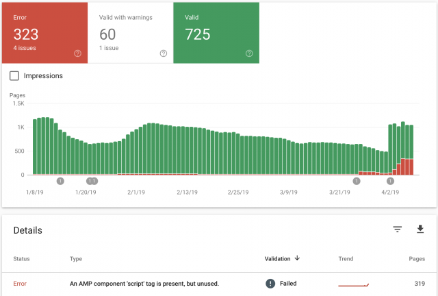
I recently updated the theme and the feature to use “mobile”, “Mobile + AMP” or “AMP” has started to create AMP errors, when previously there were none. It keeps telling me there, “An AMP component ‘script’ tag is present, but unused”. This was never an issue until after the upgrade. I had AMP Ads formatted the correct way without using the “Script” tag. As you can see from the image I attached, the errors started around March 26th, right around the time I updated. My website is GoingFor2.com. I currently have it set at “Mobile Only” because I don’t want to keep racking up errors, but I want to be able to use AMP as well. Thank you. Here is the link to the image: http://goingfor2.com/wp-content/uploads/2019/04/Screen-Shot-2019-04-08-at-10.12.43-PM.png
 haxigi
Hello. Till this new update, everything worked fine for me. Since Newspaper changed AMP plugin, my website doesn’t look like before in mobile view.
I have created static site and it work fine for desktop, but same site looks different.
It only shows: “Latest articles” and none of what i created with tdcomposer.
Why is that? My website: alilove.pl
 detoque
Hello, i am trying to set a header template, and i am having difficult to set the mobile zone background.
I am using a 480×540 image, but if i don’t clic on “use full height” i only get a small section, and if i set it, the image expands to “i don’t know what size” and cause distortion.
So the setting “full height” reffers to the height of the image o to what? cause i try with padding, and a lot of combination and i don’t have success.
Regards
 shelmes@liebertpub.com
I want to use AMP on my site, and to do that I apparently need the mobile theme activated along with the regular newspaper theme. When mobile theme is active it is asking for me to create my content twice, once for desktop and once for mobile. I don’t want this. I want one post content box that is used on both desktop and mobile, and I want my mobile pages to be served as AMP. How can I do this? It is a serious flaw if I have to have two post content sections, one for desktop and one for mobile…especially for the thousands of posts I have on my site already, we can’t go back into each one and make add in new content for the mobile editor.
 Godson
Hi, the big grid on my mobile view disappeared a couple of months ago and I can’t seem to figure out how to get it working again, if you can just guide me through it. it only shows the ‘LATEST ARTICLES’ section, you can check it out on eyewitness101.com
Thanks
 mehdiago
 hello , FYI the cause of the issue was caused by tagDiv Mobile Theme after deactivating it the mobile version worked fine .
 Casas.tech
 Hi,
In pages in code:
<h1 class="td-logo">

<span class="td-visual-hidden">Reformas Integrales Bilbao</span>
</h1>
In content:
<h1><span style="color: #2a9221;"><b><i>Estudio de arquitectos para interiores y proyectos técnicos en Bilbao</i></b></span></h1>
It’s not correct to appear two <h1> tags.
You can see for example in https://www.casas.tech/arquitectura/
In the code in the files logo-h1.php and logo-mobile-h1.php of the theme:
// H1 on logo when there's no title with H1 in page
It seems that it is not working properly.
Thanks in advance
 Jon Rice
 Hi, on the mobile theme if I click on a category, it displays the description at the top above the articles. That’s what I’m hoping to remove. Thanks!
 GurjyotSandhu
Can we set a different menu for mobile devices? Like can I have two different menus one for desktop and the other for mobile?
 Sohaib
Google’s Mobile-Friendly tool reports on of my website pages as “Not Mobile-Friendly” i run multiple tests but it gives the same error everytime.
Here’s the link: https://www.wentdiary.com/top-17-things-to-do-in-oklahoma-city/
Please resolve.
Calin Hi,
Usually when you are on desktop and you are redirect to a mobile version of your website it is a cache problem, I would suggest as a first step to clear the cache then deactivate the caching plugin temporarily. Then check if the problem is solved.
The WP Super Cache is one of the plugins that was tested with our theme and was fully suported by our theme; this is our list with tested plugins with our theme -> https://www.screencast.com/t/cmPkh9jba4sZ
Thank you for your understanding!
mehdiago hello , i did all the things you advise me to do , i ‘ m using a custom code provided by your team to fix the menu , i m facing this issue before even adding the custom code , please help this is my website please check it out through safari ( mobile and desktop )
https://tipstravelbook.com/
 bobbymc
 Ah. So I can use mobile theme only for AMP posts and the rest of the theme will look as I designed it? 🙂
 Bogdan B.
 Hello,
There should be a mobile menu even if no mobile theme is used. Please provide a link to your site so we can inspect it.
Thank you!
Calin Hi,
The News ticker on mobile will look like this -> https://www.screencast.com/t/FTF1dt14iP
Thank you!
 bdeepu
 Thanks for the reply. Currently, I am not using any logo but only text for the header, on the desktop version. I want the same text thing on mobile also. How to do that?
Rest is working ok now.
Thanks!
Bogdan B. Hello,
In the latest theme versions there is a header manager that lets you implement custom elements on the mobile and desktop menus. You can create the mobile menu implementation you need. Please read this guide: https://tagdiv.com/newspaper-theme-customize-the-header-manager/
Thank you!
 Catalin
 Hi,
I have checked your header logo and it seems that is not a PNG file, as you can see here
-> https://www.screencast.com/t/NiRhObKG and that’s the result when background is applied. Also, I do not see the blue empty box on mobile devices. Everything seems to works as expected. Also, the Latest Articles section sohuld be displayed the right posts, as you can see here -> https://www.screencast.com/t/w9zWUu1t2CCw Disable all of the untested plugins, clear all the caches and check the results.
Thank you!