
- NewspaperThe Newspaper Mobile Theme: Introduction
- NewspaperThe Mobile Theme
- NewspaperModules Builder in Newspaper Theme
- NewspaperNewspaper theme documentation
- NewsmagTheme colors introduction
- NewspaperTheme Colors Introduction
- NewspaperWhat’s Included in the Newspaper Theme Package
- ApiUsing the Theme API in plugins
- NewspaperFilters and sorting for taxonomies
- NewspaperHow to Add a Logo in Newspaper
- NewspaperBig Grid Flex Settings
- NewspaperHeader Builder
- NewspapertagDiv AMP Plugin Tutorial
- TutorialsFrom WPBakery to tagDiv Composer
- NewsmagSmart list ads
- NewspaperBest Of Forums
- NewspaperCache plugin – install and configure
- NewsmagIntroduction
- NewsmagMain menu
- NewsmagLogo & Favicon
 robert
Hi,
I’ve version 7.8 with WP Super Cache and Mobile Theme active.
Not all posts are taking the mobile theme. The posts are pretty much the same, so I don’t understand why. Here are 2 examples:
This is working ok (open in a mobile, it will display the optimized mobile layout)
https://no-tox.org/guida-miele/
This is not working (open in a mobile, it will display the desktop page, see the footer)
https://no-tox.org/riconoscere-miele-contraffatto/
Any suggestion? Thanks
 jim13736
I just lunched my news website two months ago. Great theme – both for desktop and mobile! Everything works!
My concern is that 75% of all my traffic is coming from mobile devices. My business plan was not to depend on Google Ads as my primary source of revenue, but local ad buys from small businesses in my community.
I’m facing an uphill battle to sell advertising to those local small businesses because of the limited ad inventory available on mobile.
Is there a way to expend the available inventory, such as:
1. adding a spot between the top three stories section and latest article section.
2. adding additional spots every three headlines under the latest article section.
3. adding additional spots inside articles, such as every three paragraphs.
If not, is there a way to turn off the mobile theme so all mobile traffic will see the desktop page? I have unlimited inventory on the desktop and that would be the better solution.
robertHi, I’ve customized my social urls to have only Facebook:

While on homepage the hamburger menu is ok, on the post pages it still shows the 3 social icons with # as URL:

On the mobile theme is ok. So
– Home is OK
– Mobile theme is OK
– Post Page on Desktop is WRONG
Also the footer is in sync in the hamburger, so it’s broken on the post page as well. It seems that the post page is ignoring the settings and always displaying the 3 links = “#”
I’m using version 7.8
 albertocle
 Hi,
yes i mean that logo you show me. I know that i can modify it from theme panel. But sometimes this logo is like hide in mobile version of the website. Can you help me with this? Thanks
 ParisSingapore
Hello tagDiv Team,
Thanks for the great template, I’ve been using it for a few years and I’m really happy about it. The latest updates make it even better to use. Also appreciate the tons of documentation and visual examples.
I’m currently thinking of changing my template and I was wondering if there is an option to set a maximum width for a post/page to avoid the text to be stretch on larger screen like MBP Retina (making the content difficult to read).
If I use a sidebar on a post/page there is no problem as there is already a max width set by default apparently. But if I remove the sidebar (in the option) I ended up with a very strech text.
– See example of a post with Sidebar
– See example of a page without sidebar
I know I can edit the code to set a max width directly, but I was wondering if there’s an option in the theme to do it already (so I have no worries when I update the theme). And if not it will probably be a good addition.
The main reason for me to getting rid of the sidebar is now almost 60% of my traffic is mobile and people don’t see it/use it (not to mention it will slow the the display for mobile user). Thanks for reading and have a great day!
 Catalin
 Hello floranto22,
Unfortunately, out theme does not have any such an option that allows you to translate these words only for mobile mode, sorry! If you want to translate them, you should check our Translation section from Theme panel, file this -> https://www.screencast.com/t/CKleeJDc5 For more references about this feature, please consult here -> https://forum.tagdiv.com/loading-translations/
If is not what you mean, please provide more details. Also, if you want to add some Translations only for Mobile mode, notice that you should implement it yourself or you should consider hiring a freelancer/developer to help you because we cannot provide custom services at the moment, sorry!
Thanks for your understanding!
 Simion C.
 Hi,
You can try the solution from this topic – https://forum.tagdiv.com/topic/how-to-create-a-google-custom-search-page/ for desktop, and maybe try to adapt it for the mobile theme if it is possible.
Thanks
Simion C. Hi,
Please note that when using the mobile theme plugin, this comes with predefined templates for pages, posts etc. There is only one smart list template available, and that will be displayed regardless of what is set on desktop. If you want it to display the same, just disable the plugin. You can not have only parts of the website display with the mobile theme. The theme has full responsive design for every device and will display the same content like on desktop adapted for smaller screens.
More information about the mobile theme here – https://forum.tagdiv.com/the-mobile-theme/
Thanks
Simion C. Hi,
Please try to disable all your plugins except Visual composer and the mobile theme plugin, clear any caching installed, and check again. The mobile theme is fully tested and it is working properly, maybe a plugin is interfering with it.
If you would like to make the website faster, it is recommended to use this caching plugin
– https://forum.tagdiv.com/cache-plugin-install-and-configure/ with that configuration
Also please check this available tutorial about improving page speed on your website
– https://forum.tagdiv.com/how-to-make-the-site-faster/
Thanks
Simion C. Hi,
From what I can see some of your ads are not displaying on both of the sites you provided on desktop and non mobile
– https://www.screencast.com/t/kjihczq2Wy
– https://www.screencast.com/t/hpteqV632mB
If you are not using adsense for your ads, you just have to enter the ad code in the respective section in the theme panel, and the theme will detect this and render it unmodified – https://forum.tagdiv.com/using-other-ads-non-adsense-ads/
For the mobile theme the ad codes must be entered in the mobile theme section in theme panel
– https://forum.tagdiv.com/the-mobile-theme/
Maybe the codes you are entering are not valid, or require additional implementation. If you are using a plugin for the ads maybe it is not compatible with the theme or not configured properly. Or another plugin is conflicting with the ads, so you can try disabling them all, except Visual composer, clear any caching installed, purge CDN files and check again.
Thanks
 Bogdan B.
 Hello,
This depends on whether you use the mobile theme or not. If you use the mobile theme you will not be able to have infinite loading. If you use the desktop version then on mobile you will have the same layout as on desktop so implementing infinite loading on desktop will also affect the mobile version.
Thank you!
Catalin Hello harmario,
Unfortunately, I do not exactly understand what type of menus you are referring to, sorry! Notice that our theme has only one menu for desktop and table and for mobile is the same menu but optimized for this mode. Most likely, your problem happens due to your caching plugin. Try clear all your caches, server cache and use only our recommended plugins. (especially WP Super Cache plugin) If you need more assistance in this regard and if the problem is still there, please provide your website URL and also, some useful screenshots with your problem for a better understanding.
Thanks for your message!
 sisco
siscoHI there, i want to know how is possible to integrate or Inculde AMP on newspaper Mobile theme ??
or should i use WPTOUCH if it’s compatible ?
or meaby the TagDiv Team updatet their product to AMP.!!
thanks for ur help. .-)
 floranto22
Quiero cambiar este texto que corresponde al theme mobile de Newspaper, ¿A dónde me tengo que dirigir para hacerlo, ya fui al theme panel en tranlations pero no hallé la zona?
esta es la página: http://ambitoaustral.com/
Textos a cambiar:
http://ambitoaustral.com/jpg/1.jpg
http://ambitoaustral.com/jpg/2.jpg
http://ambitoaustral.com/jpg/3.jpg
http://ambitoaustral.com/jpg/4.jpg
Gracias!
 crazydiver
Hello,
Curious but how do I integrate Google’s Custom Search into the Mobile plugin theme?
Is there any easy to follow instructions on how to do this for desktop mode too?
Thank you.
 truth
truth hi,
have you followed these instructions?
Are you using the WP Super Cache plugin?
 ritesh2190
Hello,
As the normal responsive theme is very very slow, i decided to use the mobile theme instead. But my website still shows the normal responsive theme instead of the mobile theme. I have cleared the cache and tried too,but it doesn’t help.
 fenomeno0chris
 Thank you very much for your fast and extensive response!
1) The line appears after you visit some articles and scrolling up and down. I don’t know if its just my mac, but that would be weird, since all macs are using same safari browser.
Another weird thing I noticed: If im using Google Chrome browser, the big grid at the top of the site has this great animation (image gets zoomed in), if I move the mouse cursor over one article. On safari there is no animation at all. 🙁
2) I know that your theme has a custom login build in and Im already using it, as you can see (by the way it looks awesome). My problem is, that a user gets an email notification from WordPress after he registered on my site. In this email, he gets a link to set a new password. By clicking the link he gets redirected to this unpleasant site:
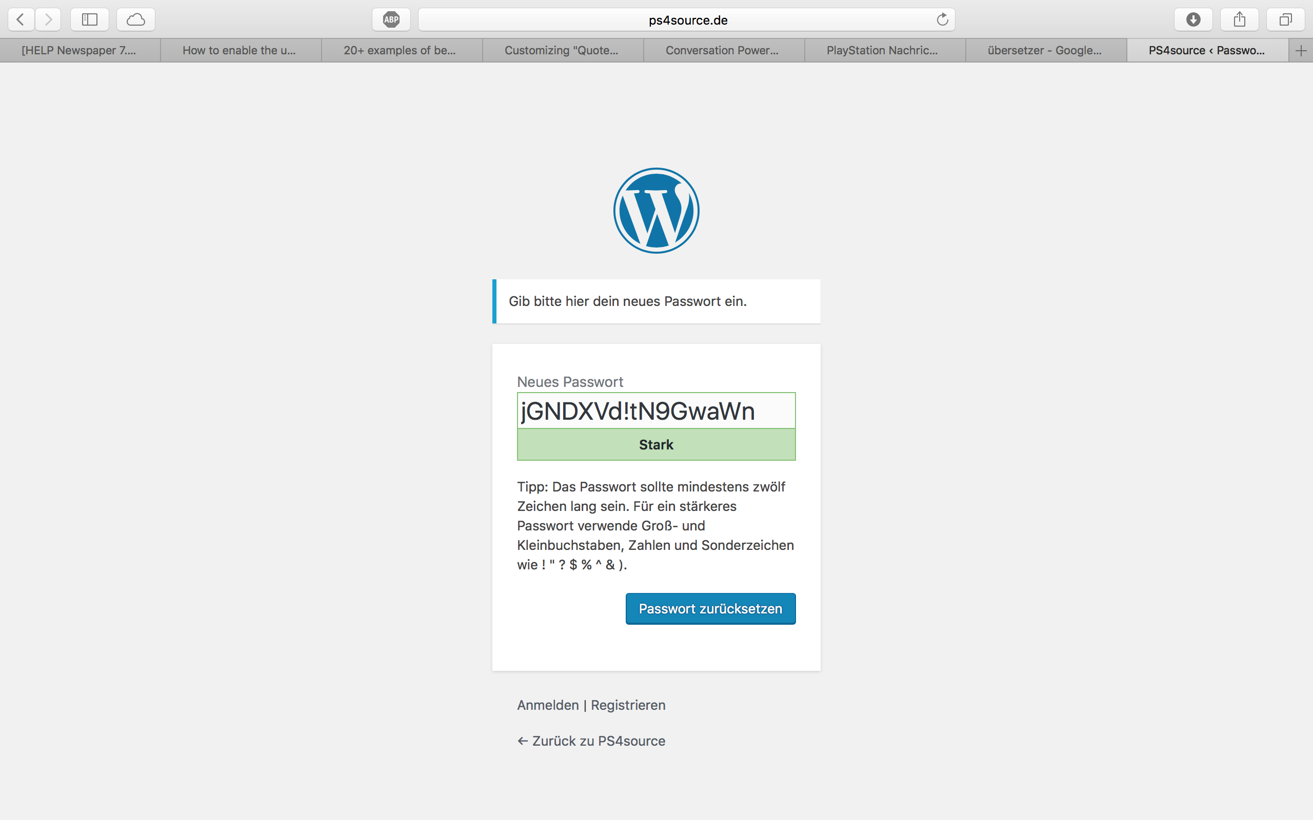
How can I change this registration process? Which plugin do you recommend?
2.1) Also Im using Disqus Comment System, as I mentioned before. Ive used my own button to let the users register without having to use a social media account. Unfortunately I don’t know the link address to open the beautiful login/registration window of newspaper7.
Right now it looks like this, which is not very beautiful:
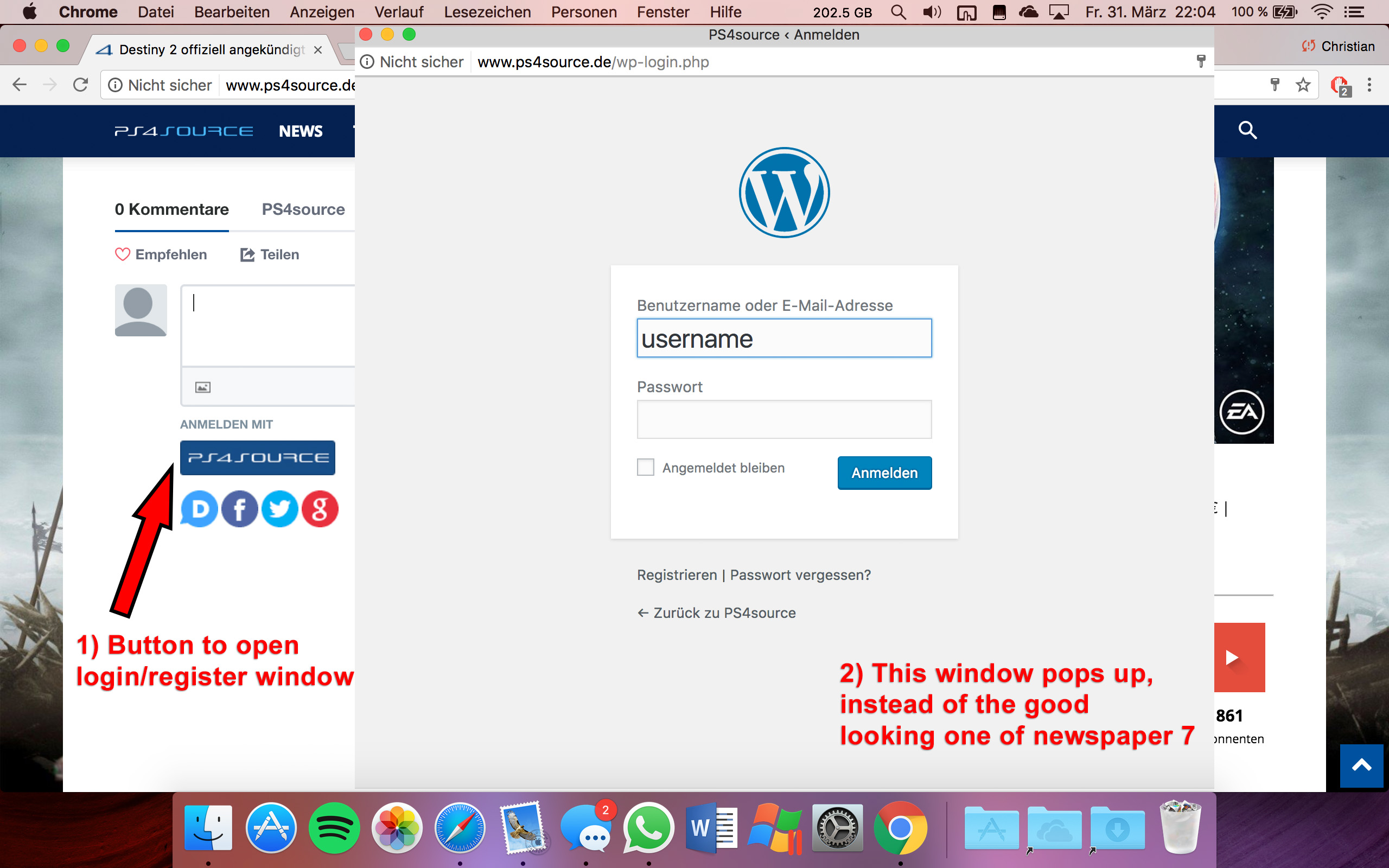
Disqus Button Code:
// Single Sign-on Integration

function dsq_sso_login() {
    global $current_site;
    $sitename = get_bloginfo('name');
    $siteurl = site_url();
    $button = get_option('disqus_sso_button');
    $sso_login_str = 'this.sso = {
          name: "' . esc_js( $sitename ) . '",
          button: "' . $button . '",
          url: "' . $siteurl . '/wp-login.php",
          logout: "' . $siteurl . '/wp-login.php?action=logout",
          width: "800",
          height: "700"
    };';
What should I enter at the url line, which is obviously responsible for the window?
3) CHECK
4) CHECK
5) Which Font do I have to use to get this vertical line on my quotes?
6,7,8) I do not know if I lost so many readers because the pagepeed has dropped or something else, but obviously I really want to get the numbers back to the state before I transferred to Newspaper7. Ive managed to increase the google pagespeed by reducing nearly all uploaded images. And I also read the Newspaper7 documentation to set the status parameters, the cache plugin and booster plugin as instructed. Unfortunately there are still some warnings, which should be solved as you can see here. Could you please help me, to get the best page speed as possible?
Should I change something on my .htaccess file?
# BEGIN WordPress
<IfModule mod_rewrite.c>
RewriteEngine On
RewriteBase /
RewriteRule ^index\.php$ - [L]
RewriteCond %{REQUEST_FILENAME} !-f
RewriteCond %{REQUEST_FILENAME} !-d
RewriteRule . /index.php [L]
</IfModule>

# END WordPress

# Deflate Compression by FileType
<IfModule mod_deflate.c>
 AddOutputFilterByType DEFLATE text/plain
 AddOutputFilterByType DEFLATE text/html
 AddOutputFilterByType DEFLATE text/xml
 AddOutputFilterByType DEFLATE text/css
 AddOutputFilterByType DEFLATE text/javascript
 AddOutputFilterByType DEFLATE application/xml
 AddOutputFilterByType DEFLATE application/xhtml+xml
 AddOutputFilterByType DEFLATE application/rss+xml
 AddOutputFilterByType DEFLATE application/atom_xml
 AddOutputFilterByType DEFLATE application/javascript
 AddOutputFilterByType DEFLATE application/x-javascript
 AddOutputFilterByType DEFLATE application/x-shockwave-flash
</IfModule>

# turns cache on for 1 month
<IfModule mod_expires.c>
ExpiresActive On
ExpiresDefault "access plus 1 week"
ExpiresByType image/jpg "access plus 1 week"
ExpiresByType image/jpeg "access plus 1 week"
ExpiresByType image/png "access plus 1 week"
ExpiresByType application/x-shockwave-flash "access plus 1 week"
</IfModule>

# gzip Compression if availiable
<IfModule mod_gzip.c>
 mod_gzip_on       Yes
 mod_gzip_dechunk  Yes
 mod_gzip_item_include file      \.(html?|txt|css|js|php|pl)$
 mod_gzip_item_include handler   ^cgi-script$
 mod_gzip_item_include mime      ^text/.*
 mod_gzip_item_include mime      ^application/x-javascript.*
 mod_gzip_item_exclude mime      ^image/.*
 mod_gzip_item_exclude rspheader ^Content-Encoding:.*gzip.*
</IfModule>

php_value memory_limit 256M
php_value max_input_vars 5000
php_value max_execution_time 300
php_value post_max_size 50M
php_value upload_max_filesize 50M
8) CHECK
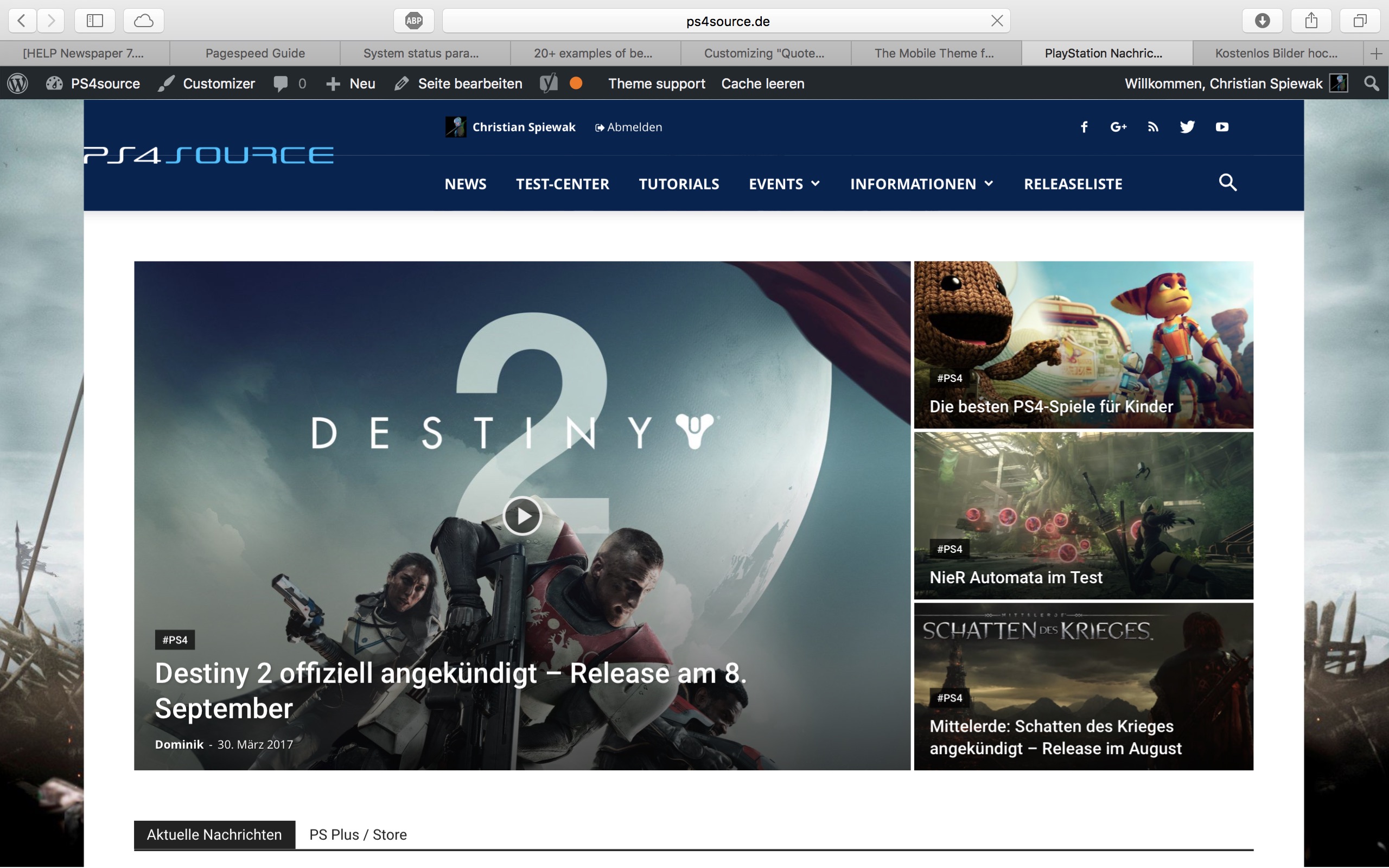
9) 
(link)
10) CHECK
11) [Newspaper->System status->php.ini configuration] I have this PHP Version 5.6.29-nmm1 (5.6 CGI). Is this ok?
-
This reply was modified 9 years by
fenomeno0chris.
 adnan
adnanHi,
i am using a plugin for upload photos form users on comments, every thing work fine but the upload button looking bad in mobile device. You can look in : https://goo.gl/A6n3dT the upload button showing in same line on PC but when user come form a mobile device the upload icon move down after the “Publish Comment” button.
I consult to Plugin author and he advise me:
It depends on the template CSS, it seems from the screenshot the button style is made full width does the button is brought to the bottom, you can consult your theme provider to see if they can advise on the post comment button on mobile.
Thanks
Simion C. Hi,
I see that maybe you resolved your problem – https://www.screencast.com/t/XBQneBWF – https://www.screencast.com/t/Fp5yLFPTtQMY
When using the mobile theme page content must be entered in the mobile editor section – https://www.screencast.com/t/b5Fsjpd1Ym
More information about the mobile theme features here – https://forum.tagdiv.com/the-mobile-theme/
Thanks
Catalin Hello dhincapie,
I have tested again your website for two different mobile devices on android and I did not saw any problem with the main menu, as you can see here -> https://www.screencast.com/t/IpgD8OJtW What kind of browser is used by your customers? Please keep in mind that the theme is fully tested with these browsers -> https://www.screencast.com/t/ngcxMpD55YOz If your users use some default browsers of their’s mobile phone, it is possible that the theme does not work as expected and that why you receive bad reports. Use the theme only on tested browsers if you want to bring best results.
Thanks for your understanding!
 Jose
JoseHello,
I have installed the latest version of the theme and plugins, all updated. I use your pluguin for mobiles.
I use the same menu for footer (in pc and mobile). In PC links of footer run ok, but in mobile not run.
¿Why?
My website: https://goo.gl/zFiz6M
When I click on link, no open the page, only show ads. Add image
https://fotos.subefotos.com/994eae9cc138f748eabfc1c8c8ed507bo.png
Can you help me?
Cheers
 keyforweb
Hi to all, we had bought some hours ago this fantastic theme and we had uploaded on our staging site for some test before upload online….
We are using last version 7.8 and we have an strange issue with menu and submenu that is not perfectly aligned..
A little question: how can i disable sidebar on mobile?
Thx a lot for help
Orlando
 Jfthai2015
 Thanks, worked wonders.
How can I implement that on the mobile theme too?
Catalin Hello alerazak,
First of all, I will thank you for your interests in our theme! Notice that our theme has 2 possibilities for using in mobile mode -> Mobile Theme or Default Mobile Responsive Mode. Which one do you want to use? For more information about Mobile Theme, please consult our guide here -> https://forum.tagdiv.com/the-mobile-theme/
Thanks for your understanding!



