
- NewspaperThe Newspaper Mobile Theme: Introduction
- NewspaperThe Mobile Theme
- NewspaperModules Builder in Newspaper Theme
- NewspaperNewspaper theme documentation
- NewsmagTheme colors introduction
- NewspaperTheme Colors Introduction
- NewspaperWhat’s Included in the Newspaper Theme Package
- ApiUsing the Theme API in plugins
- NewspaperFilters and sorting for taxonomies
- NewspaperHow to Add a Logo in Newspaper
- NewspaperBig Grid Flex Settings
- NewspaperHeader Builder
- NewspapertagDiv AMP Plugin Tutorial
- TutorialsFrom WPBakery to tagDiv Composer
- NewsmagSmart list ads
- NewspaperBest Of Forums
- NewspaperCache plugin – install and configure
- NewsmagIntroduction
- NewsmagMain menu
- NewsmagLogo & Favicon
 Bogdan B.
 Hi,
This is a simple issue to resolve. Please update your mobile theme plugin and the error will go away. Download the latest theme package from envato and install the mobile theme plugin from there.
Thank you!
 techpaced
 “I would recommend not to use any ad on above the fold for mobile devices.” – This is what I was talking about. If i display above content ad and below content the ads are shown fine on desktop but google says the ad should be after the content. Secondly on mobile they either show up as big square box or take too long space.
Why should i use any other plugin when the theme has got it’s ads system. I believe the theme author should add options to display inline ads after let’s say some number of paragraphs. Let me repeat inline ad code works fine both in desktop and mobile devices.
-
This reply was modified 9 years by
techpaced.
 renzosm
 Hi Nate, I get double that traffic. and we use redis using w3t it works fine. (our cache structure is object cache = redis, database = memcached and the rest apc. and also varnish. it safe us allot of CPU which in wordpress this is what you need when you get a traffic spike. (we also use php7)
BUT! w3t cache is not supported by the theme. We have no issues actually just the Mobile Theme we are not using because it will cause some problems.
 renzosm
I know w3t is not supported or better say being tested. Did anyone find a walk around or fix? I use w3t because I use redis, memcached and varnish as part of my cache layer and w3t makes my life easier. Anybody has a solution? I think they should start supporting this plugin. I mean its like the top 3 plugins out there 🙂
Hope I can find a solution really want to use the mobile theme
techpacedThe adsense ads are not mobile responsive when we use newspaper. Here is the thread that i posted – https://productforums.google.com/forum/?utm_medium=email&utm_source=footer#!msg/adsense/quoFGFBxI-U/hjKdi7SXCAAJ
In newspaper only inline content ad is mobile responsive. And the big limitation is we can have only one inline ad. There is no option provided by theme author to add more inline ads (after paragraph 3, 6, 8 etc). If you show the ads above and below content, the banner ads work fine in desktop view. But in mobile they take lot of extra space. Sometimes I get a big ad box in mobile if i place the banner ad above content.
@newspaper team – Can you fix this in next update ?.
techpaced Yes, even i got this message. here is the thread that i posted – https://productforums.google.com/forum/?utm_medium=email&utm_source=footer#!msg/adsense/quoFGFBxI-U/hjKdi7SXCAAJ
In newspaper only inline content ad is mobile responsive. And the big limitation is we can have only one inline ad. There is no option provided by theme author to add more inline ads (after paragraph 3, 6, 8 etc). If you show the ads above and below content, the banner ads work fine in desktop view. But in mobile they take lot of space. Sometimes I get a big ad box in mobile if i place the banner ad. I was about to raise a support ticket and I saw your question.
@newspaper team – Can you fix this in next update ?.
 insomniac79
Hi,
I am using the Newspaper theme for http://www.daydreamdistrict.com. I haven’t done any modifications, it’s the pure theme. I have now received a warning message from Google that my website does not comply to Adsense policy! If I don’t change it, they will block my account! Is the Newspaper theme not compliant to Adsense policy?? Here Google’s email:
——————————
This is a warning message to alert you that there is action required to bring your AdSense account into compliance with our AdSense program policies. We’ve provided additional details below, along with the actions to be taken on your part.
Affected website: daydreamdistrict.com
Example page where violation occurred: http://www.daydreamdistrict.com/daydream-view-vs-gear-vr/
Action required: Please make changes immediately to your site to follow AdSense program policies.
Current account status: Active
Violation explanation
Publishers may not implement Google ads in a manner that disguises the ads in any way. In order to maintain a good user experience, it is important for publishers to clearly distinguish Google ads from site content. This includes, but is not limited to: site layouts in which the ads push content below the fold on mobile devices; placing 300×250 or larger ad units above the fold on a mobile optimized site.
In order to remain fully compliant please ensure that your site and ad layout remain compliant across all devices. More information about this policy can be found in our help center and on this short video.
How to resolve:
If you received a notification in regard to page content, we request that you immediately remove Google ads from the violating pages. If you are unable to, or unsure of how to remove the ads from these pages, or would like to continue monetizing the page with Google ads, please modify or remove the violating content to meet our AdSense policies.
If you received a notification in regards to the way ads are implemented on your site, please make the necessary changes to your implementation.
You do not need to contact us if you make changes. Please be aware that if additional violations are accrued, ad serving may be disabled to the website listed above. You should immediately take time to review your pages with Google ads to ensure that they comply with our policies.
Additionally, please be aware that the URL above is just an example and that the same violations may exist on other pages of this website or other sites that you own. To reduce the likelihood of future warnings from us, we suggest that you review all your sites for compliance. Here are some useful resources you might be interested in.
AdSense policy FAQs
Using site: search to find violations
Recommended solutions for policing your content
Content filtering
For more information regarding our policy warning notifications, visit our Help Center.
We thank you in advance for your cooperation.
Sincerely,
The Google AdSense Team
——————————
I am really worried now. What should I change? Do you need to change something on the Newspaper theme?
Please get back to me ASAP!
Sincerely, Sebastian
 newdesigner8
Good morning,
I’m having problems removing a footer when someone views my website on a mobile phone. I inspected the elements with the browser and found that this is the problem <div class=”td-mobile-footer-wrap”> if i just remove it from the browser the footer goes away but im having a problem doing this from the theme. I don’t know what would actually be the code necessary to be added to the custom code section of the theme (no experience coding).
Another problem is that when I load the website from a phone the main layout of the first couple of articles changes and under the top articles this short code comes up “[td_block_big_grid3 sort=”featured”] [td_block_big_grid_5td_grid_style-6″ sort=”randomposts”].
Any help would be much appreciated I’ve been at this all morning.
 rebel.mindset91
Hi can someone help me.
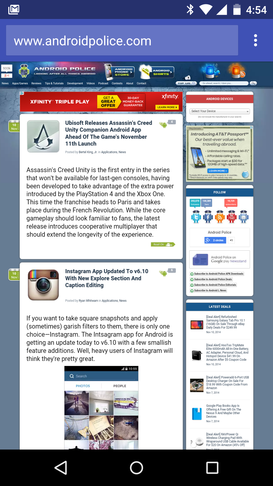
Is the tinted address bar like in the image above working for anyone in the mobile theme? It’s working in the standard newspaper theme, but not mobile.
 theleaderdotinfo
Hello –
I have set up and customised the homepage. It works fine on a desktop but I receive errors on the mobile platform (Android, Google Chrome). The errors are:
wp booster error:
td_api_base::mark_used_on_page: a component with the ID: td_remote_cache is not set.
wp booster error:
Missing parameter: ‘file’
Any ideas on how I can resolve this? The articles seem to display fine.
Best regards,
Neil.
 Catalin
 Hello NathanAripez,
Please keep in mind that the Footer for Mobile theme cannot be changed from panel and it is created by default with looks like this -> http://screencast.com/t/mHRaXkEDC If you want to make some changes to your mobile theme footer, you should edit the core file from Mobile version where the footer is created, like footer.php, like this -> http://screencast.com/t/eszLQrvK3 If you want to display more levels in our theme and if you are not aware of the steps which are needed to take in this regard, please consider hiring a freelancer/developer to help you because we cannot provide custom work at the moment, sorry!
Thanks for the message!
Catalin Hello arisdla,
Please keep in mind that our theme has 2 possibilities regarding on mobile mode, like as -> General Responsive Mobile Mode and Mobile Theme. So, if you want to have different menu on mobile version you should use the Mobile Theme plugin -> https://forum.tagdiv.com/the-mobile-theme/ because this allows you a way to change the menu on mobile, like this -> http://screencast.com/t/NzopIdglTuE5 Please notice that the footer will be the only one for entire website because the theme does not have any such an option that offers you a way to change it for mobile mode, sorry!
If you want to display more levels in our theme and if you are not aware of the steps which are needed to take in this regard, please consider hiring a freelancer/developer to help you because we cannot provide custom work at the moment, sorry!
Thanks for the message!
 Dimitron
 Hi,
I checked again (I checked before writing here), and there’s no logo added anywhere whatsoever.
This code and
.td-mobile-footer-wrap{
display:none!important;
}
.td-mobile-footer-wrap .td-footer-description{
display:none!important;
}
and this, neither of them worked.
I just want to remove the amilucid.com and about us part. I tweaked every setting in the theme panel, otherwise I would not write, as I respect other people’s time.
Thank you.
 NathanAripez
 How do I get the mobile theme to update? I have made changes to the footer at the link you provided and it looks fine on the desktop but nothing changes on the mobile version.
Catalin Hello NathanAripez,
Unfortunately, our theme does not have any such an option that allows you a way to make some modifications and customizations to your footer on mobile theme, sorry! All the available settings for footer section can be found here -> http://screencast.com/t/HQ7rDz3IZrb
If you want to display more levels in our theme and if you are not aware of the steps which are needed to take in this regard, please consider hiring a freelancer/developer to help you because we cannot provide custom work at the moment, sorry!
Thanks for the message!
 javid
javid thanks i fix my problem with
#td-mobile-nav {
display: none;
}
but you most support rtl user
because we love your theme
and this is good for your theme
good luck
 arisdla
I love Newspaper Theme, it’s really simple and nice.
The mobile menu use the main menu.
however I want to use another menu for mobile for better experience.
like different menu items, and how can i customise the mobile menu to add some html codes before and after the menu section in mobile menu? I would like to add a logo and some text before the menu items section and add a footer for the mobile menu.
Thx
 lethow
 I had checked under theme fonts>> fonts settings and line height is default line height in all settings.
Moreover, you can see search icon is also not on its location on desktop as well…it is a line above its position….this is the same in mobile menu and search icon and 1 line above…
-
This reply was modified 9 years by
lethow. Reason: more details
NathanAripezI am working on my site and the footer on the desktop version is easy to change but none of the changes I am applying are happening on the mobile version. I loaded the logo and on the mobile version is still shows the demo version. How can i change the information on the mobile version. The website is http://www.temeculabeat.com
Thanks
Bogdan B. Hello,
Please provide an example of a non rtl and non-customized site that has the mobile theme menu appear on the front-end without any custom rtl.css. (I’m not sure where the rtl.css comes from. If it;s a plugin, there is no rtl plugin tested with our theme.)
If the problem only originated when moving online, you might check your host to see what issue can show up when moving to an online environment, any caching on the server, any firewall…etc.
If you can provide an example with a default site without customization providing any problems such as you describe, we will gladly look into it via contact@tagdiv.com.
Thank you!
Bogdan B
Bogdan B. Hello,
Sorry but our theme has no RTL options and altering the css to work in TL mode will provide this issue as the mobile menu is hidden outside of the view but if the layout is altered it will show up as it does on your site. Please ask a developer to help in altering the theme code. Our theme does not have RTL support and it has to be implemented properly at a development stage. There is no easy solution we can provide for RTL. If you cannot use our theme without RTL support we will be able to provide a refund if you make a request on envato.
Sorry for the inconvenience.
lethow Website is lethow.com
I tried disable all plugins, cleared cache and reset cdn files. PLease advice how to restore the theme line height?
Also, please see the following custom code is in mobile theme…
.td-post-author-name div { display:inline; }
.error404 .td-a-rec-id-header_mob, .page .td-a-rec-id-header_mob {
display:none;
}
@media(max-width:767px){
.td-author-line{
display:none!important;
}}
@media(max-width:767px){
.td-mobile-footer-wrap{
display:none!important;
}}
And Below is the custom code in Desktop Theme…
.td-author-line{
display:none!important;
}
.error404 .td-g-rec, .page .td-g-rec {
display:none;
}
 andalucian
 Hi,
Excuse me Bogdan but im not in total agreement with ur diagnostic.
1. The issue of the mobile menu on the left of the page is present in another site (ltr) i made based on ur theme.
2. In my localhost everything is fine with the VC. The problem began to appear when i hosted my work online.
The only modification i did is adding an rtl.css file. I didnt modify the core of the plugin at all.
3. I can give u the access to the backend if u give me where to send it privately to u
Bogdan B. Hello,
Sorry you feel this way about our support. Here are couple of solutions I can provide:
1. load the translation in the wordpress translations settings first and your translations should load automatically for spanish so you will not need to load spanish in the theme panel. http://screencast.com/t/Q6hUAo1F4
2. Use this topic as I has to search for your website in other topics (as you did not provide it here) and saw that you use https.
https://forum.tagdiv.com/topic/mobile-plugin-doesnt-translate-to-spanish/
If you want professional help, please be a professional yourself and do not make accusations and not provide all the circumstances of the issue you are facing.
Thank you!
Bogdan B. Hi,
The mobile.jpg image that you have troble with is not part of our theme: http://screencast.com/t/S3waApplX It might be a mobile logo you added maybe…
Thank you!
