- NewspaperThe Newspaper Mobile Theme: Introduction
- NewspaperThe Mobile Theme
- NewspaperModules Builder in Newspaper Theme
- NewspaperFilters and sorting for taxonomies
- NewspaperHow to Add a Logo in Newspaper
- NewspaperBig Grid Flex Settings
- NewspaperHeader Builder
- NewspapertagDiv AMP Plugin Tutorial
- TutorialsFrom WPBakery to tagDiv Composer
- NewsmagSmart list ads
- NewspaperNewspaper theme documentation
- NewspaperBest Of Forums
- NewspaperCache plugin – install and configure
- NewsmagIntroduction
- NewsmagMain menu
- NewsmagLogo & Favicon
- NewsmagHeader ads
- NewsmagSmart sidebar
- NewsmagSharing buttons
- NewsmagCategory tag on modules/blocks
 Karan Gandhi
Hey Team
My site http://www.baqqit.com is currently running newspaper 8 and I am facing an issue in the theme. My desktop site is automatically converted to mobile theme. I had installed the mobile plugin and I am ok with the mobile site becoming more responsive but why does my desktop site also change?
 pixelar
Hello,
The top bar has esencial links that disappear on the mobile version, How can I add those link on the mobile menu?
https://www.diarioenergetico.com.mx
Thank you for the support
 aglasem
I want to put a “Install Icon” in main menu (mobile) just left to search icon.
Please suggest how to do it.
 LegendToBe
 Hi Bogdan,
We managed to get the mobile theme issue resolved, but the second issue is continually occurring.
It’s not just me either, all the users on our website have the same problem. Please provide some more detailed advice on this. It’s irritating many of our users.
Open an incognito window and go to this page: https://flixed.io/best-news-channels-roku/
Refresh it 2-3 times and you will see it come up.
-
This reply was modified 8 years by
LegendToBe.
 andrewm
 Ok, I found that and have selected ‘hide title’
https://i.imgur.com/NpGmnED.png
Yet as you can see, on our mobile home page the text ‘Latest Articles’ still appears
 nute
nuteHi all
I created the top menu, this is visible in the desktop version but is no longer visible in the mobile version?
How is it possible ?
 Simion C.
 Hi,
From what I can see the iframes are not displaying properly on desktop as well, they are not using the full width available in the post content
– https://www.screencast.com/t/TXLOlNr8p
The iframes have fixed width value. A better solution would be to make them use all the space in desktop, while solving the mobile issue as well. Like this
– https://www.screencast.com/t/O5HCwLLGk
– https://www.screencast.com/t/Il1C2GG4
This is the code used, enter it in Theme panel->Custom CSS
.td-post-content iframe {

width:100%;

}
Please let us know if you need further help, or the solution is not working properly.
Thanks
 benh_82
 OK guys, i reverted back to the previous version of the theme as the latest one was kind of breaking the website.
Im going to leave on this version now i think.
I do need help resolving the purple mobile menu background showing in between navigating the website though please.
https://news.lovepattayathailand.com
Move off the homepage to another and you see the mobile menu background flashes before the page is loaded.
THanks
benh_82Hi,
Yesterday i noticed that the website had developed an issue. The problem was that when navigating between pages on the website there was a flash of the mobile menu background before the page would load. So before the pages load theres a quick flash of the purple background used on mobile menu.
I decided to look in my envato account to check on theme updates. I saw that i was on version 7.7 so needed to update my theme.
Since updating the the latest version of the theme my website layout has broken.
Now the website homepage has changed to full width. Now there is also something called TD composer in place of visual composer tab on the homepage.
The website also seems much slower to load now. https://news.lovepattayathailand.com
Anyway,if possible i would like to re-install the previous version of the theme and go back to how it was before.
Or id like some support in fixing the mess my update has caused please.
Thanks
 mally
mallyPLEASE HELP!
I have the Newspaper theme and as of recently, my mobile function is not working the way it used to. I have the dark theme selected and on mobile it shows something completely different. The theme is white and only shows just one category and not my whole homepage. And my menu bar displays nothing.
However, on desktop, everything functions the way it’s supposed to. Please help!!!
 virgboggie
 I have done the above, but the UA code is still appearing at the top of the website homepage in my Safari browser. What is weird is that it is an old UA code that is appearing. I replaced this with a new one yesterday, and the old one is still showing. It doesn’t appear on the homepage in any other browser, or on the mobile site. Thanks.
 Liverdades
Good afternoon. My name is Ruben and I am the web site manager http://liverdades.com which uses newspaper.
The reason for writing you is because I have a small problem. I don’t know if you can help me. When inserting the internal links at the end of the articles, in the mobile version they do not become responsive. It appears cuted and don’t fit the screen width.
I don’t know how to make internal links appear as responsive when uploading articles in mobile version. You can check it from any mobile device by loading any page.
Thank you very much for your attention and a cordial greeting
Simion C. Hi,
1. Please note that the theme width overall cannot be changed. It should not be attempted by custom code. The theme has a fixed width, and all the elements used are dependent on this fact. Modifying the width will most likely break the website. There are precise values used that will not display properly under different circumstances.
On pages you can stretch rows to full width, using the composer. Header and footer elements can be stretched in the theme panel. But a general setting for width is not available.
2. You could adjust the line height for the header menu
– https://www.screencast.com/t/ki24ggk4sU
Increasing the line height value will affect the header menu height.
3. The search icon is a font, it could be increased with some CSS
– https://www.screencast.com/t/WobUXDutVP4
Hamburger menu icon as well
– https://www.screencast.com/t/hOC404fGB
This is the code used in the example, adjust it as you like
.header-search-wrap .td-icon-search {

font-size: 50px;

}

#td-top-mobile-toggle i {

font-size: 50px;

}
The Travel blog demo uses a different header style, so the code will not work. Either change the header style to 6, or modify the header style in the code. Might need to adapt more of the code as well.
When you uninstall the demo, this will remove all the demo settings. The theme panel will be reset. The theme has an option to export/import theme panel settings
– https://forum.tagdiv.com/import-export-theme-settings/
That should be the only case that the theme panel is affected.
Thanks
Simion C. Hi,
The only option would be with CSS, the footer content will be displayed on the whole website regardless of desktop or mobile. You could use the mobile theme plugin, as this uses other files. Then make modifications in the mobile theme footer file
– https://www.screencast.com/t/pIP93JWZPwf
Thanks
 DigitalConsulting
Hi, hope you can help!
Since earlier in the week (October 12th), our Home Page keeps showing the same version, despite the daily news updates.
All the other section and article pages will show current, and sometimes if we go from a current page to the Home Page it will present the current version. But then later it reverts back to the Oct 12 version.
We’ve cleared our browser cache, used incognito, installed an entirely new browser (Opera), and regularly are seeing the Home Page cached form Oct 12.
On Firefox it seems okay, and on mobile iPhone Safari it will show the current site (although delayed an hour or so), but desktop Safari is the always showing the old Oct 12 version.
Chrome is intermittent depending on what we are doing for new Post publishing, so if we make a change to the Home page color scheme for example it will show, but only 30 minutes or so.
We’ve installed and uninstalled WP Super Cache several times in the last week, deleting all files. Currently there is no cache plug in on the site.
We’ve called our hosting company GoDaddy 3-4 times, they insist our shared hosting environment has no server-side caching.
When we add /?nocache=1 to the web address it will show the current Home Page from today. But clicking back to the Home Page serves up the old Oct 12 version.
We have a Dev version of the site in a sub directory and that testing seems to show it serves the current page.
Our thought is maybe there is something in the route directory that was reverted/changed (we’ve had a lot of problems in the last couple months) to no Cache Control as intended, but not sure how to fix that.
Any suggestions, can someone help us solve this?
 MTUK
MTUK The issue is not RSS feeds, as the embeds are appearing fine on desktop/mobile. It’s when converting to facebook instant articles that there is a problem, even when using the correct embed tag/codes, for ex:
<figure class=”op-interactive”>
<iframe>
<!– Include Twitter embed code here.
</iframe>
</figure>

 hmtuan
Dear,
Please help me,
I need to completely remove Footer Info in Mobile. I don’t want to just hide it by CSS.
Can I remove it by functions.php? Or any other ways to do this?
Hope to hear from you soon,
Best regards,
Tuan
Simion C. Hi,
It should display on all devices. For me the ad is displayed on desktop and on mobile devices
– https://www.screencast.com/t/ld1ga8EGF8k
– https://www.screencast.com/t/sjVbgDdvTW
Try testing on a different browser or device. The would be no reason to not display the ad.
Thanks
virgboggieMy Google Analytics UA code is appearing on the top of my public mobile site. How do I get rid of this? I have actually changed the UA code, but the old one is still appearing on phones. I have cleared all the history and caches on my phone. It is also appearing on another phone I tested this on. How do I get rid of it?
 brookz
Hi
I noticed my wordpress site is reloading the old template theme I had before I uploaded the newspaper theme? Why does it load the old theme on some pages? in particular on the mobile verision.
thanks
 blueyellowfish
Hi,
I am experiencing some issues with the mobile logo, it is the right size, but it shows like it cannot load properly on the homepage. It works just fine when I open some articles, but not on homepage.
To be more specific: it appears a square with an X on it.
This is the website: http://www.coho.ro
Thanks, awesome theme!
 Rafael Fernandez
 Hi,
It does not work, maybe I’m not putting it where it should go
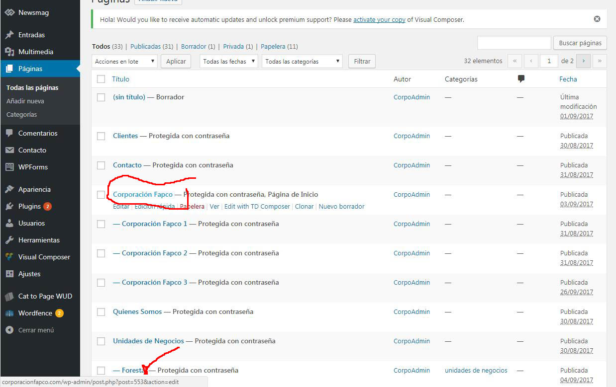
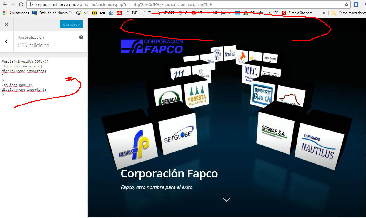
This is another code, but hide the menu on all pages and I just need it to be on the landing page and I’m learning as fast as I can.
thank you very much for your help,
regards
@media(min-width:767px){
.td-header-main-menu{
display:none!important;
}
}
.td-icon-mobile{
display:none!important;
}
http://corporacionfapco.com/wp-content/uploads/2017/10/Clip0001-1.jpg”
http://corporacionfapco.com/wp-content/uploads/2017/10/Clip0002-1.jpg
http://corporacionfapco.com/wp-content/uploads/2017/10/Clip0003-1.jpg
andrewmHi, thanks for the theme, it’s great. We’ve just implemented the mobile theme and love the options, especially re: advertising.
One small question: On our home page the latest articles are displayed under the header text ‘Latest Articles’. How can we remove that text?
Thanks 😉
 Catalin
 Hello bingdc,
Please check the Theme panel settings for adding the right logo for mobile devices.
Thanks for the message!
Simion C. Hi,
You could do it for specific pages, using the unique page IDs. For example this code will remove the menu on desktop and mobile, just for a specific page
– https://www.screencast.com/t/X7Syqm1juG
– https://www.screencast.com/t/KFeQeTPIf
.page-id-2906 .td-header-menu-wrap-full {

display: none;

}
Thanks