
- NewspaperThe Newspaper Mobile Theme: Introduction
- NewspaperThe Mobile Theme
- NewspaperModules Builder in Newspaper Theme
- NewspaperFilters and sorting for taxonomies
- NewspaperHow to Add a Logo in Newspaper
- NewspaperBig Grid Flex Settings
- NewspaperHeader Builder
- NewspapertagDiv AMP Plugin Tutorial
- NewspaperNewspaper theme documentation
- NewspaperBest Of Forums
- NewspaperCache plugin – install and configure
- NewspaperFont Customization
- NewspaperTheme Colors Introduction
- NewspaperBackground Introduction
- NewspaperHeader ads
- NewspaperPost template ads
- NewspaperCustom ad spots
- NewspaperMain Menu
- NewspaperHow to Install Newspaper via FTP
- NewspaperHow to Install Newspaper via WordPress
 Bettina
 Hello @jose405 !
Do you use the mobile theme or AMP? Please uninstall them and try again.
Thank you!
 College Info Nepal
 In the screenshot, the table size is fixed, when the table becomes larger, create the slider.
https://app.screencast.com/zAPqY00iQrv75
Things become worse when we view the website from mobile.
https://app.screencast.com/R4bkKKSI4O7KC
Bettina Bettina  usc-shift
Hi, I’m trying to make a multi-language site using polylang. I have a problem with the menu in the mobile theme. Since I can assign only one menu in the theme panel -> mobile. And for the standard menu, polylang provides an option to create a separate menu for each language/location pair. How can I solve this problem (can be code or plugin or something useful to fix this). Thanks
 djalejo
I have a Custom Post Type with a custom template which works fine.
I added a second template and change it to “Mobile”, also selected the option “Copy content”.
So now I have two templates for my CPT, the original one and the mobile version with a few mods.
I would expect to see the mobile template when using my phone, by I still see the original template (desktop).
What am I missing?
 jose405
myfeelingsarevalid.com
1. SSL is not working on mobile devices. Site shows secure on desktop, but shows as not secure in all mobile devices.
2. When I make a change on the website, that change does not apply on mobile. Why not?
Please help
 drniazi
Hello!
I have a problem executing an html code for a button. I use one script for tidio plugin, which place after the footer (in theme panel/JS-Analytics. I have an html code that should run after a button is clicked. When I use html code for the button in the normal wp builder – I have no problem. If I use the tagdiv composer button and put a class, it only works on desktop version. On mobile version it doesn’t work while the code in normal wp builder works on both desktop and mobile version. The code is the same for button.
Do you have any idea about this problem?
 nitin sethi
Hi,
I have noticed that whenever I have enabled CSS Combine to Generate UCSS, the layout breaks (atleast the mobile home page) [https://ibb.co/RpJwRgn]. When I disable CSS Combine (Generate UCSS still ON, which is of no use without CSS Combine) the layout is back to normal.
I have written to litespeed support too
Report number: WDFUHCKF
Kindly guide.
 wowa1986
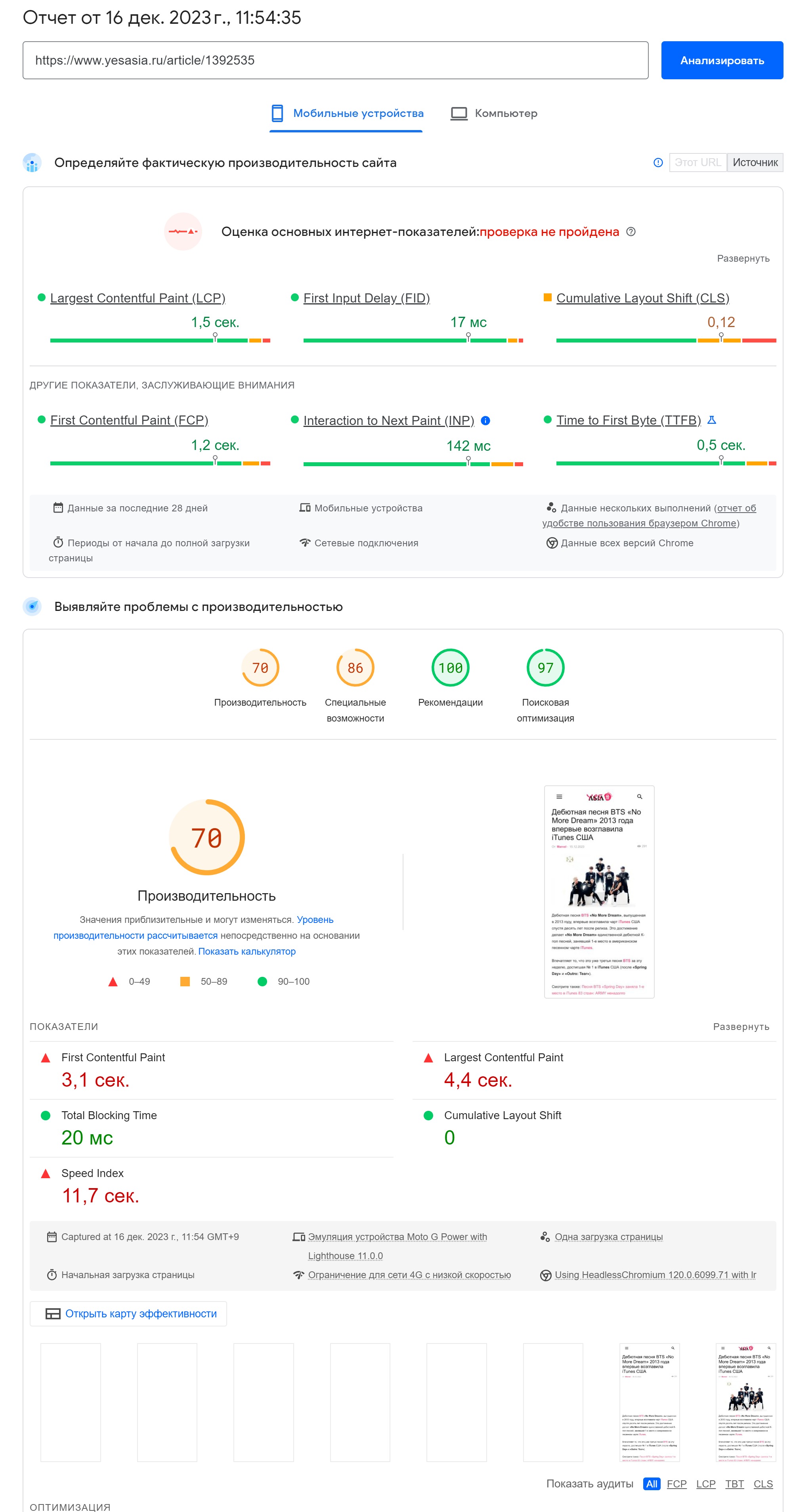
Already for over 1.5 months, our website has been showing a CLS error in https://search.google.com/search-console. We are using the TagDiv Mobile plugin. This is despite the fact that https://pagespeed.web.dev/ shows CLS results = 0. Why is this happening and how can it be fixed?

 Beldar
 Hello, I have the same problem:
The mobile version (with the Mobile Plugin) is detected by Google Pagespeed as showing images at a much larger size than they should be. screenshot
I have thumbnails enabled at 265×198 and 741×486, in the WordPress Media settings I have the large size set to 741 max, but they are still displayed at a larger size than they should be.
Any solution?
Bettina Hello!
Did you solve the issue with the logo?
You can modify the width and height of every element in the CSS tab, use padding or increase the line height for that font.
Also, I can see that these sections are in the desktop version and not in the mobile version.
Thank you!
 Calin
Calin Hi,
Please make sure that the mobile theme plugin and amp plugin are not installed, because those will change the mobile layout.
For further assistance please provide a link to the website.
Thank you!
 Alex
AlexHi,
In VERSION: 12.6.3
Option to stop zones render on mobiles for Header Menu and Header Menu Sticky
On Mobile: When mobile device is turned horizontally – header is not showing.
Option to stop zones render on desktop for Mobile Menu and Mobile Menu Sticky;
On desktop: When screen is narrowed to approx mobile device size header is not showing.
Is this an expected behaviour?
 Raj Kumari
 Please check my link:
https://prnt.sc/j3CDek8JfAho
For mobile “Tap targets are not sized appropriately 75% appropriately sized tap targets”
I have highlight this link on above link so please check it.
I checked this issue by this link:
https://pagespeed.web.dev/analysis/https-www-iacquireexpert-com/fhqk73yw6n?form_factor=mobile
 libertylens
 Hi Bettina,
It looks like I modified either the template or the header, but I’m not sure how I did that, and I can’t see where to resolve it.
There is a space at the bottom of the header with an image of a mountain. I would like to remove that space. Incidentally, it is only affecting the desktop view (not mobile) which leads me to believe it is a template.
Thank you!
-
This reply was modified 2 years by
libertylens.
-
This reply was modified 2 years by
 sanjid310
When I installed this thim it’s demo perfectly placed for desktop version. When I visit by mobile then broken the theme structure. What’s the issue here?
please solved my problem.
Bettina Hello @cborgers!
Unfortunately, no. The other blocks will come one after another on mobile.
Thank you!
Bettina Hello @jguillen !
Please edit the homepage with the TagDiv Composer and add the elements you need there in order to display some information on the page. Documentation here: https://forum.tagdiv.com/homepage-how-to-build-and-set-it/
I can see that you use the mobile theme plugin.
We have 3 options for mobile versions that you can use:
1. Responsive version: A responsive version of your website looks similar to the desktop version. TagDiv Composer is used to edit the page.Click on the mobile viewport: https://www.screencast.com/t/XDQJedlggSB. There, you can see your mobile version and edit or adjust the elements to look better.
2. Mobile pages: https://tagdiv.com/newspaper-10-3-7-update-brings-customizable-and-fast-mobile-pages
3. Mobile theme plugin: The Mobile Theme is a performance-optimized theme included in the main Newspaper theme that only loads on mobile devices. It comes with its own templates and designs for pages, posts, categories, etc., so your current templates from the desktop theme will get converted to the mobile theme layout. Please see https://forum.tagdiv.com/the-mobile-theme/ and https://forum.tagdiv.com/mobile-theme-introduction/ for more information.
A full explanation is here: https://www.youtube.com/watch?v=SpGkOnJeNZY
If you need to use mobile version 1 or 2, then you need to uninstall the Mobile Theme plugin and AMP.
Thank you!
Bettina Hello!
Please delete the logo you’ve added in the theme panel and let only the logo added in the tagdiv Composer. Click on the mobile viewport: https://www.screencast.com/t/XDQJedlggSB. There, you can see your mobile version and edit or adjust the elements to look better. Click on the logo and check the settings.
Thank you!
 cborgers
Hi,
Is there a way to do a horizontal slider on mobile similar to the “Big grid flex 2” but without the big top picture?

Thanks!
 jguillen
Hello,
I discovered today that the website is not loading, it is empty on desktop and some problems loading on mobile.
The website is http://www.gogreen.com.do
Raj Kumari I checked the website on this tool: https://pagespeed.web.dev/analysis/https-www-iacquireexpert-com/02ez25zyu6?form_factor=mobile
and found that mobile showing two logo.
I want to remove this logo which I have highlight in screenshot so please check this link:
https://prnt.sc/TfUwgGWr8FsE
Bettina Hello!
The social icons from the mobile menu are coming from the Theme Panel -> Social/Apis -> Social Networks -> https://i.imgur.com/kKYIECB.png remove/edit them after your needs.
Here you can remove/set a picture for mobile menu background: https://www.screencast.com/t/x3Xrln2b88x
And the background color here: https://www.screencast.com/t/PbU3hQpDqHh
Or you can delete that element and create a fully customizable page there using the modal popup: https://forum.tagdiv.com/modal-popup/
Thank you!
 Jay2K973
 Nope, it hides ALL the grids, even my text below.
The only way I found to show my homepage properly is to deactivate the mobile plugin.
But now I have a chicken picture in the background of my mobile menu. How can I remove/change it ?

Also, how can I edit/remove the social icons in the same menu ?
Thanks in advance.

