
- NewspaperThe Newspaper Mobile Theme: Introduction
- NewspaperThe Mobile Theme
- NewspaperModules Builder in Newspaper Theme
- NewspaperFilters and sorting for taxonomies
- NewspaperHow to Add a Logo in Newspaper
- NewspaperBig Grid Flex Settings
- NewspaperHeader Builder
- NewspapertagDiv AMP Plugin Tutorial
- NewspaperNewspaper theme documentation
- NewspaperBest Of Forums
- NewspaperCache plugin – install and configure
- NewspaperFont Customization
- NewspaperTheme Colors Introduction
- NewspaperBackground Introduction
- NewspaperHeader ads
- NewspaperPost template ads
- NewspaperCustom ad spots
- NewspaperMain Menu
- NewspaperHow to Install Newspaper via FTP
- NewspaperHow to Install Newspaper via WordPress
 coerrace
 This is not issue to enter the site. I forgot in previous message attach the photo links:
https://freeimage.host/i/3JRFj5v
https://freeimage.host/i/3JRFWga
https://freeimage.host/i/3JRFEs1
Check how the ‘ad column is shown always on top in mobile. And the ‘MOST POPULAR’ is not shown in the mobile version. For first problem I try to send the ad column to section below where I mark FINAL in the other photo if I select the icon for mobile and I do a copy and paste of the elements will work, but it also move in to desktop versions. For the desktop versions I don’t want to do anything just mobile in specific.
I say you this demo page because I have other pages I’m creating but I have that problems, then I just want to know only if you can indicate me with photos where to click to move:
1.-How you make visible that columns of the ‘MOST POPULAR’ in mobile? Is not showman. You say is hidden, I don’t know how you can hide an inner column in mobile in specific. Check your demo in that link the column ‘MOST POPULAR’ is not seen why? How you activate?
2.-How you move that two columns below where I mark with my arrow that says FINAL? I tried to click and reorder and if I reorder it works but it destroys the Desktop versions.
 Bettina
 Hello!
You can use and modify the demo as you like. If there is no section on mobile, please add it on your end and ensure the block is not hidden. Also, the demo has CSS code there. Please check it on your mobile viewport. If you can provide screenshots, I can help you efficiently. Also, you can contact us via email at contact@tagdiv.com and provide wp-admin (URL and credentials). So I can log in and help you as soon as possible.
Thank you!
Bettina Hello!
1. A responsive version of your website looks similar to the desktop version. TagDiv Composer is used to edit the page. Click on the mobile viewport: https://www.screencast.com/t/XDQJedlggSB. You can see your mobile version there and edit or adjust the elements to look better. Make sure you set the row/inner row to display horizontally like this: https://app.screencast.com/pP2VLHMKvhRCq, and you can set up the flex block to display in 1 column on mobile: https://app.screencast.com/6anFiiOrILAVV
2. You should edit the article with the tagDiv Composer and use the shortcode Single Post Subtitle. Or if you mean the caption of the featured image, then there are some settings if you use this shortcode: https://app.screencast.com/kJkfArS2iurHs
More documentation about the cloud templates is here:
– https://forum.tagdiv.com/cloud-library-templates/
– https://forum.tagdiv.com/design-post-pages-using-cloud-library-templates/
– https://forum.tagdiv.com/cloud-library-category-templates/
About pages here: https://forum.tagdiv.com/page-templates-2/ -> https://forum.tagdiv.com/homepage-how-to-build-and-set-it/
Check out this video about how to create a website from scratch: https://www.youtube.com/watch?v=SoGQ0d5kIBg
Thank you!
Bettina Hello!
You need to edit and customize the pages and your header with the tagdiv Composer: https://forum.tagdiv.com/main-menu/
A responsive version of your website looks similar to the desktop version. TagDiv Composer is used to edit the page. Click on the mobile viewport: https://www.screencast.com/t/XDQJedlggSB. You can see your mobile version there and edit or adjust the elements to look better.
More documentation about the cloud templates is here:
– https://forum.tagdiv.com/cloud-library-templates/
– https://forum.tagdiv.com/design-post-pages-using-cloud-library-templates/
– https://forum.tagdiv.com/cloud-library-category-templates/
About pages here: https://forum.tagdiv.com/page-templates-2/ -> https://forum.tagdiv.com/homepage-how-to-build-and-set-it/
Check out this video about how to create a website from scratch: https://www.youtube.com/watch?v=SoGQ0d5kIBg
Thank you!
Bettina Hello!
You need to edit and customize the pages and your header with the tagdiv Composer: https://forum.tagdiv.com/main-menu/
A responsive version of your website looks similar to the desktop version. TagDiv Composer is used to edit the page. Click on the mobile viewport: https://www.screencast.com/t/XDQJedlggSB. You can see your mobile version there and edit or adjust the elements to look better.
More documentation about the cloud templates is here:
– https://forum.tagdiv.com/cloud-library-templates/
– https://forum.tagdiv.com/design-post-pages-using-cloud-library-templates/
– https://forum.tagdiv.com/cloud-library-category-templates/
About pages here: https://forum.tagdiv.com/page-templates-2/ -> https://forum.tagdiv.com/homepage-how-to-build-and-set-it/
Check out this video about how to create a website from scratch: https://www.youtube.com/watch?v=SoGQ0d5kIBg
Thank you!
coerrace I want to add that in this demo:
https://demo.tagdiv.com/newspaper_aramis_pro/category/style/
How you send that 2 columns of my arrows in mobile to the section where says final.
For example, in all desktop versions and tablets is ok display as it is your demo but in mobile how you do this:
1.-As I said just in mobile phone how you send that 2 columns to where I marke in the photo that says FINAL with my arrow. Is below the other content of main category. By any reason I made all I see and I couldn’t send without destroy the desktop versions. Desktop versions are clear.
2.-Another issue, why is not displayed in mobile from that 2 columns of my arrows the section ‘MOST POPULAR’ and how you enable to see in mobile? Just in mobile is the problem. I see in all desktop versions or tablets.
 inkslinger
 Hi, I deactivated WP Super Cache. I have cloudflare. I purged everything from Cloudflare as well.
The Desktop version loads fine.
The Mobile Plugin version loads a really old 2022 version.
Is there a Mobile Plugin Cache someplace?
 Greg
Greg I appreciate your response. However, I have already disabled the plugin and even deleted it completely. I followed the steps exactly as shown in the YouTube tutorial, cleared the cache multiple times, yet I am still seeing the old version from the TagDiv Compressor mobile version.
I am getting really frustrated because this issue is preventing me from making progress, and I spent 7 hours last night trying to fix it without any success.
How can I completely disable the TagDiv Compressor mobile version? I need a definitive solution to remove it entirely. Your support on this matter would be greatly appreciated.
Best regards,
Greg
 stemalo
I’m almost ready with my new website (new design of a already existing, also with your theme) but there are some little things making me crazy, I’m not able to resolve it by myself.
1. Please have a look at the last FlexBlock1 before footer. And take a look on mobile view. Something wrong there, the block shows two small columns, instead one article after another in one column.
2. Where can I change CSS settings of subtitle, like font, color and so on.
Did fill in at theme panel some additional CSS, but didn’t take effect.
Domain: http://www.2024.gartenwoche.ch
 Tony
Tony
Trying to figure out why I get the default template header when loading up the site on a mobile phone. I have turned off all the mobile options, and even the footer seems to display properly.
What I have done to this point…
In THEME PANEL under Header>Mobile Header, I have changed the Logo Mobile/Retina Logo Mobile to the Yin/Yang design.
In THEME PANEL under THEME COLORS>Mobile Menu, I have changed the background colors to the deep red.
In Newspaper Plugins, I have deactivated ‘tagDiv Mobile Theme’ and ‘Official AMP for WP’
In CLOUD TEMPLATES, I have ‘Main Header’ as Global (as I do with Main Footer, which is showing up).
I feel like I am missing something fairly obvious and just overlooking a setting or a checkbox somewhere. But I’m all out of ideas at the moment. Would love to display the proper header when viewing page from a mobile device.
Thank you!
 ReyLagarto
Hi guys, just want to set a normal mobile menu. A logo + hamburger menu. Why nothing is working?!
 Anamaria
 Hello,
You have the mobile theme version now, so you can disbale the plugins to check the responsive version.
Using our theme, you can choose from 3 mobile versions
-> mobile responsive => https://www.screencast.com/t/oJ2ShOp47
-> mobile theme plugin => https://forum.tagdiv.com/the-mobile-theme/
-> mobile page => https://tagdiv.com/newspaper-10-3-7-update-brings-customizable-and-fast-mobile-pages/ The option that you need to use.
Suppose you created the mobile pages with tagDiv Composer. In that case, when you install the Mobile Theme plugin, your pages will be overwritten by the plugin (the mobile theme comes with its templates for page, post, category, etc, so your current templates from the desktop theme will get converted to the mobile theme layout, the page content is made without builders in mobile editor => https://www.screencast.com/t/xbgZG8kH also, the options that are provided to edit the mobile theme version are limited (this keeps the things simple)).
This is a video about Responsive Newspaper Theme, AMP & Mobile Theme, Mobile Pages & Templates -> https://www.youtube.com/watch?v=SpGkOnJeNZY.
So, the mobile responsive is what you see when that you select the viewport on phone => https://www.screencast.com/t/matV17hH, so some settings may apply for each viewport(where is the border blue), and others are not(where the border is black).
The mobile page has the mobile templates from Cloud Library => https://www.screencast.com/t/YCcZ8rL8
The Mobile responsive version of the theme and the mobile page editor can be edit with tagDiv Composer, the mobile theme plugin cannot.
For example, you can have the mobile theme plugin activated and use the mobile page/mobile responsive version for the homepage/pages, but for the categories pages/404 page, you can’t use the mobile page/mobile responsive version if you have the mobile theme plugin activated.
So, if you want to design the pages with tagDiv Composer, you can use the mobile page or mobile responsive version.
Thank you!
Anamaria Hi,
This usually happens with cache plugins. If the cache plugin does not have mobile support, the mobile version can be delivered instead. Please make sure that you have enabled the mobile cache -> https://i.imgur.com/W1KaV3U.png
Thank you!
inkslingerGood afternoon,
I am using the mobile plugin however one of our Pages is stuck on an old cache and I can’t for the life of me figure out how to clear the cache for that page. It only seems to be related to the Mobile Plugin. Works fine without this plugin…
Any thoughts?
GregHello Support Team,
I followed the instructions from the YouTube video to create my mobile page. I copied the content, added the header and footer, and checked the option for global display. In the editor, everything looks good for both tablet and mobile. After saving and clearing the cache, though, I see that the footer is broken (or looks completely different) when I check in incognito mode.
I also tested on my phone in incognito mode and noticed a footer that’s entirely different from what I see in the editor. Do you know why this might be happening and how I can fix it?
Thank you for your assistance.
Best regards,
Greg


 jamiesharpe
 Hello – I followed these steps however the menu is still not showing up, neither on the website or the mobile site. I confirmed that the options in your screenshot are enabled. Can you let me know next steps to fix?
 mediatime
 On my pages there is no option to enable/disable the Mobile Theme. In my pages that button, that option to enable/disable is missing.
 Davidpinto
 Hi Bettina,
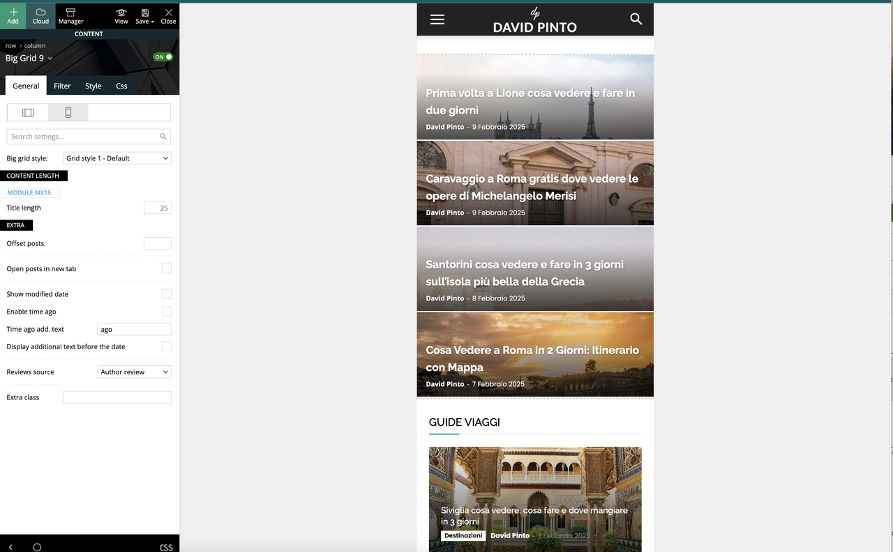
are you sure? I created the mobile page with Tagdiv composer.
Anamaria Hello,
I answered you on this topic https://forum.tagdiv.com/topic/mobile-is-different-on-phone-than-whats-displayed-on-wordpress/#post-526364
Thank you!
Anamaria Hello,
You have the mobile theme version now, so you can disbale the plugins to check the responsive version.
Using our theme, you can choose from 3 mobile versions
-> mobile responsive => https://www.screencast.com/t/oJ2ShOp47
-> mobile theme plugin => https://forum.tagdiv.com/the-mobile-theme/
-> mobile page => https://tagdiv.com/newspaper-10-3-7-update-brings-customizable-and-fast-mobile-pages/ The option that you need to use.
Suppose you created the mobile pages with tagDiv Composer. In that case, when you install the Mobile Theme plugin, your pages will be overwritten by the plugin (the mobile theme comes with its templates for page, post, category, etc, so your current templates from the desktop theme will get converted to the mobile theme layout, the page content is made without builders in mobile editor => https://www.screencast.com/t/xbgZG8kH also, the options that are provided to edit the mobile theme version are limited (this keeps the things simple)).
This is a video about Responsive Newspaper Theme, AMP & Mobile Theme, Mobile Pages & Templates -> https://www.youtube.com/watch?v=SpGkOnJeNZY.
So, the mobile responsive is what you see when that you select the viewport on phone => https://www.screencast.com/t/matV17hH, so some settings may apply for each viewport(where is the border blue), and others are not(where the border is black).
The mobile page has the mobile templates from Cloud Library => https://www.screencast.com/t/YCcZ8rL8
The Mobile responsive version of the theme and the mobile page editor can be edit with tagDiv Composer, the mobile theme plugin cannot.
For example, you can have the mobile theme plugin activated and use the mobile page/mobile responsive version for the homepage/pages, but for the categories pages/404 page, you can’t use the mobile page/mobile responsive version if you have the mobile theme plugin activated.
So, if you want to design the pages with tagDiv Composer, you can use the mobile page or mobile responsive version.
Thank you!
Bettina Hello David!
I see a mobile theme layout on your screenshot, meaning your website is cached if you do not use the Mobile theme or AMP anymore. Clear all your cache and repeat the test.
Thank you!
 jordanphilippe88
 jordanphilippe88
 Davidpinto
 Hi Bettina,
I don’t use more Mobile Theme and AMP Plugin, i’m using the mobile pages.
But I don’t lknow have this result the same…
 andrea.turco
Hello,
after the last update of Newspaper theme, I’m experiencing a weird behavoiur with Center Magazine Pro.
If I’m logged in, I can see a correct mobile layout. If I’m not logged in, the mobile layout is totally broken.
Every time I update the theme, all the tagdiv plugins are automatically uninstalled. I need to manually install them again, but now everything seems ok. I mean I don’t think is a problem related to plugins.
– tagDiv Composer is active
– tagDiv Cloud Library is active
– tagDiv Social Counter is active
– tagDiv Newsletter is active
– tagDiv Opt-In Builder is active
The url is https://cronachedibirra.it/
Here can you see the layouts for logged (correct, left) and not logged (broken, right) users https://cdn1.cronachedibirra.it/wp-content/uploads/20250220184159/Senza-titolo-1.png


