
- NewspapertagDiv AMP Plugin Tutorial
- ApiPractical example – How to add a new Block and Module
- NewspaperTrack Subscription Sources with Locker URL in Opt-In Builder
- NewspaperWP Rocket and Newspaper Theme: Optimization Guide
- NewspaperCredit System
- NewspaperIntroduction to CPT and ACF with Newspaper Theme
- NewspaperHow to edit modules for Flex Block X
- NewspaperHow to use the Posts List shortcode
- NewspaperUser review system
- NewspaperCustom Fields Support
- NewspaperHow to generate Facebook App ID
- NewspaperHow to insert a block inside the content of a post
- NewspaperModal Popup
- NewspaperPayPal Setup
- NewspaperLink Tracker
- NewspaperLockers
- NewspaperGeneral Options that May Interfere with the Newspaper Theme
- NewspaperAdd Cryptocurrency Price Ticker Widget
- NewspaperPosts Loop Element
- NewspaperThe Newspaper Mobile Theme: Introduction
 Simion C.
 Hi,
That is true, the mobile theme will not display blocks or grids for example. It’s purpose is to display a different and lighter version of the website on mobiles for users who want this.
If you want to display page builder content on mobiles, simply deactivate it. The plugin is optional and there will be no problem.
 Adaras
Hi,
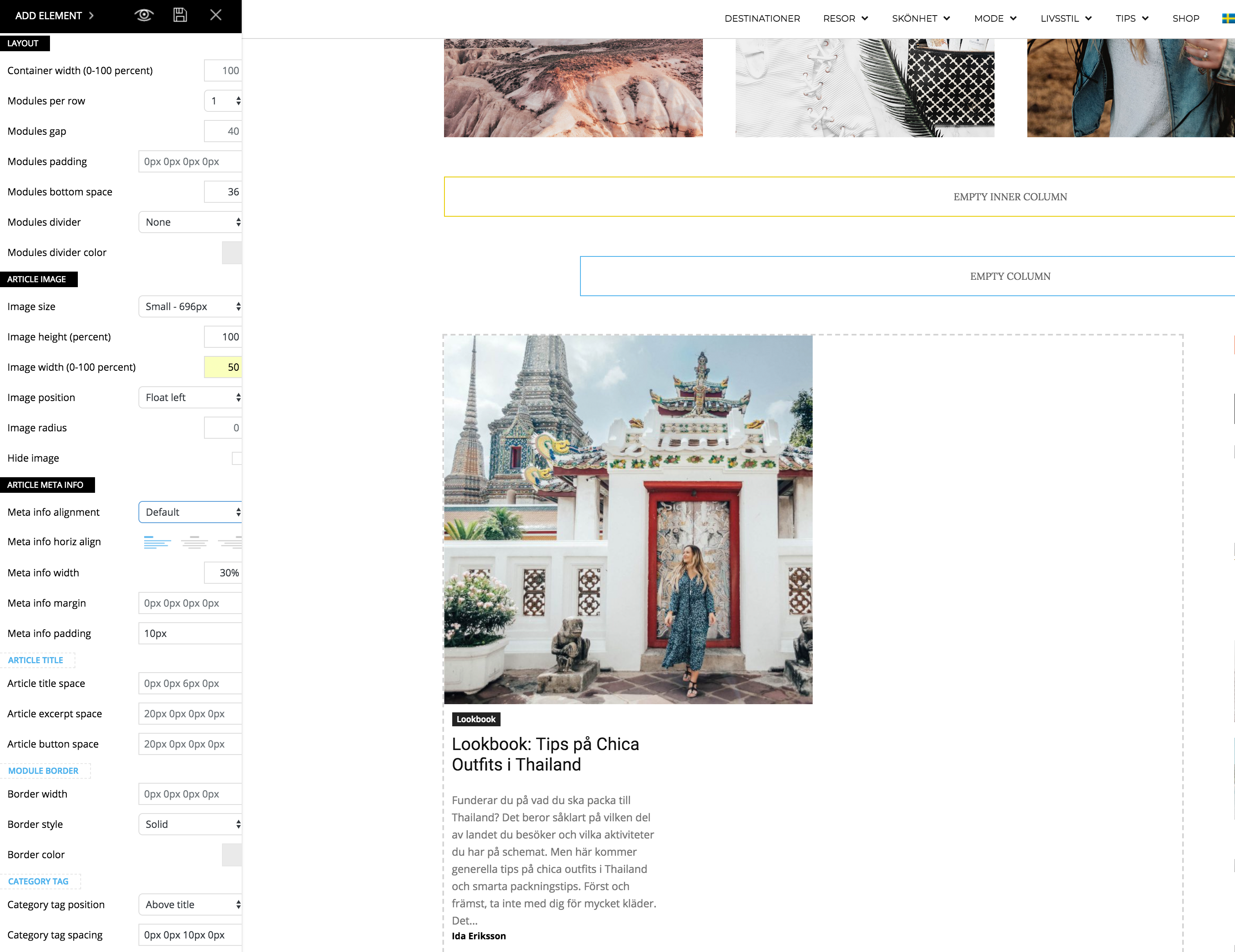
I just updated to the newest version of the theme and noticed a problem when I’m trying to make my flex block as the example for “2 modules per Row here”: https://demo.tagdiv.com/newspaper/flex-block/
I can’t get my meta description to show next to the photo. It’s position below or above the photo, no matter what I do.
When I inspected the elements I see that the difference is that my .td_module_flex_1 .td-module-container has flex-direction: column. And if I change it to “row” like in the example it works. But how do I get it right with only the TD composer?
Simion C. Hi,
Those other modules can be seen by swiping with your finger, there is a scroll there. Other grids display all the modules in view on mobile, like this grid for example
– https://demo.tagdiv.com/newspaper/big-grid-11/
But others require swiping to scroll through them. Please correct me if I misunderstood something.
Thanks
Simion C. Hi,
Try a code like this for example – https://www.screencast.com/t/sxfZJKkc0M
#td-top-mobile-toggle,

.td-search-wrapper {

display: none;

}

.td-header-wrap .td-header-main-menu {

height: 47px !important;

}
This could be a solution, give it a try.
Thanks
 irfan.id
Hi, I got saveral questions about new plugin TagDiv CL.
1. Why I can’t see Import button? (I must zoom out to -80% to display import buttom)
2. Why Installing TD CL template take too long? even can’t be imported
3. While try to edit TD Cloud Library tamplate, it show message “Errors happened during tdcIframeData.init() -> bindViewsModelsWrappers()!” and loading process keep rolling.
4. When try to Share article with share button, it show “Full Featured Image https://irfan.id/tdb_templates/single-post-template-20/”, not showing article it self please take a look here https://irfan.id/ingin-investasi-saham-tapi-tidak-punya-npwp-begini-caranya/
Thanks,
 ozgunozakyildiz
Hi, how do I use Google Adsense auto ads on AMP pages?
 meri
meriHi,
I use this code to align the titles on mudule 6
.td_module_6 .item-details {
display: flex;
align-items: center;
}
But now the ratings are on the right hand side. How could I have them below (and in line, not on 2 lines)?
Screenshot: https://ibb.co/fVyMPd
URL http://www.coupdepoker.com
Thanks for your help
 Erythros
Hello,
I have a page that shows on desktop all articles that are in one of the two predefined categories.
With the mobile theme active, this page doesn’t work.
What I would like is to display on mobile all the articles based on the same rule (post to be in category A or B).
Using the custom mobile theme editor, I can just display text… not show posts in a category…
Just like the “index” page, but with an active filter
Example: https://esportsmedia.ro/articole/ (check on both mobile and/or desktop)
 MayankParmar
 Hi,
Just a heads up. Yoast said it’s fine as they set pagination pages like https://www.example.com/page/2 to a canonical of https://www.example.com/
Thanks,
 tvcity
 I bought your template, to change the look at my site that has 3 years of life and 54402 posts and about 10,000 videos attached.
I can not lose the job done.
the links of videos related to my posts in my old template are registered in (wp_postmeta) in my wordpress database:
example:
wp_postmeta
meta_id 1820718
post_id 54355
meta_key magazin_video_url
meta_value https://vimeo.com/27523800
How can I tell the template to get the video link from meta_value from meta_key (magazin_video_url)?
Or can I change the value of the meta_key in the table in … (what ?????)
I do not think it has not happened before.
Thank you
 Edward
 P.S. You should not have allowed to copy content through the right mouse button.
First, it is easy to do, for example, in the Firefox view the page source code: Tools – Web development – Page Source code (Ctrl+U).
Secondly, it lowers the behavioral factors of the whole site.
 InstallationComplete
 Hi Bogdan, I’m running the latest Newspaper 8.8 and tried the example id. That’s why I’m unsure what the issue it. Instagram is working fine.
 ozan310
hello,
im looking for a solution to decrease the width of the menu for about 50%, in my opinion its a little bit to width.
my second question is, i dont want that it shows the latest articles and “all” when i put my mouse on the menu, it should only show the categories. hope for help
https://kampfsportupdate.de/wp-content/uploads/2018/06/website2.png
thank you
 dylanswims
Hi,
I was wondering if there’s a way to input shortcodes from other plugins into the page composer?
For example, I use the plugin EventOn for our events and would like to continue using it. It works fine with the old page builder but I’m curious if there’s a way to put it in with the new tagdiv composer? This would be very helpful as I like the page layout options on your composer better but want to use the functionality of EventOn.
Appreciate your input.
Thanks,
 jkfriends
Hi, I want a sidebar width to be exactly 300px. On browser resizing, if 300px sidebar width content can’t be fit it in, I don’t want to see a responsive sidebar by becoming slimmer & slimmer but rather I want the sidebar to be dropped to the bottom of the page. I have tried many CSS tweaks but could not make it work. BTW I have smart sidebar option turned on from theme panel as well.
Could you please suggest exactly what do I have to do to achieve this?
Thanks, JK
 Bogdan B.
  tzabula
 Simion, hi!
I’ve corrected AMP ads due to your recommendation above:
http://prntscr.com/jvbz8g
http://prntscr.com/jvbzrs
But it still shows mistakes in AMP:
http://prntscr.com/jvc17w
http://prntscr.com/jvc1zq
http://prntscr.com/jvc2i6
http://prntscr.com/jvc3qs
http://prntscr.com/jvc5il
Please, help 🙂
Simion C. Hi,
Most of the demos have a theme to them, like for example business or sports. All the demos use the same theme elements, what makes them different from each other is the custom design and theme panel settings. As soon as a demo is imported, the demo theme panel settings will be imported along with the custom design.
It would be up to you to decide which demo would be the proper one for you, at any time you can uninstall it and install a different one if needed.
The tagDiv composer is used to build all demos, so the same elements are available regardless of demo used.
Thanks
 dragoerny
 I have tried the same code to remove the section :
<div class=”wppaszone paszone-5819 ” id=”5819″ style=”overflow:hidden; max-width:1070px; max-height:230px; margin: 0 auto; text-align:center; “><div class=”wppasrotate paszoneholder-5819″ style=””><div class=”pasli pasli-8333 ” aid=”5819″ bid=”8333″ data-duration=”5000″> </div></div></div>
but it doesn’t work. Still visible. you can see it now with the css added.
 Global
 Thanks for the answer. Perhaps that would be a cool feature for future development?
Just to check – what would happen to posts where tamplate is assigned on per-post basis if, for instance, somehow template is deleted? Would they all turn back to default template or become broken?
Thanks
Igor
Simion C. Hi,
The theme offers many font customization options. A simple guide here
– https://forum.tagdiv.com/font-customization/
A general font style can be set for the body, note that this general font will be replaced by more specific settings
– https://www.screencast.com/t/87cGiS80HK
That example you mention seems to be a post, the theme settings for the post content are here
– https://www.screencast.com/t/nQlO5ZuD1Yq
The example uses this font, font-size, font-weight and line height
– https://www.screencast.com/t/nVGUWEMLyJQ
So you could do that like this
– https://www.screencast.com/t/IWxktx4N7gi
– https://www.screencast.com/t/zEakklDG0
Result – https://www.screencast.com/t/dGxlTQiHKYc
Let me know if you have more questions.
Thanks
 Julia white
Hello,
We are using Newspaper Theme and wrote some custom CSS in Live CSS. We just noticed that in production (no logged in WordPress user), we see CSS is showing in 2 places and one is part of the HTML, where Live CSS editor is hidden. We have removed the css from live css but we noticed that the editor html + css is showing in the html. Not only is the css duplicated unnecessarily but also there is unnecessary code. You can see it on our https://www.kinbox.com
Here is the example of the code we see.
<textarea class="tdw-css-writer-editor td_live_css_uid_1_5b2391f5d7105">.my-class....{display:none;}</textarea>
Bogdan B. Hello,
This is the default implementation. Try to access some popular sites on amp and see that this is the same issue. Here is an example from yoast: https://yoast.com/wordpress-seo/amp/ Just click away and you will see you will not be led to an amp template: https://www.screencast.com/t/1lboVW1V8
We did not create this behavior on our own call and our own ideas. We followed the google instructions on how to create an amp template and how to make the proper implementation, exactly as yoast did and other developers as well.
I am not aware of any amp plugin that lets you have amp across the whole mobile site and replace the mobile version completely with the amp version.
Thank you for understanding.
Bogdan B. Please check your amp ads as inline styles are not allowed. If you have a style attribute in your ads, they will provide errors on amp.
https://www.ampproject.org/docs/design/responsive/style_pages
Thank you!
Erythros @Bogdan
Thanks for your answer.
But…why?
Don’t you agree with my previous post that users accessing a blog post from a MOBILE device should always be served an AMP page?
Imagine this scenario: you google something and you open an article on your favorite website. Looks white, AMP, fast..everything’s awesome. At the end of the article, you decide to keep reading so you click a related an article. BAM, no AMP. Moreover, a totally different look, not optimized, slow…
Isn’t that a horrible user experience?

