
- NewspaperThe Newspaper Mobile Theme: Introduction
- NewspaperThe Mobile Theme
- NewspaperModules Builder in Newspaper Theme
- NewspaperNewspaper theme documentation
- NewsmagTheme colors introduction
- NewspaperTheme Colors Introduction
- NewspaperWhat’s Included in the Newspaper Theme Package
- ApiUsing the Theme API in plugins
- NewspaperFilters and sorting for taxonomies
- NewspaperHow to Add a Logo in Newspaper
- NewspaperBig Grid Flex Settings
- NewspaperHeader Builder
- NewspapertagDiv AMP Plugin Tutorial
- TutorialsFrom WPBakery to tagDiv Composer
- NewsmagSmart list ads
- NewspaperBest Of Forums
- NewspaperCache plugin – install and configure
- NewsmagIntroduction
- NewsmagMain menu
- NewsmagLogo & Favicon
 Calin
Calin Hi,
That is because you are using the mobile theme plugin, you’ll gain a better speed then responsive version of theme, but in order to achieve that speed you’ll need to create a new content for pages because in the most of cases those were made with builders ( tagDiv Composer, WPBakery ) and you need to use only the mobile editor ( you need to set the content for pages in mobile editor and this content will be display on mobile theme)
-> https://i.imgur.com/9d0UWLT.png
Also you can show the responsive version on mobile theme -> https://i.imgur.com/m0bVB5T.png you can check more details about mobile theme in our documentation -> https://forum.tagdiv.com/the-mobile-theme/ or if you want to have the responsive version only, you can use the amp option from mobile theme -> https://i.imgur.com/oofST3D.png (to use the mobile theme template on amp) or you can disable the plugin.
Hope this will help you!
Thank you!
 Vlad S
 Hello !
The Mobile theme was specially designed for optimization on mobile devices. Unfortunately on mobile theme you cannot do much changes of design. If you want to have the same design as on desktop mode you can achieve that by simply disabling the mobile theme.
You will have to recreate your pages into the Mobile editor or completely disable the mobile theme. The mobile editor will not render shortcodes !
Also you can disable mobile theme on certain pages or posts by following this setting: 
Please take a look here: https://forum.tagdiv.com/the-mobile-theme/
Mobile theme plugin can be disabled from Newspaper Plugins as you can see here: https://www.screencast.com/t/LnkZCEVC
Also please make sure that you clear your cache!
Thank you !
 praveenputtur
Hai, I am using Mobile theme for news website.
I need to replace Latest Articles text to my own title.
https://imgur.com/a/jXv2Pxc
thank you 🙂
Calin Hi,
1. You need to use the option form theme panel -> https://i.imgur.com/nT8TAlG.png -> https://forum.tagdiv.com/login-how-to-enable-user-registration/
2. You can change the mobile logo size to be bigger only if you are using a cloud header from tagDiv Cloud library, this can be edited with tagDiv Composer and adjust -> https://i.imgur.com/6blCyI2.png
3. If you are referring to this -> https://i.imgur.com/m5vUkh7.png this is the logo on desktop and on mobile is this one -> https://i.imgur.com/3kzGMow.png
Thank you!
Calin Hi,
Unfortunately the cloud footer can be edited only live for the moment, sorry!
Also you can check and adjust the footer elements by changing the view port in tagDiv Composer -> https://i.imgur.com/Kz6WIS8.png also you can check the flex block layout per device -> https://i.imgur.com/yE5ihsn.png
Or you can use the mobile theme plugin, but there are only few customization that you can do. -> https://forum.tagdiv.com/the-mobile-theme/
If the problem with “Warning: getimagesize” persists, you can send us an email at contact@tagdiv.com and provide admin login. We will take a look. Include a link to this topic in the email.
Let me know the results!
Thank you!
 DKF
DKFHi there,
Can’t figure this out. I would like the images that are right aligned on desktop, to be centered on mobile. I’m using mobile theme. How can I adjust these settings?
 Fabio
FabioHi,
if I edit/create a post or a page using a PC, the editor seems to be for mobile version. Why?
If I use another theme, all works fine.
Thanks
Fabio
 Mahirautela
I don’t know where to start this issue but on desktop mobile version are open and it’s really looks bad please help me to fix this.. i don’t know that much technical things so i purchase this theme and on GT Matrix i try to fix JS modification this things this issue start from there please help me
Vlad S Hello !
This is the only option available at the moment. For desktop they will have to create the image larger in order to fit your website.
For the mobile there is nothing that can be done. Mobile theme cannot be edited.
Thank you !
Calin Hi,
Is possible that the Pullquote element to be set on blockquote, please try this settings from mobile theme -> https://i.imgur.com/pPn38at.png
Let me know the results!
Thank you!
Vlad S Hello !
By going into Theme Panel – Theme fonts you will be able to see the mobile menu options: https://www.screencast.com/t/oZ3Y1kCWwO9x
Thank you !
Calin Hi,
As a solution you can use the amp plugin without mobile theme and set the amp option like this -> https://i.imgur.com/lbe43pJ.png but the best implementation of this amp with our theme is using it with mobile theme plugin.
Thank you for your understanding!
 sonicstadia
Mobile theme keeps changing back to desktop version every few hours.. how can I fix this issue please?
 dtbcoin
I use a plugin called Multi-column Tag Map and it works great in the regular Newspaper theme.
But when I try to use it in the Mobile theme I get nothing.
The page is a blank.
You can check out the problem by going to https://www.ethingstodo.com and look at the site in a mobile phone.
Can you please give me some idea as to what is wrong or what I am doing wrong?
Thanks,
David Best
 engrmahmud
The previous one is when I install WPbekar Page builder & if I use custom post template then sidebar not support perfectly. Its show below the post! In mobile view, it’s even worse
I have found another problem today when I update the theme. I use the WMPL plugin to my site for English & Bengali Language. I use different post page templates for English & Bangla but after today’s update, it shows the same template! It’s a big issue for my site. Please Help me. my website address: https://footcricinfo.com
Calin Hi,
Please make sure that you are using the amp plugin with mobile theme plugin.
If there is still a problem, make sure that you do not have a plugin conflict, please deactivate ALL plugins except tagDiv plugins, also if you are using child theme, cache plugin or CDN, deactivate them, clear all cache and try again.
Please make sure that all the settings are like in our requirements, please follow the guide carefully
– https://forum.tagdiv.com/requirements-for-newspaper/
and please increase all requirements that are lower, and follow all steps.
Let me know the results!
Thank you!
Calin Hi,
The amp version will be on mobile and you can not make the hover on mobile devices, but if you want you can set it in Theme panel> Mobile theme > Custom code> css it should apply on amp too.
Thank you!
Calin Hi,
This can be done only form theme panel -> https://i.imgur.com/SKrrlJw.png -> https://i.imgur.com/ENfQYMP.png or if you are using the mobile heme plugin you need to use the settings from here -> https://i.imgur.com/dfVufME.png
Thank you!
 FietsersbondHZ
 I managed to solve the problem by deactivating all plugins as you suggested and reactivating them again, the tagDiv Mobile Theme plugin however messes up the layout completely on my phone, if I decativate it everything looks fine on my phone but as soon as I activate it all my layout changes are gone and I get to see the default newspaper header.
 ankhlabs_gmbh
 Hello Vlad S!
Thank you for your support.
I’ve deactivated all plugins, cleard the cache, but there are still no pictures in the mobile theme.
And what do you mean with using child theme? Can you specifiy this a bit more?
Thank you.
Vlad S Hello !
The Mobile theme was specially designed for optimization on mobile devices. Unfortunately on mobile theme you cannot do much changes of design. If you want to have the same design as on desktop mode you can achieve that by simply disabling the mobile theme.
You will have to recreate your pages into the Mobile editor or completely disable the mobile theme. The mobile editor will not render shortcodes !
Also you can disable mobile theme on certain pages or posts by following this setting:
Please take a look here: https://forum.tagdiv.com/the-mobile-theme/
Mobile theme plugin can be disabled from Newspaper Plugins as you can see here: https://www.screencast.com/t/LnkZCEVC
Also please make sure that you clear your cache!
Thank you !
Calin Hi,
You can try this custom css for mobile theme -> https://i.imgur.com/7gOv6dg.png
#td-outer-wrap {

background-color: #222;

}

#td-outer-wrap * {

color: #fff;

}
The code need to be set in theme panel> mobile theme > custom code> css.
Hope this will help you!
Vlad S Hello !
The Mobile theme was specially designed for optimization on mobile devices. Unfortunately on mobile theme you cannot do much changes of design. If you want to have the same design as on desktop mode you can achieve that by simply disabling the mobile theme.
You will have to recreate your pages into the Mobile editor or completely disable the mobile theme. The mobile editor will not render shortcodes !
Also you can disable mobile theme on certain pages or posts by following this setting:
Please take a look here: https://forum.tagdiv.com/the-mobile-theme/
Mobile theme plugin can be disabled from Newspaper Plugins as you can see here: https://www.screencast.com/t/LnkZCEVC
Also please make sure that you clear your cache!
Please provide a link to your website in order to inspect the breadcrumbs.
Thank you !
 DaveKinetic
Hello,
I want to change the default styling of the pull quote block on AMP. It seems excessively large and is set to 60% width. I have tried editing the pull quote section in Mobile Theme > Font Settings > Pull Quote, but that doesn’t seem to make any difference to font style.
Any idea where to change the font styling and the max-width, please?
 Archerix
Hi,
I’m using the newspaper theme on a large website, more than 1 million pageviews per month and recently a company wanted to promote a series on our website with a site skin, the only problem is that the only option that newspaper as is “background click ad”, basically two large ads in the side of the website.
The result was this below
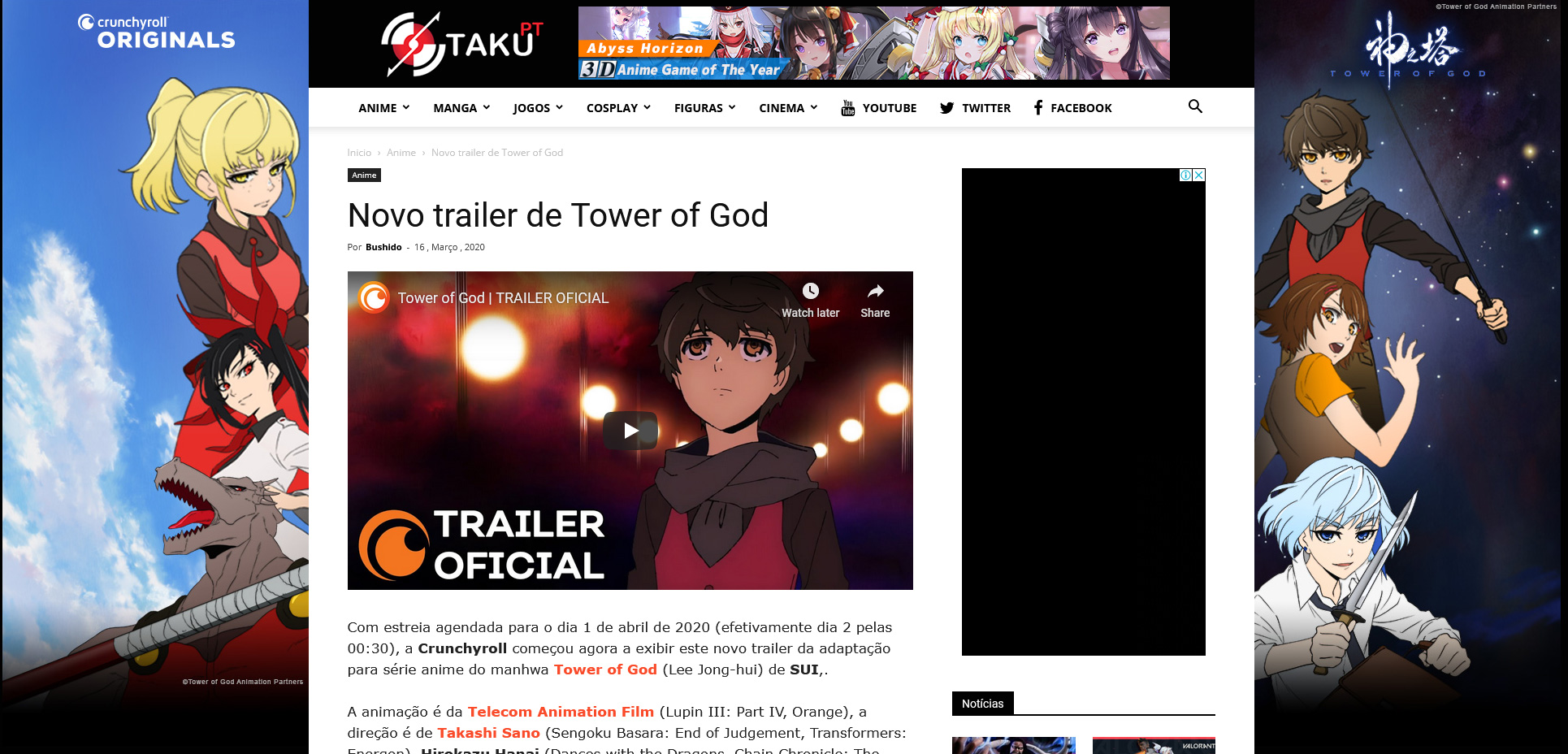
What the company wanted is something like the photoshoped version bellow
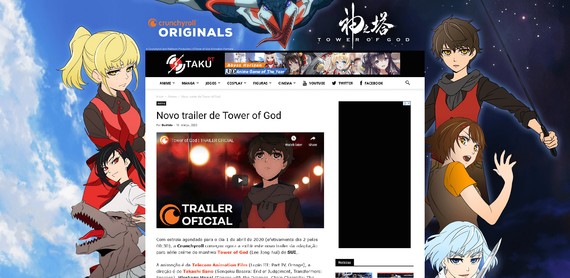
The problem with “background click ad” is that it does not shows in smartphones, only in desktop. I have seen in other themes a better application of the site skin, in which the ad sides are not shown but the top is.
So, basically, I’ve negotiated a worse contract because I didn’t find a way to show the ad to mobile users, which are 60% of my users.
How in mobile it should look:

So what I’m asking is how could I do this with Newspaper and asking you to implement more options to “background click ad”
Best regards



