- NewspaperThe Newspaper Mobile Theme: Introduction
- NewspaperThe Mobile Theme
- NewspaperModules Builder in Newspaper Theme
- NewspaperFilters and sorting for taxonomies
- NewspaperHow to Add a Logo in Newspaper
- NewspaperBig Grid Flex Settings
- NewspaperHeader Builder
- NewspapertagDiv AMP Plugin Tutorial
- TutorialsFrom WPBakery to tagDiv Composer
- NewsmagSmart list ads
- NewspaperNewspaper theme documentation
- NewspaperBest Of Forums
- NewspaperCache plugin – install and configure
- NewsmagIntroduction
- NewsmagMain menu
- NewsmagLogo & Favicon
- NewsmagHeader ads
- NewsmagSmart sidebar
- NewsmagSharing buttons
- NewsmagCategory tag on modules/blocks
 Bettina
 Hello!
Enable these settings from the theme panel for mobile menu and mobile search: https://app.screencast.com/pUtCgElyRwzjo
Make sure you choose a menu in order to display there.
Thank you!
 Anamaria
 Hello,
We don’t recommend to using amp, because it is deprecated -> https://developer.bigcommerce.com/docs/storefront/wordpress/platform-integration/enabling-amp -> https://forum.tagdiv.com/topic/amp-end-of-line/
For mobile theme + Amp the content need to be added in Mobile Editor -> https://www.screencast.com/t/xbgZG8kH
Please check this topic where I explained each mobile version -> https://forum.tagdiv.com/topic/mobile-version-not-working-properly-2/and choose what mobile version you want.
Thank you!
Anamaria Hi,
In this topic is a suggestion on how to redirect the links https://forum.tagdiv.com/topic/amp-end-of-line/
You can try to add the code here https://imgur.com/2myuxcU and if it not work in this path if you have also, the mobile theme -> wp-content/plugins/td-composer/mobile/single.php
Thank you!
 dnhan
dnhanHello, Please help.
I’m facing a bit of a problem but can’t identify the source.
Some of my latest articles don’t appear when accessed via smartphone and the link goes to 404, even though if accessed via the web it’s fine.
I use the mobile theme for the smartphone display
Here are some new articles that have problems with mobile themes:
Thanks.
 tsbiz
tsbizHi,
My mobile menu is not working. But when I test on desktop with mobile mode, it seems to be fine. But when I go to Chrome, Brave or Firefox on mobile, it’s not working at all.
See here: https://imgur.com/y7SMGla
Seems like nothing is happening.
The Search mobile shows up to me when I click, but with terrible UX.
See here: https://imgur.com/Q9fkqDa
I’m trying to change that, but nothing is working.
What can I do, please?
Thanks.
 elmi
elmiHi, I have installed AMP and mobile theme plugins and modified them while following the docs. I fail to alter the home page body. How do I take control of it and change or add some features?
Bettina Hello!
Please change it exactly like I mentioned above on the mobile viewport too: https://app.screencast.com/TffmDPVrdAg0Z?tab=Details&conversation=AKSAQD3gCjYHzgr0YLpH4k
Thank you!
Anamaria Hi,
Usually, this happens with cache plugins. If the cache plugin does not have mobile support then the mobile theme version can be delivered instead.
The solution would be to use the recommended WP Super Cache plugin instead and activate these settings (especially the mobile device support): https://forum.tagdiv.com/cache-plugin-install-and-configure/
Also, please let me know what plugin for the cache you use now.
Thank you!
Anamaria Hello,
Please disable alos, the mobile theme plugin.
Using our theme, you can choose from 3 mobile versions
-> mobile responsive => https://www.screencast.com/t/oJ2ShOp47
-> mobile theme plugin => https://forum.tagdiv.com/the-mobile-theme/
-> mobile page => https://tagdiv.com/newspaper-10-3-7-update-brings-customizable-and-fast-mobile-pages/ The option that you need to use.
Suppose you created the mobile pages with tagDiv Composer. In that case, when you install the Mobile Theme plugin, your pages will be overwritten by the plugin (the mobile theme comes with its templates for page, post, category, etc, so your current templates from the desktop theme will get converted to the mobile theme layout, the page content is made without builders in mobile editor => https://www.screencast.com/t/xbgZG8kH also, the options that are provided to edit the mobile theme version are limited (this keeps the things simple)).
This is a video about Responsive Newspaper Theme, AMP & Mobile Theme, Mobile Pages & Templates -> https://www.youtube.com/watch?v=SpGkOnJeNZY.
So, the mobile responsive is what you see when that you select the viewport on phone => https://www.screencast.com/t/matV17hH, so some settings may apply for each viewport(where is the border blue), and others are not(where the border is black).
The mobile page has the mobile templates from Cloud Library => https://www.screencast.com/t/YCcZ8rL8
The Mobile responsive version of the theme and the mobile page editor can be edit with tagDiv Composer, the mobile theme plugin cannot.
For example, you can have the mobile theme plugin activated and use the mobile page/mobile responsive version for the homepage/pages, but for the categories pages/404 page, you can’t use the mobile page/mobile responsive version if you have the mobile theme plugin activated.
Thank you!
 jayflyer
 i tried doing it but it messes up header and footer.
at least there is an option to make mobile template for footer, but there is no option for the header.
my site: jayflyer.com
-
This reply was modified 2 years by
jayflyer.
 digicom
Hi, I’ve activated the tagDiv Mobile Theme plugin and configured it, but I don’t know why the mobile version also displays on the computer, as you can see from the link on my site : https://magazine.pagesjaunes.online/
Please help me so that the mobile version displays on the mobile and the computer version on the computer.
I would also like to know how to change the presentation of the mobile version.
Thank you.
 AreaDesign
Hi i’ve a newspaper12 template but mobile version is different from desktop version.
Teresa aren’t some articles and there aren’t sponsor etc.
How can i set a responsive version for mobile that have some setting as PC desktop version?
I’ve also disabled AMP pluin but no difference.
Anamaria  Calin
Calin Hi Teachy,
I will like to help you related to mobile versions that our theme can provide:
The theme has by default a responsive version and this can be checked (and some options from elements/blocks can be adjusted).
Now the theme is also providing a an option to create mobile pages and mobile cloud templates. – https://tagdiv.com/newspaper-10-3-7-update-brings-customizable-and-fast-mobile-pages/
And the last one is the tagDiv Mobile Theme plugin.
Now When the tagDiv Mobile theme plugin is enabled this one will apply. If the plugins is disable and you have a mobile page/template, then that one will be apply.
If none of them is enabled, then the responsive version will be used.
Thank you!
Anamaria Hello,
You can create a mobile template, and in this way, you can change the place of the element for mobile https://tagdiv.com/newspaper-10-3-7-update-brings-customizable-and-fast-mobile-pages/
Thank you!
Bettina Hello!
I’ve checked and I can see your mobile page displaying just well: https://app.screencast.com/S9SOpMWtjVQ6o
Did you solve the issue?
Thank you!
Anamaria Hello,
The menu is made using the modal popup and you can create the page of the mobile menu as you want.
Thank you!
Anamaria Hello,
The options from the theme panel are for standard templates. If you have cloud templates, you must make all the changes using tagdiv Composer https://forum.tagdiv.com/tagdiv-composer-tutorial/ -> https://forum.tagdiv.com/how-use-tagdiv-cloud-library-templates/. Also, if the block is not from our theme, then to change the color, you need to use a custom code CSS.
Using our theme, you can choose from 3 mobile versions
-> mobile responsive => https://www.screencast.com/t/oJ2ShOp47
-> mobile theme plugin => https://forum.tagdiv.com/the-mobile-theme/
-> mobile page => https://tagdiv.com/newspaper-10-3-7-update-brings-customizable-and-fast-mobile-pages/ The option that you need to use.
Suppose you created the mobile pages with tagDiv Composer. In that case, when you install the Mobile Theme plugin, your pages will be overwritten by the plugin (the mobile theme comes with its templates for page, post, category, etc, so your current templates from the desktop theme will get converted to the mobile theme layout, the page content is made without builders in mobile editor => https://www.screencast.com/t/xbgZG8kH also, the options that are provided to edit the mobile theme version are limited (this keeps the things simple)).
This is a video about Responsive Newspaper Theme, AMP & Mobile Theme, Mobile Pages & Templates -> https://www.youtube.com/watch?v=SpGkOnJeNZY.
So, the mobile responsive is what you see when that you select the viewport on phone => https://www.screencast.com/t/matV17hH, so some settings may apply for each viewport(where is the border blue), and others are not(where the border is black).
The mobile page has the mobile templates from Cloud Library => https://www.screencast.com/t/YCcZ8rL8
The Mobile responsive version of the theme and the mobile page editor can be edit with tagDiv Composer, the mobile theme plugin cannot.
For example, you can have the mobile theme plugin activated and use the mobile page/mobile responsive version for the homepage/pages, but for the categories pages/404 page, you can’t use the mobile page/mobile responsive version if you have the mobile theme plugin activated.
Thank you!
 College Info Nepal
 No, the problem is not solved yet. When we inspect our website on the desktop and watch it on the mobile version, it shows no problem. But when we view our website pages from mobile, it still has the same problem.
Anamaria Hello,
You can add those icons with the elements of social icons, and there you can add your social custom icon, set the links, and so on. You can add those using tagdiv Composer, and for the mobile menu, you can now create a modal popup and set the element you want in the menu; you do not need to use the social network elements.
Thank you!
Anamaria Hello Patrick,
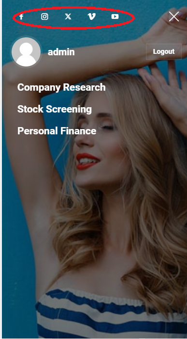
To change the font and color for the mobile menu please go to Theme Panel -> Theme Colors -> Mobile menu/mobile search => https://www.screencast.com/t/0CvSgXp9H to set a background image go in Theme Panel -> Background -> Mobile menu/mobile search => https://www.screencast.com/t/uvDejzbX to change the font from Theme Fonts => https://www.screencast.com/t/ANBQe7hQhJd
The social icons from the mobile menu are coming from the Theme Panel -> Social/Apis -> Social Networks -> https://i.imgur.com/kKYIECB.png remove/edit them after your needs.
Thank you!
 Teachy
 We are months further and the more I work with your theme, the more amazed I am that you guys have really found the most complicated way to create a nice, smooth elegant mobile website. The problem I described still exists. Your image doesn’t show which plugin you use and that should matter. The theme should have its own cache options.
I am not using the mobile plugin because that’s even more horrifying to work with. But GOD please, when I setup a normal frontpage, please make the mobile pagina look the same as the desktop version: stop plying mindgames!!!
Thanks Calin for your reply, you guys probably are doing your best. I’m gonna try one or two days more to get it all setup, alythough I think I am just to simple miinded to grasp your theme….
 pwisker
Hi!
When I am on my mobile home page and I click on the search button or mobile menu at 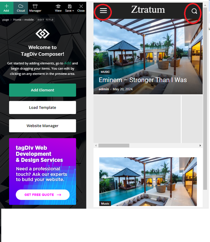
how/where can I change these pages:
Mobile menu I want to remove the background image and some of the social buttons
and also at the mobile search page, how do I remove the background image: Mobile search
Thank you!
Patrick
College Info NepalMy website’s (http://www.collegeinfonepal.com) header and footer are experiencing problems. Half of the navbar is transparent and the other half is solid black (I want solid black full) and the same with the footer. The problem is only in mobile.

 IdentidadyFuturo
Hola,
I created a page and it is not visible in mobile format:
page: https://www.fiestascostumbristas.cl/fiesta-de-la-tirana/
I have another website with several pages on this same topic and this has not happened to me
Thanks for the help