- NewspaperThe Newspaper Mobile Theme: Introduction
- NewspaperThe Mobile Theme
- NewspaperModules Builder in Newspaper Theme
- NewspaperFilters and sorting for taxonomies
- NewspaperHow to Add a Logo in Newspaper
- NewspaperBig Grid Flex Settings
- NewspaperHeader Builder
- NewspapertagDiv AMP Plugin Tutorial
- NewspaperNewspaper theme documentation
- NewspaperBest Of Forums
- NewspaperCache plugin – install and configure
- NewspaperFont Customization
- NewspaperTheme Colors Introduction
- NewspaperBackground Introduction
- NewspaperHeader ads
- NewspaperPost template ads
- NewspaperCustom ad spots
- NewspaperMain Menu
- NewspaperHow to Install Newspaper via FTP
- NewspaperHow to Install Newspaper via WordPress
 pppppppp
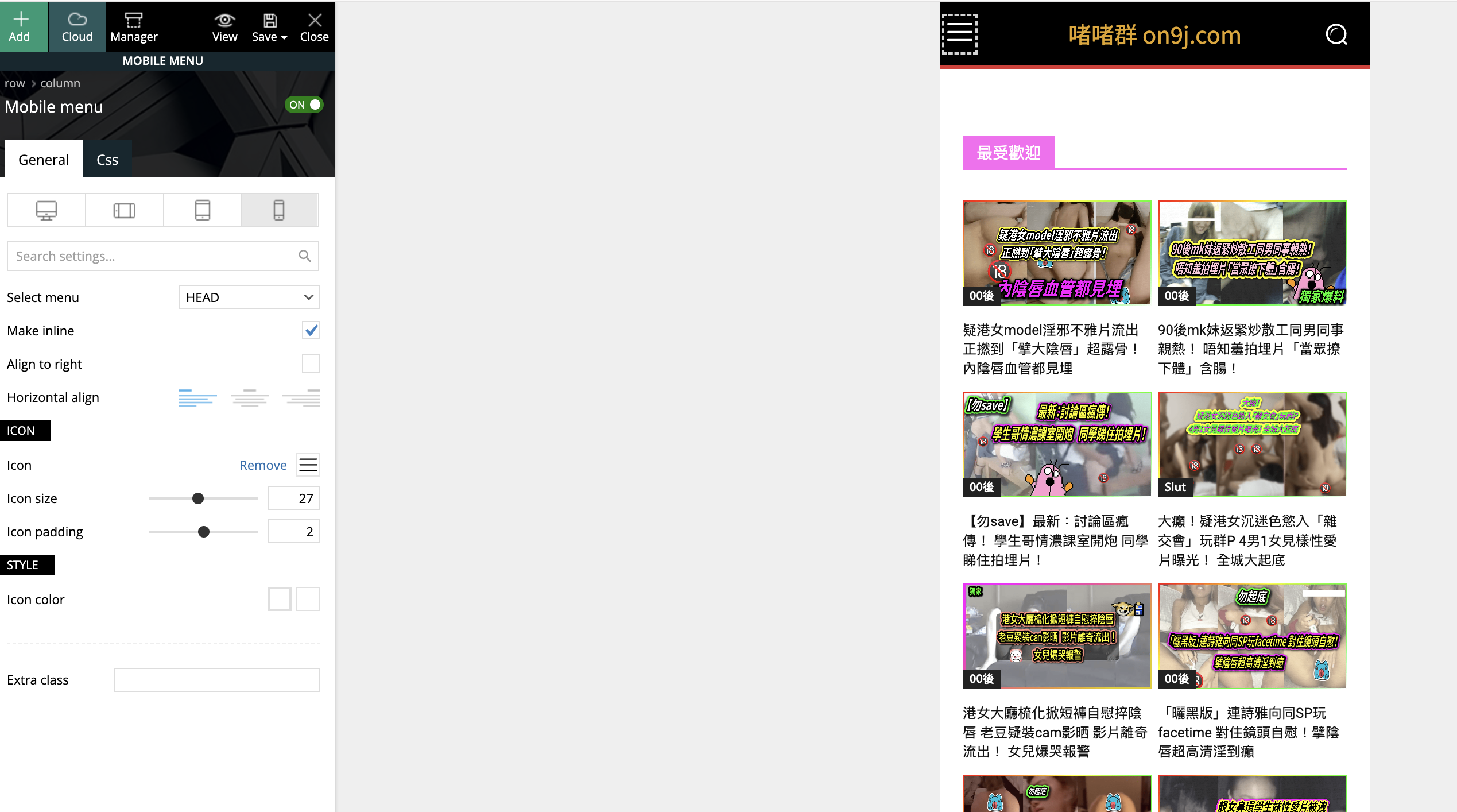
My main page: mobile menu and mobile live search don’t work. Nothing happen when clicking it.
Please help.
Website: on9j.com
 ibadurrahman
i use many other plugin in my website. the site is showing menu on PC and on Mobile properly when i visit post other pages etc but Menu on Mobile not working when a i add shortcode of another plugin in any page.
Website : https://gadgetsfocus.com/
video of problem: https://drive.google.com/file/d/1Yvrpy5Bfy9CBth83m4yr8PEfUKDtzadT/view?usp=sharing
 Bettina
 Hello @Southview92!
It looks like you have only the AMP elements on that page.
From my point of view, if you don’t use the Mobile Theme plugin, then there is no reason or benefit to AMP. Unfortunately, AMP is not working with the cloud templates because the AMP’s layout is not fully customized.
The AMP version works best with default templates and not cloud templates. That’s why we integrated it with the Mobile theme plugin.
The feedback from our clients about AMP was negative and it is not used anymore, that’s why we didn’t add more customization options.
Thank you for understanding!
 libertylens
 Hi Annamaria,
Do you have an answer to the issue with the mobile header for our pages? I’d really like to resolve this soon, as it is preventing us from being able to launch an important initiative.
Thank you.
Ken
Bettina Hello @mostwonder!
Unfortunately, the feature isn’t available for the mobile theme layout.
You have two other available options there, so you can have this feature on your mobile version:
1. Responsive version: A responsive version of your website looks similar to the desktop version. TagDiv Composer is used to edit the page.Click on the mobile viewport: https://www.screencast.com/t/XDQJedlggSB. There, you can see your mobile version and edit or adjust the elements to look better.
2. Mobile pages: https://tagdiv.com/newspaper-10-3-7-update-brings-customizable-and-fast-mobile-pages
Thank you!
 Suliman Razvan
Hello in there…have an issue with the mobile menu not working anymore after update to Newspaper 12.6.3. When i click to categories or sub elements nothing loads just an white page.
I must say that I disabled all plugins to avoid a potential conflict and… still not working. Need u’r help.
Bettina Hello!
You have two other available options there:
1. Responsive version: A responsive version of your website looks similar to the desktop version. TagDiv Composer is used to edit the page.Click on the mobile viewport: https://www.screencast.com/t/XDQJedlggSB. There, you can see your mobile version and edit or adjust the elements to look better.
2. Mobile pages: https://tagdiv.com/newspaper-10-3-7-update-brings-customizable-and-fast-mobile-pages
Thank you!
 mostwonder
Hello Tagdiv team. I couldn’t see it in the theme settings. Isn’t there infinite scrolling in the mobile theme? If not, are you considering adding it? I would love it to happen.
pppppppp yes, I follow your suggestions, I hada uninstalled the Mobile theme and AMP plugin.
But it is still like this, please help.
 bduhamel
I have an issue where the site won’t display properly for anyone not logged in either for the desktop or mobile unless I go and clear the cache and used CSS. I never know when the formatting is going to go out of whack, so this is highly annoying and probably driving away a lot of traffic. I have WP Rocket installed and I never had this issue before but it seems the latest versions of the theme have a problem.
There is also an issue with the Instagram and X widgets where Instagram just shows I have 0 followers all the time and X is frozen at 1710 followers.
My site is located here: https://www.theaterbyte.com
 JhonnySan
 I understand that it is not your job to help me optimize my site.
But can you help me crop the featured image. I want to put the values that I see fit, but the template doesn’t let me put custom values.
I want to know if you could help me with this.
I am using the pre-made template: Single Post Template 4.
But this template makes the featured image very large and I want to reduce its size.
To reduce the size of the featured image I have set the size 265 x 198 in the options, but when choosing this size the image looks blurry. Now if I choose another size the image looks very large on the PC and on the mobile too.
 simchris
 Also, note AMP is no longer “required” by Google for anything, and really only useful if you have high traffic site, slow server, or located someplace where audience may not have broadband and you want to serve cached pages off google. For most modern sites, simply having a clean simple mobile experience is better than using AMP.
(I don’t work here.)
Bettina Hello @eduardo!
Here you can remove the picture for mobile menu/search background: https://www.screencast.com/t/x3Xrln2b88x
Thank you!
 miccmalta
 here the screenshot https://drive.google.com/file/d/1LEcYh4A2jt6FwXsCIarlxNfTUaLxw9HB/view?usp=sharing, https://drive.google.com/file/d/1bIc8GhuOVmD7VfgQJRbTtlCQDc5O-k39/view?usp=sharing if I’m logged ad admin works the mobile version if I log out show that version that is the desktop.
please help us to sort it out.
best regards
miccmaltaDear All,
on our website https://gazzettadimalta.com/ we have a mobile template. One day works and one day no. Imagine yesterday we setup a new mobile template. Works properly and today it was showing the desktop version.
We don’t know how to fix this.
Our users, mostly mobile like all of us now, are complaining.
Could you help us to sort it out?
thank you and best regards
Enry
Bettina Hello @choicemedia !
We have 3 options for mobile versions that you can use:
1. Responsive version: A responsive version of your website looks similar to the desktop version. TagDiv Composer is used to edit the page.Click on the mobile viewport: https://www.screencast.com/t/XDQJedlggSB. There, you can see your mobile version and edit or adjust the elements to look better.
2. Mobile pages: https://tagdiv.com/newspaper-10-3-7-update-brings-customizable-and-fast-mobile-pages
3. Mobile theme plugin: The Mobile Theme is a performance-optimized theme included in the main Newspaper theme that only loads on mobile devices. It comes with its own templates and designs for pages, posts, categories, etc., so your current templates from the desktop theme will get converted to the mobile theme layout. Please see https://forum.tagdiv.com/the-mobile-theme/ and https://forum.tagdiv.com/mobile-theme-introduction/ for more information.
A full explanation is here: https://www.youtube.com/watch?v=SpGkOnJeNZY
If you need to use mobile version 1 or 2, then you need to uninstall the Mobile Theme plugin and AMP.
Thank you!
Bettina Hello!
Please uninstall the Mobile theme and AMP plugin.
Thank you!
 eduardo
In the mobile menu and in search mobile, a photo appears in the background, how do I remove this photo?
search: https://imgur.com/FYDcNuJ
menu: https://imgur.com/J9h37BZ
I installed the magazine pro theme recently
my site: https://mobilidadesampa.com.br/
 thecitylane
 Hi I will send an e-mail with details. Have those settings selected and I get the error, logged in or not (it was someone trying to search using the function on my mobile website who notified me of the issue).
 David
David Hi Calin,
Does this mean this mobile menu setting in the theme needs always be active, no matter if the menu/ search is placed via a cloud template?
Thanks!
 choicemedia
I installed Artist PRO theme in artkerala.com. On the desktop, it shows correctly but when on mobile it is a different theme. How do I correct it? Kindly help
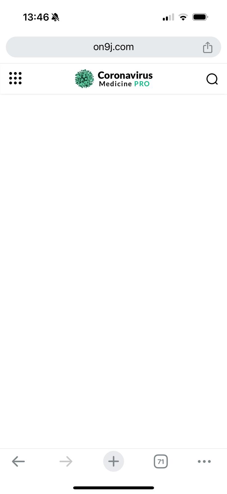
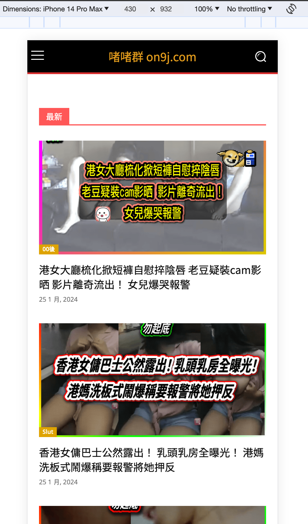
ppppppppPlease, I found that the mobile version of my website cannot show correctly. Please help.
I edited in TagDiv composer , but it shows differently in real phone.
macbook chrome mobile mode: https://upload.cc/i1/2024/01/25/6z1pSO.png
real mobile: https://upload.cc/i1/2024/01/25/QzWmoK.png
Bettina Hello!
You need to wait a few seconds until it loads the new posts.
If this will take more than usual, then it could be a page speed issue.
To increase the page speed you can check these similar topics for more solutions:
– https://www.infophilic.com/get-almost-100-pagespeed-newspaper-theme/
– https://forum.tagdiv.com/topic/score-100100-pagespeed-with-newspaper-wordpress-theme/
– https://developers.google.com/speed/docs/insights/v5/about
– https://www.youtube.com/watch?v=tnkVapqhIHc
– https://www.xtechkr.com/optimize-newspaper-theme/
– Check those guides : https://web.dev/lcp/ – > https://www.sqlpac.com/en/documents/google-pagespeeds-lighthouse-6-new-features-lcp-cls.html -> > https://wp-rocket.me/google-core-web-vitals-wordpress/improve-cumulative-layout-shift
– https://forum.tagdiv.com/topic/to-high-cumulative-layout-shift-in-mobile-theme/
Please check the tutorials from those platforms gt metrix and Google Pagespeed Insights and I’m sure you can increase the page speed.
Please note that page speed is not covered by the support team: https://forum.tagdiv.com/newspaper-theme-support/
Thank you!
Bettina Hello!
We have 3 options for mobile versions that you can use:
1. Responsive version: A responsive version of your website looks similar to the desktop version. TagDiv Composer is used to edit the page.Click on the mobile viewport: https://www.screencast.com/t/XDQJedlggSB. There, you can see your mobile version and edit or adjust the elements to look better.
2. Mobile pages: https://tagdiv.com/newspaper-10-3-7-update-brings-customizable-and-fast-mobile-pages
3. Mobile theme plugin: The Mobile Theme is a performance-optimized theme included in the main Newspaper theme that only loads on mobile devices. It comes with its own templates and designs for pages, posts, categories, etc., so your current templates from the desktop theme will get converted to the mobile theme layout. Please see https://forum.tagdiv.com/the-mobile-theme/ and https://forum.tagdiv.com/mobile-theme-introduction/ for more information.
A full explanation is here: https://www.youtube.com/watch?v=SpGkOnJeNZY
If you need to use mobile version 1 or 2, then you need to uninstall the Mobile Theme plugin and AMP.
Thank you!
Bettina Hello @trasno!
There is all about the DOM. Which means you need to have less elements into that container or row, as such on that page. I can suggest you only to take care of how many elements you use on that page. You can try to use a cache plugin or a plugin which can minify the page or combine some elements in order to reduce its size.
To increase the page speed you can check these similar topics for more solutions:
– https://www.infophilic.com/get-almost-100-pagespeed-newspaper-theme/
– https://forum.tagdiv.com/topic/score-100100-pagespeed-with-newspaper-wordpress-theme/
– https://developers.google.com/speed/docs/insights/v5/about
– https://www.youtube.com/watch?v=tnkVapqhIHc
– https://www.xtechkr.com/optimize-newspaper-theme/
– Check those guides : https://web.dev/lcp/ – > https://www.sqlpac.com/en/documents/google-pagespeeds-lighthouse-6-new-features-lcp-cls.html -> > https://wp-rocket.me/google-core-web-vitals-wordpress/improve-cumulative-layout-shift
– https://forum.tagdiv.com/topic/to-high-cumulative-layout-shift-in-mobile-theme/
Please check the tutorials from those platforms gt metrix and Google Pagespeed Insights and I’m sure you can increase the page speed.
Please note that page speed is not covered by the support team: https://forum.tagdiv.com/newspaper-theme-support/
Do you encounter any errors while importing the sections from the Cloud Library? I’ve tested, and for me, it comes out as it should with all the settings.
Thank you!