
- NewspaperCreate Custom Code with the browser’s Inspector or the Live CSS Box
- NewspaperScroll Animation
- NewspaperWP Rocket and Newspaper Theme: Optimization Guide
- NewspaperHow to setup Twitch for Social Counter
- NewspaperModal Popup
- NewspaperFlex Block Settings Guide
- NewspaperAutoptimize Plugin – install and configuration
- NewspaperAdding Multiple Authors to Your Articles
- NewspaperDesign your Post Pages using the Cloud Library Templates
- NewspaperBig Grid Flex Settings
- NewsmagtagDiv Composer Tutorial
- TutorialsFrom WPBakery to tagDiv Composer
- NewspapertagDiv Composer Tutorial
- NewspaperTheme modules and blocks
- TutorialsDefault Block Settings Guide
- NewspaperThe Mobile Theme
- NewspaperCompare theme files – Winmerge tutorial
- NewsmagBlock settings tutorial
- NewsmagLogo & Favicon
- NewsmagFooter templates
 Yash M.
I’ve come across an issue that says – “Stylesheet is missing.”
https://paste.pics/GGN38
I think I used a plugin that broke this thing, don’t know which one.
But If I see it in a file manager, It shows the style.css file in the newspaper theme folder.
It was working fine before. Now I don’t see the theme editor and other options when I open my website.
 janamtrup
Hi
I am getting a warning on site Audit for all pages, that CSS is not compressed for this LATO fontt I am using :https://gyazo.com/41a5ba8e9a4b426f78bb9e62cf1965f8
Can this be solved adding Google fonts Lato locally in Woof files?
And then a question about this text in your manual for this issue:
“The theme comes with two preset default Google Fonts: Open Sans and Roboto”
Dos this mean, that the fonts that comes with the theme, already has Open Sans an Roboto installed locally ?
Thank you
 Calin
Calin Hi,
Indeed this is about a margin bottom of 48px, the faster way to solve it is to use this custom css
.td_block_wrap {

    margin-bottom: 0;

}
this code need to be set in the theme panel> custom code> custom css.
The second solution is to find out from where it is coming this custom code https://i.imgur.com/Wx3BLBG.png and set it on 0.
To save some time I recommend the first solution.
I hope this will help you!
Thank you!
 Greg45
 I have made some screenshots to demonstrate what I mean. These are screenshots of the sticky menu, although both the sticky and non-sticky ones have the same problem. Example 1 demonstrates what it looks like in Word Press build mode, where you will see no extra padding at the bottom of the header. That’s the way I want the header to appear. Example 2, however, shows what the page looks like when published. Note the extra space at the bottom of the header.
Again, no padding, margins or any CSS features have been set.
Greg45Hello,
I imported a header template (Estates PRO) and installed it as my top menu, after modifying it a bit. I have also installed a sticky menu from the same template. They save fine, but when they display, there is an extra space at the bottom of both menus (the regular and the sticky one). What is causing this extra padding at the bottom?
None of the CSS rows, columns or elements have any padding or any borders or margins in both menus. All elements seem to be properly set, with no extra spaces from the original template. Yet the problem persists on most computers and on the mobile. Can you help?
The website is:
onlineleadershipnetwork.com
Gregory
 Anamaria
 Hello,
The pagination number has only the elements posts loop and posts loop 2 -> https://i.imgur.com/RXAh0iM.png
The Posts Loops settings are divided into 5 tabs: General, Layout, Style, ADS and CSS. The Posts loop is a special block and doesn’t have filtering options.
Also, one of the options for pagination of the Posts Loop has the option for normal numbered and the flex blocks do not have this option.
The Posts Loop is automatically filtering the posts depending on the cloud template you set (for example on the category page there will be posted posts from that category).
Thank you!
Anamaria Hello,
Yes, seems to be a problem if the element with buy now is removed.
I informed the developers about this problem and in the next update, a fix will be added, or maybe sooner.
What I can suggest is to set the element to hide from the tab called CSS -> https://i.imgur.com/F7qxitF.jpg -> https://i.imgur.com/jTvZ1ad.png
Thank you for your understanding!
Anamaria Hello,
You are probably uploading the whole theme package. You have to upload only the theme zip file, not the whole package which contains other items
– https://help.market.envato.com/hc/en-us/articles/202821510-Theme-is-missing-the-style-css-stylesheet-error
Install via WordPress -> https://forum.tagdiv.com/install-via-wordpress/
Install via FTP -> https://forum.tagdiv.com/install-via-ftp/
Requirements for Newspaper => https://forum.tagdiv.com/requirements-for-newspaper/
After installing the theme and activating it you will find in the Prebuilt websites all the theme demos and you can import whatever demo you want => https://www.screencast.com/t/6rf5g0Dxc0K
Thank you!
 mgiannelis
 I think I found the problem with this.
I think the issue was being caused by the footer CSS padding because I put in a different footer template and now its fine.
mgiannelis Hello thanks for the video. This was not exactly what I was looking for.
I used CSS and it made my front page full screen perfectly but adding css into the customizer. But it did not work on the single posts pages.
Do you have some css I can use to make the post pages full width like my front screen. I have managed to this once before on a different site using newspaper. But its not working now for some reason.
Do you have css code you can give me to make the single post page full width on the desktop pc. As said its working perfect for front page
 christvbible
Just purchased.
Tried to install into my wordpress site in the normal way ‘install zip’ and I got this error message
The package could not be installed. The theme is missing the style.css stylesheet.
Theme installation failed.
 globalcomcl
Hi.
For SEO purposes, I’m only using text, not a logo image in my Default Pro prebuilt website.
I added my site’s title (Logo text) and it’s tagline (Logo text tagline) using tagDiv composer. Unfortunately, the default font size was too big (75px). I fixed its size by adding this CSS code:
.tdb_header_logo .tdb-logo-text-title {
font-size: 40px !important;
font-family: serif !important;
}
I forced my Default Pro prebuilt website to display the site’s title (Logo text) in Phone viewport. Unfortunately, the font size is too big (40px) due to the previous fix.
It seems I may need to modify manually the CSS files.
It would be great if you could provide in the future an easy option in the Default Pro prebuilt website for those customers that may only want to use text and not a logo image.
Just my 2 cents.
Thanks.
 rashedsubaihi
Hi there,
After I have updated the theme to the latest version you have released, I observed 2 Important things happened
1. I had a short code in the custom CSS in the Theme Panel and after updating the theme it disappeared alongside that all plugins (newsletter plugins) have been deactivated. Note: the custom CSS code disappearance issue may be happened because of I have used another prebuilt demo.
I need to know exactly when the custom code disappears, When I update the theme? or when I change the demo? and why is that happening??? I need my website to work well for the future. I don’t like sudden issues like this.
Please help me.
Best Regards.
 Bettina
 Hello @mgiannelis!
We have some settings for the rows and different stretch sizes, so you can use the stretch row from here: https://www.screencast.com/t/bsbB5P97A or use some CSS paddings.
Thank you!
Calin Hi,
For me the layout looks like this https://i.imgur.com/7xkzwvD.png do you want to remove this space https://i.imgur.com/XvlsDmk.png ? for this you must use this custom css:
.td_block_big_grid_mob_1 {

     top: -19px;

}
This code must be set in the theme panel > mobile theme > custom code> css -> https://i.imgur.com/iUnWZED.png
I hope this will help you!
Calin Hi joseacevedotp,
Only changing the footer image will not remove the entire row, only if you deleted the row (that image was on the row in css tab -> https://i.imgur.com/KgkGT7B.png). I just checked the source code for the footer and that row with blocks is no longer there. What you can do now is to use an revision for the footer cloud templates, for this go in cloud templates and click on edit on the footer template -> https://i.imgur.com/nGn8VRD.png in case that this is option is not enabled what you can do is to get that footer template from the cloud and edit it again.
Thank you!
mgiannelisHello
I am trying to set single post max width so whole area fits the screen on desktop
I have been able to get my front page max width for desktop along with category pages.
You will see on desktop pc screen cannot get max width
I have tried many combinations of CSS code but none seem to work. (yes flushing cache after)
I have tried setting manual size with “important” and auto
Do you have a recommended CSS ?
I have tried the following combos
body.single-post .container {
max-width: 1780px!important;
}
body.single-post #main-content>.container {
width: 100%!important;
max-width: none!important;
}
body.single-post #main-content {
padding-top: 0!important;
}
body.single-post .et_pb_row {
max-width: 1780px!important;
}
None of these are working
Bettina Hello Peter!
Try to add this CSS:
.tdb_single_tags a[href="https://www.modre-novice.si/oznaka/oglas-1/"] {

    display: none;}
For the tags 2,3, just change the URL from the code.
Hope that helps you!
Thank you!
 Peter_86
 Hello,
If I don’t use stated tags, than same advertorial can appear on 2 or on all 3 flex blocks at once. That Is why I use tags as a aditional filter option on 3 modules/blocks that are used for showing adverts on homepage.
Is there option to hide these specific tags from showing on single page of the advert even though it is assigned to it with some kind of CSS and .class? Maybe If one of your coding experts could help? 🙂
Thank you!
BR, Peter
Calin Hi,
About the ads on mobile. Normally those should look like this https://i.imgur.com/do4tpAV.png there is set by default on mobile content 20px left/right padding. But in case that this is snot apply, then you can try other methods, for example select the ad box and set in css tab some margins -> https://i.imgur.com/gRQSVH3.png or set the adsense code in a div like this -> https://pastebin.com/m2jQfFfN
I hope this will help you!
Calin Hi,
I thin that the best solution for the moment will be to use a custom css
.td-menu-mob-open-menu .td-menu-background, .td-search-opened .td-search-background {

    opacity: 0.5;

}
Please set this code in the theme panel > mobile theme > custom code> css.
I hope this will help!
Let us know the results!
 Oliagri7
 Hi @Bettina
I appear to have a similar issue to @Eighthats. when I select the desired menu for the mobile menu on my site in the tagdiv editor, it won’t save. Other CSS settings for other elements elements in the mobile view, and even other settings under the “General” tab of the mobile menu element save just fine, the issue appears to be isolated to the “select menu” drop down of the mobile menu element. I’ve tried fully disabling my cache plugin and the problem persists.
Any ideas?
Cheers,
Oli
 Bruno Riggs
hello,
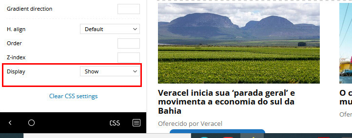
When we hide the element, it disappears, that’s ok. I do this for desktop and other responsive options.
But when I do that the element hides and I can no longer find it in the layout on the right painel to click and configure display:show if necessary.
These “hidden” elements, how do I find them later?
Thanks.
mgiannelis I dont have mobile plugin installed. But still site shows standard header on mobile.
I am having so many issues
Two different versions of site.
Admin bar keeps going missing all the time and now I cannot get it back at all. Admin bar is turned on and also forced with CSS
Getting close to refund
mgiannelisHello
My top admin bar keeps vanishing when I visit the front page of my site. The only way to get it back is to constantly clear the cache which is annoying because this means I need to warm up all the pages again.
Even adding adding the force admim CSS code does not stop it from vanishing all the time.
I also have this exact same problem with this theme on a different website
Whats this problem?



