- NewspaperThe Newspaper Mobile Theme: Introduction
- NewspaperThe Mobile Theme
- NewspaperModules Builder in Newspaper Theme
- NewspaperNewspaper theme documentation
- NewspaperTheme Colors Introduction
- NewspaperWhat’s Included in the Newspaper Theme Package
- NewspaperFilters and sorting for taxonomies
- NewspaperHow to Add a Logo in Newspaper
- NewspaperBig Grid Flex Settings
- NewspaperHeader Builder
- NewspapertagDiv AMP Plugin Tutorial
- NewspaperBest Of Forums
- NewspaperCache plugin – install and configure
- NewspaperFont Customization
- NewspaperBackground Introduction
- NewspaperHeader ads
- NewspaperPost template ads
- NewspaperCustom ad spots
- NewspaperMain Menu
- NewspaperHow to Install Newspaper via FTP
 Calin
Calin Hi,
Here are a few additional recommendations you can try. For some users, all themes work without issues, while for others, only certain ones function properly. This can vary depending on the extra plugins in use, as well as any caching or optimization plugins installed.
-> Footer delayed load https://prnt.sc/FS34hBno40sx (under the theme panel > footer > footer delayed load)
-> MINIFY INLINE CSS and AGGREGATE INLINE CSS – https://prnt.sc/en14t6CQChM- (under the theme panel > block settings> inline css)
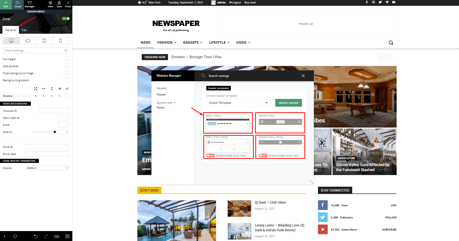
-> Don’t load on mobile/desktop, this option is only on the cloud header for HEADER MENU https://prnt.sc/udlAW4icvSPP on HEADER MENU STICKY https://prnt.sc/9pKnilQdWyex on MOBILE MENU https://prnt.sc/ff7fRQvTnaXt and on MOBILE MENU STICKY https://prnt.sc/Mm-4mbC4WB68
-> Flex Blocks cache – https://forum.tagdiv.com/use-flex-blocks-cache-option/
Also, it is recommended to use a good cache plugin and even Cloudflare (CDN)
Thank you!
Calin Hello,
“Performance Optimization
Among the most anticipated features are options to minify and aggregate inline CSS of blocks, accessible directly from the Theme Panel. Additionally, you can now hide the mobile menu and mobile search functions, offering a cleaner user experience on mobile devices.” – here is how you can enable those options:
-> Footer delayed load https://prnt.sc/FS34hBno40sx (under the theme panel > footer > footer delayed load)
-> MINIFY INLINE CSS and AGGREGATE INLINE CSS – https://prnt.sc/en14t6CQChM- (under the theme panel > block settings> inline css)
-> Don’t load on mobile/desktop, this option is only on the cloud header for HEADER MENU https://prnt.sc/udlAW4icvSPP on HEADER MENU STICKY https://prnt.sc/9pKnilQdWyex on MOBILE MENU https://prnt.sc/ff7fRQvTnaXt and on MOBILE MENU STICKY https://prnt.sc/Mm-4mbC4WB68
-> Flex Blocks cache – https://forum.tagdiv.com/use-flex-blocks-cache-option/
“The Newspaper Theme has leveled up its performance by optimizing the Theme Panel’s color settings through CSS variables. Moreover, JavaScript files will only be loaded when they are needed, which should noticeably improve the website’s speed.” – yest this is apply as long you are using cloud tenmplates, so if you do not have the tagDiv STandard pack plugin in used (this is loading all css and js even if is not need), then it will load only the js and css that will be used on that page/template.
Also, it is recommended to use a good cache plugin and even Cloudflare (CDN)
Thank you!
 nycinsider
My site is abysmally slow – but I’d like to work on the actual issues before I add a caching plugin. I’ve come across many speed articles and supposed Newspaper Optimization – but I can’t figure out what is current, or where any of things mentioned are.
https://tagdiv.com/newspaper-theme-unveils-comprehensive-update-v-12-6-what-you-need-to-know/
Performance Optimization
Among the most anticipated features are options to minify and aggregate inline CSS of blocks, accessible directly from the Theme Panel. Additionally, you can now hide the mobile menu and mobile search functions, offering a cleaner user experience on mobile devices.
The Newspaper Theme has leveled up its performance by optimizing the Theme Panel’s color settings through CSS variables. Moreover, JavaScript files will only be loaded when they are needed, which should noticeably improve the website’s speed.
What are the instructions for this? I have no clue where to click or what to do – AI lies constantly and makes things up. What is a step by step guide to gain the advantages claimed above?
https://tagdiv.com/how-to-increase-page-loading-speed/ – is this still accurate?
I’d love an updated step by step list on how to speed up newspaper before I add a plugin to do so.
 Spotahome
Hello,
We are currently working with your Newspaper theme and have encountered an SEO issue when defining headings.
We have a global header with a mega menu, in which we have explicitly specified that the titles should be of the type <p>
If you check the following URL:
– https://living.spotahome.com/
You can see that there are two H1 tags (another error) and quite a few H3 tags coming from the menu; these H3 tags, when checking the page’s source code, start at line 2276.
All the source code for the menu appears as <p>, but it seems to be duplicated in this area, and we can’t figure out why.
We also have an issue with the two H1 tags—we don’t know where they’re coming from, but there should only be one.
Here is the SEO heading structure, where there should only be one H1 heading, and the rest should be H2 headings. The H3 headings are an error in the structure, and we couldn’t find them.
<H1> Spotahome LivingBest info for expats in european cities
<H1> Spotahome LivingBest info for expats in european cities
<H3> Digital Nomad Starter Kit for Spain: Essentials to Set Up Fast
<H3> Erasmus+ in 2026: The Complete Guide for International Students Coming to Europe
<H3> Internet & Mobile Providers in Spain
<H3> Making Friends in Madrid: How to Build a Social Life Fast
<H3> Where to Live in Madrid in 2026: Best Neighborhoods
<H3> Barceloneta Beach Life: What Living by the Sea in Barcelona Is Really Like
<H3> Digital Nomad Starter Kit for Spain: Essentials to Set Up Fast
<H3> Barcelona Metro Guide: Everything You Need to Know Before You Ride
<H3> Erasmus+ in 2026: The Complete Guide for International Students Coming to Europe
<H3> L’Eixample: Barcelona’s Modernist Architecture District
<H3> Your First Week in Valencia: What to Do and What to Set Up
<H3> Common Mistakes New Tenants Make (and How to Avoid Them)
<H3> Erasmus+ in 2026: The Complete Guide for International Students Coming to Europe
<H3> The ultimate rental guide to Living in Valencia in 2026
<H3> Universities in Valencia: Complete Guide for International Students
<H3> Common Mistakes New Tenants Make (and How to Avoid Them)
<H3> Erasmus+ in 2026: The Complete Guide for International Students Coming to Europe
<H3> Erasmus+ in 2026: The Complete Guide for International Students Coming to Europe
<H3> Your First Week in Milan: What to Do and What to Set Up
<H3> Milan Design Week Guide, what to see, events, and tips for visitors
<H3> Living in Milan in 2026: The Complete Guide to Relocating
<H3> Your First Week in Berlin: What to Do and What to Set Up
<H3> Berlin Nightlife and Culture Guide: Clubs, Bars, and Creative Life
<H3> Berlin for Digital Nomads: Complete Guide to Living and Working Remotely
<H3> Erasmus+ in 2026: The Complete Guide for International Students Coming to Europe
<H3> The ultimate rental guide to choosing where to live in Berlin in 2026
<H3> Common Mistakes New Tenants Make (and How to Avoid Them)
<H3> Erasmus+ in 2026: The Complete Guide for International Students Coming to Europe
<H3> First Week in Paris: Checklist for Expats
<H3> Areas to Avoid in Paris: Safe Neighborhood Guide 2026
<H3> Living in Paris 2026: Complete Move and Life Guide
<H3> London first week checklist: essential guide for new residents
<H3> Where to live in London: 3 best neighborhoods to move to
<H3> Common Mistakes New Tenants Make (and How to Avoid Them)
<H3> Erasmus+ in 2026: The Complete Guide for International Students Coming to Europe
<H3> London for Digital Nomads: Where to Live, Work and Connect
<H3> Common Mistakes New Tenants Make (and How to Avoid Them)
<H3> Erasmus+ in 2026: The Complete Guide for International Students Coming to Europe
<H3> First Week in Brussels Checklist: What to Do First
<H3> Your First Week in Lisbon: What to Do and What to Set Up
<H3> Common Mistakes New Tenants Make (and How to Avoid Them)
<H3> Erasmus+ in 2026: The Complete Guide for International Students Coming to Europe
<H3> Lisbon Neighborhoods Guide: Where to Live in 2026
<H3> Living in Lisbon: The Complete Guide for Expats and Newcomers in 2026
<H2> Your First Week in Berlin: What to Do and What to Set Up
<H2> Lisbon Neighborhoods Guide: Where to Live in 2026
<H2> Making Friends in Madrid: How to Build a Social Life Fast
<H2> London first week checklist: essential guide for new residents
<H2> Where to live in London: 3 best neighborhoods to move to
<H2> Barcelona Metro Guide: Everything You Need to Know Before You Ride
<H2> Eating in Barcelona Like a Local: Food Costs, Markets and Daily Habits for Expats
<H2> Valencia Neighbourhood Guide 2026: Find your perfect Barrio for your Lifestyle
<H2> Your First Week in Berlin: What to Do and What to Set Up
<H3> Join or social media
<H2> London first week checklist: essential guide for new residents
<H2> Where to live in London: 3 best neighborhoods to move to
<H2> Your First Week in Lisbon: What to Do and What to Set Up
<H2> Barceloneta Beach Life: What Living by the Sea in Barcelona Is Really Like
<H2> Erasmus+ in 2026: The Complete Guide for International Students Coming to Europe
<H2> Barcelona Metro Guide: Everything You Need to Know Before You Ride
<H2> Common Mistakes New Tenants Make (and How to Avoid Them)
<H2> How to Open a Bank Account in Spain (2026) and Avoid Common Mistakes
<H2> First Week in Paris: Checklist for Expats
<H2> Valencia Neighbourhood Guide 2026: Find your perfect Barrio for your Lifestyle
<H2> Where to live in London: 3 best neighborhoods to move to
<H2> Universities in Valencia: Complete Guide for International Students
<H2> London first week checklist: essential guide for new residents
<H2> Where to live in London: 3 best neighborhoods to move to
<H2> Your First Week in Lisbon: What to Do and What to Set Up
<H2> Barceloneta Beach Life: What Living by the Sea in Barcelona Is Really Like
<H2> Digital Nomad Starter Kit for Spain: Essentials to Set Up Fast
<H2> Your First Week in Valencia: What to Do and What to Set Up
<H2> Your First Week in Berlin: What to Do and What to Set Up
<H2> Berlin Nightlife and Culture Guide: Clubs, Bars, and Creative Life
<H2> Common Mistakes New Tenants Make (and How to Avoid Them)
<H2> Berlin for Digital Nomads: Complete Guide to Living and Working Remotely
<H2> Barcelona Metro Guide: Everything You Need to Know Before You Ride
<H2> Erasmus+ in 2026: The Complete Guide for International Students Coming to Europe
<H4> Enjoying the cityLifestyle
<H2> London first week checklist: essential guide for new residents
<H2> Where to live in London: 3 best neighborhoods to move to
<H2> London first week checklist: essential guide for new residents
<H2> Where to live in London: 3 best neighborhoods to move to
<H2> Your First Week in Lisbon: What to Do and What to Set Up
<H2> Barceloneta Beach Life: What Living by the Sea in Barcelona Is Really Like
<H2> Digital Nomad Starter Kit for Spain: Essentials to Set Up Fast
<H2> Your First Week in Valencia: What to Do and What to Set Up
<H2> Your First Week in Berlin: What to Do and What to Set Up
<H2> Berlin Nightlife and Culture Guide: Clubs, Bars, and Creative Life
<H2> Common Mistakes New Tenants Make (and How to Avoid Them)
<H2> Berlin for Digital Nomads: Complete Guide to Living and Working Remotely
<H2> Barcelona Metro Guide: Everything You Need to Know Before You Ride
<H2> Erasmus+ in 2026: The Complete Guide for International Students Coming to Europe
<H2> London first week checklist: essential guide for new residents
<H2> Where to live in London: 3 best neighborhoods to move to
<H2> Your First Week in Lisbon: What to Do and What to Set Up
<H2> Barceloneta Beach Life: What Living by the Sea in Barcelona Is Really Like
<H2> Digital Nomad Starter Kit for Spain: Essentials to Set Up Fast
<H2> Your First Week in Valencia: What to Do and What to Set Up
<H2> Your First Week in Berlin: What to Do and What to Set Up
<H2> Berlin Nightlife and Culture Guide: Clubs, Bars, and Creative Life
<H2> Common Mistakes New Tenants Make (and How to Avoid Them)
<H2> Berlin for Digital Nomads: Complete Guide to Living and Working Remotely
<H2> Barcelona Metro Guide: Everything You Need to Know Before You Ride
<H2> Erasmus+ in 2026: The Complete Guide for International Students Coming to Europe
<H2> London first week checklist: essential guide for new residents
<H3> Where to live in London: 3 best neighborhoods to move to
<H3> Your First Week in Lisbon: What to Do and What to Set Up
<H3> Barceloneta Beach Life: What Living by the Sea in Barcelona Is Really Like
<H3> Digital Nomad Starter Kit for Spain: Essentials to Set Up Fast
Thank you in advance for your support.
Calin Hi,
Yes, this is normal, the theme has 2 heads, one used only on mobile that starts from 737px (https://prnt.sc/VMduZHsWM4r3) width and the other one used for desktop. So if you have a cloud header, you can also edit the mobile header and add the elements you want to have when a mobile device is in use https://prnt.sc/Vd_GP6lzXlJV
Also, there is no real device that will have 767px width, so that case should ot happen on a real device.
 Bilken
Hello,
I am using the Newspaper theme with Single Post Featured Image and Featured Video enabled as a pop-up.
The video pop-up works correctly on desktop, but on iOS mobile devices (Safari), the pop-up opens and the video remains blank or stuck on loading.
This happens with both self-hosted MP4 videos and YouTube embeds.
I have already:
* Disabled Lazy Video on Mobile
* Disabled Sticky Video
* Cleared all caches (LiteSpeed and Cloudflare)
* Excluded tagDiv and popup scripts from delayed/deferred JS
Example:
https://thebilken.com/u-s-marines-seize-iranian-flagged-vessel/
Could you please check if this is a known issue with mobile popup video and provide a fix?
Thank you.
 SP1
SP1Hi,
I tried finding out in all your documents, but could not find.
Since the last Newspaper theme we are facing LCP and CLS issues on both desktop and mobile newspaper sites.
And all have to do with tagdiv and newspaper.
For example CLS –
Layout shift score: 0.1865
div.tdc_zone.tdi_67.wpb_row.td-pb-row
div.vc_column_inner.tdi_31.wpb_column.vc_column_container.tdc-inner-column.td-pb-span8
div.td_block_wrap.td_flex_block_4.tdi_82.td_with_ajax_pagination.td-pb-border-top.td_block_template_1.td_flex_block
div.vc_column_inner.tdi_36.wpb_column.vc_column_container.tdc-inner-column.td-pb-span12
div#tdi_37.td_block_inner.td-fix-index
and
Layout shift score: 0.0596
div.tdc_zone.tdi_67.wpb_row.td-pb-row
div.td-block.td-a-rec.td-a-rec-id-custom-spot.tdi_32.td_block_template_1
div.vc_column_inner.tdi_31.wpb_column.vc_column_container.tdc-inner-column.td-pb-span8
div.vc_column_inner.tdi_36.wpb_column.vc_column_container.tdc-inner-column.td-pb-span12
div#tdi_37.td_block_inner.td-fix-index
these all shifting on desktop, which is very high.
Similar problems with LCP too.
How to solve?
website: GadgetBridge.com
 Terra Adentro
Hello,
I’m using the Newspaper theme on my website and I’m experiencing an issue on mobile devices.
When the user scrolls down the page, the mobile header disappears as expected (sticky hide on scroll), but it leaves a horizontal line.
It looks like some kind of leftover header height or placeholder is still being rendered even when the header is hidden.
I tried disabling sticky header and adding custom CSS, but the issue still persists.
Could you please help me fix this or let me know the correct way to completely remove the header space when it is hidden on scroll?
Website: http://www.terraadentroexpedicoes.com
Thank you in advance.
Calin Hi,
Based on the screenshots you provided, it appears that you are using the tagDiv Mobile Theme plugin. In this case, it’s important to maintain separate caches for desktop and mobile devices. Please make sure that your caching plugin supports device-based caching, so it can generate distinct cache versions for desktop and mobile.
If you’re using the free version of Cloudflare, this functionality is not included by default. To enable separate caching for mobile and desktop in Cloudflare, you can configure Cache by Device Type using Cache Rules, or enable it through Automatic Platform Optimization (APO) for WordPress.
 luciamyv
Something is happening with my website—the mobile version is showing as the desktop version.
My theme and plugins are up to date.
What’s going on? It started happening out of the blue. My PHP version is 8.3.
website: https://tanpolitica.com/
screenshots:
1- http://tanpolitica.com/wp-content/uploads/2026/04/2026-abril-14-13168-Updates-TanPolitica-—-Word_-https___tanpolitica.com_wp-admin_admin.php_-scaled.png
2- http://tanpolitica.com/wp-content/uploads/2026/04/2026-abril-14-13169-Theme-panel-TanPolitica-—-_-https___tanpolitica.com_wp-admin_admin.php_-scaled.png
3- http://tanpolitica.com/wp-content/uploads/2026/04/Captura-de-Pantalla-2026-04-14-a-las-15.44.22-scaled.png
Can you help me?
Calin Hi,
From your screenhost, I see that you are using mobile templates, which are normally used only when you want the mobile version of the website to be different from the desktop version. If you want to be as on a desktop, then is no need of that, the theme has a responsive version, which can be adjusted with tagDiv Composer by selecting the mobile viewport – https://prnt.sc/DlK-25TLvJL7
Also, using a mobile page template, you must be sure that the cache plugin used can offer a separate cache for mobile and desktop, otherwise, it will deliver the wrong version on the wrong device.
Related to the menu, those can be created under Appearance> Menu and https://forum.tagdiv.com/main-menu/ and should be set on the menu elements with tagDiv Composer, by selecting the desired menu https://prnt.sc/3qIFiPoJkPz9 – https://prnt.sc/Y2qo5NAGV5W7
Calin Hi Vladimir,
To have the same layout on mobile as on desktop, please check your plugin and see if you are using the tagDiv mobile theme plugin and/or amp plugin, if you have any one of them, please disable those plugins, clear the cache and check again, the same information and layout from desktop will also be used on mobile.
Thank you!
Calin Hi,
I just checked teh website, and it appears that the sticky header is only on mobile, so I checked with the Wayback Machine to see how it was before the update https://prnt.sc/iT5WXE67POYX, and it was exactly as it is now, only for mobile https://web.archive.org/web/20260212122551/https://www.electronicsforu.com/, so this is not a theme update-related.
Please check our documentation for how to enable the sticky header https://forum.tagdiv.com/header-manager/ – https://forum.tagdiv.com/wp-content/uploads/2019/07/Header-Main-Menu.png
Calin Hi Levaire,
The Newspaper theme uses different headers for desktop and mobile. If you’re using a Cloud Header, you can customize it separately for each device just switch the viewport and make the necessary adjustments.
– https://prnt.sc/eVVPIHUITfAI
– https://prnt.sc/OM9GVlP59muy
Calin Hi,
Do you use the mobile theme plugin or the mobile page? If so, then you need to have a separate cache on desktop and mobile, using the free version of Cloudflare doesn’t include this option. To separate mobile and desktop cache in Cloudflare, enable Cache by Device Type within Cache Rules or via Automatic Platform Optimization (APO) for WordPress.
 Levaire
 Looks like this theme has had issues displaying the top bar on mobile for over a decade? Anyways, I’m struggling with something I feel shouldn’t be a struggle. Top bar works fine and as expected on all formats EXCEPT it disappears on mobile. I’ve stared at the screen shot offered above, to no avail. I’ve tried to duplicate the only row that remains, thinking I can just add the menu element and change the new bar to black, but that doesn’t work; the first bar just gets taller instead of actually duplicating. I’ve tried adding a row, but can’t seem to figure out what elements need to be placed just to achieve what is working in the other desktop and tablet layouts.
What would you have me do to fix this? Levaire.com
 tobiasinfo
Hello, I use the Newspaper theme on at least 5 websites.
For a while, all of them had a conflict with Cloudflare and the use of the theme’s mobile plugin.
I noticed that on some sites, this no longer exists. However, on one of them, I need to leave the proxy disabled; otherwise, I have problems with the mobile version.
Is there any way to resolve this conflict? I really need to activate the proxy to protect the site.
 RENATO
 @Calin A serious situation is happening with the theme. What happens is that sometimes when accessing on mobile, it falls into the computer theme and doesn’t respect the mobile theme https://glostv.com/tv-ao-vivo/tdb_templates/postagem-celular which was created specifically for mobile. When a person accesses on mobile, it sometimes falls on the computer page all messed up, this one here https://ibb.co/5hhx3nfr which has a light blue color, all misconfigured, and the computer ad above is all broken. It should load on mobile like this https://postimg.cc/wtn2T9WW — the correct one with the strong/dark blue. You can run several tests on mobile or through website performance testing sites and it always does this, with people coming to complain to me. I ask for help solving this. I have other issues but this is the most important one to fix first.
 leagcooks
hi,
When i add the flex block 1 to my website it makes the all the mobile version move to the left when you scroll?
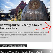
https://www.ukthemeparkspy.co.uk/
Thanks.
 Thefiscaldaily
Dear TagDiv Support Team,
I am experiencing an issue with the Newspaper X theme in WordPress. When editing the mobile theme in the builder, the footer appears correctly. However, when accessing the site from a browser on a mobile device, the footer does not display at all.
I have already tried multiple troubleshooting steps, but the problem persists. Since we are using the WP Rocket premium caching plugin, I am confident this is not a caching issue.
Could you please advise on the possible cause and suggest a remedy to ensure the footer displays properly on mobile devices?
Thank you for your assistance.
Best regards,
http://www.thefiscaldaily.com/
Calin Hi,
If you want to edit the Big Grid 3 block on mobile, unfortunately, there are no options available. What you could do is use CSS to increase the size of the grids so there is more space and the images can be seen a bit better.
.home .td_block_big_grid_3 .td-big-grid-post {

        height: 300px;

}
Set the above css in the theme panel > custom code > advance css in the phone section. You can adjust the height numerically.
Calin Hi,
For this, please use this custom css for mobile :
body .td-pb-span12 .alignwide {

    width: auto!important;

}
Set the code in the theme panel > custom code > advance css > phone – https://prnt.sc/gmHKEhHeMQeQ
Thank you!
Calin Hi,
The solution that I can offer is to use a custom css that will hide it from the header zone on mobile, the css is:
.td-header-sp-rec {

    display: none!important;

}
This should be placed in the theme panel> custom code > advance css > phone – https://prnt.sc/x13Vx2tifJvC
Calin Hello,
I think that you are using the mobile theme plugin for AMP version, right? If so, then you can disable the grids from front and category page using the theme panel settings – https://prnt.sc/JNDTENp7HXR5
Thank you!
 dennisjpitocco
 Hi Calin – all caches have been flushed by our tech support team for our site, and all non-logged in device caches have been flushed, but the problem persists and ONLY related to this particular Page (create from Cloud templates). Our tech support team has advised: “It may be worth reviewing the code used to build the new page. In many themes, custom CSS is added specifically for mobile and tablet views. If this is not configured, the layout typically defaults to the desktop CSS, etc., which does not always display properly across devices. I am not certain whether the TagDIV Newspaper theme supports this behaviour, but I would expect that it does.
Since other pages appear to be functioning correctly, this points to a likely issue within the code of the newly created page itself.