- NewspaperThe Newspaper Mobile Theme: Introduction
- NewspaperThe Mobile Theme
- NewspaperModules Builder in Newspaper Theme
- NewspaperNewspaper theme documentation
- NewsmagTheme colors introduction
- NewspaperTheme Colors Introduction
- NewspaperWhat’s Included in the Newspaper Theme Package
- ApiUsing the Theme API in plugins
- NewspaperFilters and sorting for taxonomies
- NewspaperHow to Add a Logo in Newspaper
- NewspaperBig Grid Flex Settings
- NewspaperHeader Builder
- NewspapertagDiv AMP Plugin Tutorial
- TutorialsFrom WPBakery to tagDiv Composer
- NewsmagSmart list ads
- NewspaperBest Of Forums
- NewspaperCache plugin – install and configure
- NewsmagIntroduction
- NewsmagMain menu
- NewsmagLogo & Favicon
 deliciousthemes
Hey guys,
I’m wondering what you would recommend, from an SEO POV: the mobile theme, AMP or both?
Are there any issues if using both of them? How the mobile theme interfere with the AMP protoco?
Thanks!
 Najeyalafary
 I have a problem adding tagDiv Mobile Theme when I activate it and after an hour or more I find that the addition has been deactivated automatically
 deanysus
Hi tagDiv team,
I’ve just updated the Newsmag theme to its latest version, and we’re having a few issues. Could you possibly help?
1. “Sharing” social media icons are not displaying properly: https://i.gyazo.com/af00b0bc835c09dc1f36dddd781bc46a.png
2. On mobile, featured images on homepage are not displaying: https://i.gyazo.com/5e113038ef3f3e27f865e92d45ce7e8c.png
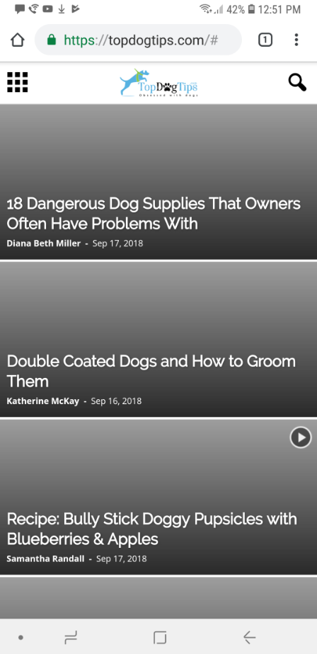
3. On mobile, “search” icon/function does not work. It only gives a “domain/#” (like in screenshot) link and doesn’t allow to search. We’ve had many people email us that they’re unable to search our site.
Any help on how to fix this would be appreciated!
Thank you.
Dean
 fgmotta
Hello people…
I noticed that in the last version of the theme the smoth scroll problem was solved in the dental studio template.
I would like to know which file I should replace and where it is.
thank you.
 breetoplay
 Tried disabling RocketLoader, no effect.
I actually CAN get the gray bar effect on your live demo, but only by making the mobile preview unrealistically narrow, so it’s just an effect that’s kicking in at a larger width for us (theme loading too-wide thumbnails?)
One more clue: the featured image and the two images that are visible in the slider on first load have gray bars, but the three images that are NOT visible on first load have correct thumbnails. Does that help at all? Is there a difference between initial load thumbs and those that are hidden initially?
breetoplayHello! We’re really liking Newspaper as a theme, but I’m having a problem with the way the grid thumbnails are responding to being made “phone narrow” as seen here:
The gray bars appear on any resolution narrower than 480 px or so, at least on my 1920×1080 monitor’s mobile simulation.
I know I’ve seen this problem described on this forum many times, and the answer is usually to regenerate one’s thumbnails, which I have done (with careful attention to the grids and modules that we are using). In this case, the problem shows up when the page is viewed on a narrow mobile device (or in Chrome or Firefox mobile preview with the simulated device made very narrow). The images shrink properly until the aspect ratio matches the ratio present in the thumbnail, and from then on as the page gets narrower, they shrink to match the x-direction, leaving them too short to fill the box in the y-direction. I wouldn’t complain, but this isn’t some extreme, unrealistic aspect ratio, it’s what’s actually present on my Pixel 2 or my wife’s Pixel 2 XL.
(In a related behavior, if you use Chrome or FF to simulate mobile and then drag the device to be more than about 750px wide, the thumbnails snap back to the wrong aspect ratio once they stop filling to 100%, not to the correct aspect ratio thumbnails that get served to the real desktop site. That means that even if a mobile user clicks “request desktop site” the thumbnails will still come with gray bars! I’ve seen this behavior in Safari on iPad. It’s probably not a coincidence that this is the pixel width at which the “large tablet” CSS is supposed to come into effect.)
Is there some way to get the images to stop shrinking to match x and start cropping the y-axis once they get too narrow to resize correctly? And why are the thumbnails for the “large mobile” the wrong aspect ratio?
Thanks for your help! The theme is working great otherwise!
 Simion C.
 Hi,
WhatsApp and other mobile socials will only be displayed on mobile. When used on a mobile the mobile WhatsApp application will launch and you can share the post.
If you want this social to appear as a sharing option on desktop as well, you could make it visible with a code like this
– https://www.screencast.com/t/sGA8pfmMuWb
@media (min-width: 767px) {

.td-social-whatsapp {

display: inline-block;

}}
Enter it in Theme panel->Custom CSS section if you want to use it.
Thanks
 Calin
Calin Hi,
If I understand correctly when you say “Single Image” you refer to logo, if is so there is a way to set different Logo for mobile; go in Newspaper > Theme panel > Header > Logo for mobile and set your mobile logo https://www.screencast.com/t/U1glxznAp
If is not that please put here your url site, so i can inspect the problem.
Thank you.
Calin Hi,
If I understand correctly you desire to switch between to logos, if is that than it’s possible, but you can chose only from tow option logo mobile and logo header this is the only way you can switch logo between your sticky menu and menu.
If is this, I will show you how to do it: go back to WP dashboard Newspaper > Theme panel > Header expand Logo & Favicon then put your logo for static menu ( https://www.screencast.com/t/H1lVAbuWj ) , then expand Logo for Mobile and chose upload your second logo to Logo Mobile ( https://www.screencast.com/t/vzqdtC9Q3nR )
See results: https://www.screencast.com/t/wwEqEISNJ https://www.screencast.com/t/CRoHjDzZm .
This is the only way to switch the logo for sticky menu and menu.
Thank you.
 NickDeBaerdemaeker
Currently I’m developping the mobile site, which includes a “hamburger” mobile menu.
The desktop site has a mega category menu.
However when switching to test the site to my mobile phone, when the menu icon is clicked there is a “zooming” effect, like the image below, and the menu doesn’t show.

The menu seems to come through after a while, when mimicking it on a desktop with firebug it restors itself within a second or 5, on mobile however it takes ages or simply doesn’t result in a working menu.
We have tried the mobile plugin that comes with the theme and that resolves the issue completely, however, we really don’t want to use the mobile theme. We’d like to keep the design exactly like the main site only slimmed down.
Suggestions ?
It seems to be an issue with the mega categories menu, perhaps altering the code to make a regular menu appear would do the trick but we haven’t been lucky so far.
the address is http://v2.enola.be/
 ctoweett
 You have to replace the mobile plugin with the one that came with the newer theme version 9.0.1. Just deactivate and delete it from the plugins section and upload the new one afresh.
NickDeBaerdemaekerHi,
I was wondering if there is the option built in the theme to display a link on the mobile site, which lets users switch between the full desktop theme and the mobile theme.
if not I was hoping somebody could help me with this.
 NBak18
Hi. I recently updated Newpaper Theme to V 9.0.1.
I used Mobile plugin, but I see that now it’s disabled.
I try to enable it and I get the message:
“PLUGINS DISABLED AUTOMATICALLY
The following plugins were disabled because they are incompatible with this version of Newspaper:
tagDiv Mobile Theme
For update please check our Plugins update guide“.
What do I do?
Thank you in advance,
Nick.
Simion C. Hi,
Unfortunately that is not possible with our theme, or the mobile theme plugin. Something like that could be implemented in the future, if it becomes a popular request however.
Simion C. I believe you are referring to the scroll on mobile, when using the menu, using the dental studio demo.
There could be some scrolling issues on mobile only, the scroll may not stop where it is supposed to. That is on our list and we will try to optimize it in the future. Sorry for the inconvenience.
That design is called a menu overlay in the theme, and there is a page template provided for it, like this example demo page
– https://demo.tagdiv.com/newspaper_nature/news/
So you can select that template for the page you want
– https://www.screencast.com/t/iQ3XNg7aXv
 Catalin
 Hello JDH,
Please notice that I have tested to post some comments on my website using the Mobile Theme and everything seems to work as expected, as you can see here -> https://www.screencast.com/t/db4mpXe2 If the problem is still there, please provide your website URL so I can take a closer look at it.
Thanks for your understanding!
 JBH
JBHHey TAGdiv!
We are experiencing an oddity on our Newspaper website.
On our desktop version, we are able to send comments. On our mobile theme (running on the optimized tagDiv Mobile Theme), we are unable to post any comments.
What we tried:
– Disabling caching
– Disabling any required fields
Do you have any solution for this matter?
 vanpope ROCKS
Hi there,
I am currently prepping a music site to go live on aback up URL and would then transfer the database to the correct URL. The theme is actually amazing. Best investment ever. The website is practically done, with a few minor changes that I still need to do. So I have a few questions:
1) Can I use Visual Composer to create my own Contact Page?
2) Whenever I add a picture to the packground (be it in the footer or website body) it pixelates, even if the image is of high quality. I have tried different formats and just looks terrible to be honest.
3) When will you introduce Social Login to login or subscribe or login to comment on a blog? Newspaper does have the social share, but to comment you either have to login and register first. We all know that the quicker comments could be given or decisions be made the more profitable your website would be. Love the mobile login feature or normal desktop, but I do think its time to intro and All-In-One type plugin feature for the theme?
This is a massive feature at the moment to login or comment with a preferred social platform’s details.
Looking forward to your reply.
Marius
Simion C. Maybe you use the mobile theme, the shortcodes will not work if the mobile theme plugin is active. Deactivate it and the ads will appear same as on desktop.
Catalin Hello vibolsun65,
Sorry, but at the moment, your website it seems to be unavailable, unfortunately!
Check here -> https://www.screencast.com/t/fn5vCm6l6d
Please notice that the speed of your website depends on how well your site is optimized.
-> https://developers.google.com/speed/pagespeed/insights/?hl=ro&url=https%3A%2F%2Finsanertech.com%2F&tab=mobile
Notice that is not a simple task and if you do not have any experience in this regard you will do not bring good results for the theme. Also, notice that we have a speed optimization tutorial but this is addressed only to advanced users. So, if you follow the steps which are presented in this tutorial here -> https://forum.tagdiv.com/how-to-make-the-site-faster/ you can increase the page speed loading and if you are not aware of the steps in this regard, please consider hiring a freelancer/developer to help you because the speed optimization services are not covered by our support policy, as you can read here -> https://forum.tagdiv.com/support-policy-2/ Check our documentation here -> https://forum.tagdiv.com/requirements-for-newspaper/ regarding on dedicated server to fit our requirements.
Unfortunately, our theme does not have such an option to minify the style.css file and we cannot recommend any plugins with this functionality because is not tested with our theme. For minifying this file, we are using CloudFlare for our demo and works fine. If you want to read other views from our users, please check this topic -> https://forum.tagdiv.com/topic/tip-how-to-easily-minify-your-css-without-breaking-your-site/
Also, check all of your Ad Spots and if you have entered any suspicious code through them, remove all of them and check the results without them.
One of our top members here on the forum wrote his own optimization tutorial here:
https://forum.tagdiv.com/topic/tutorial-chriss-custom-optimizations-for-functions-php-etc/ and here -> https://www.infophilic.com/get-almost-100-pagespeed-newspaper-theme/
Basically, these are the theme requirements
– https://forum.tagdiv.com/requirements-for-newspaper/
Thanks for your understanding!
Catalin Hello Seb,
Please notice that the speed of your website depends on how well your site is optimized.
-> https://developers.google.com/speed/pagespeed/insights/?hl=ro&url=https%3A%2F%2Finsanertech.com%2F&tab=mobile
Notice that is not a simple task and if you do not have any experience in this regard you will do not bring good results for the theme. Also, notice that we have a speed optimization tutorial but this is addressed only to advanced users. So, if you follow the steps which are presented in this tutorial here -> https://forum.tagdiv.com/how-to-make-the-site-faster/ you can increase the page speed loading and if you are not aware of the steps in this regard, please consider hiring a freelancer/developer to help you because the speed optimization services are not covered by our support policy, as you can read here -> https://forum.tagdiv.com/support-policy-2/ Check our documentation here -> https://forum.tagdiv.com/requirements-for-newspaper/ regarding on dedicated server to fit our requirements.
Unfortunately, our theme does not have such an option to minify the style.css file and we cannot recommend any plugins with this functionality because is not tested with our theme. For minifying this file, we are using CloudFlare for our demo and works fine. If you want to read other views from our users, please check this topic -> https://forum.tagdiv.com/topic/tip-how-to-easily-minify-your-css-without-breaking-your-site/
Also, check all of your Ad Spots and if you have entered any suspicious code through them, remove all of them and check the results without them.
One of our top members here on the forum wrote his own optimization tutorial here:
https://forum.tagdiv.com/topic/tutorial-chriss-custom-optimizations-for-functions-php-etc/ and here -> https://www.infophilic.com/get-almost-100-pagespeed-newspaper-theme/
Basically, these are the theme requirements
– https://forum.tagdiv.com/requirements-for-newspaper/
Thanks for your understanding!
 paultony
Hi,
I do not use the mobile theme as the one that comes with the main theme works well enough.
The problem I am having is in trying to find out where I can delete/disable the social media icons that appear on the menu sign (three stripes in upper left corner) on a mobile screen?
These icons don’t appear on my desktop screen in any of the menu bars, so not sure why they still appear on the mobile screen.
Could you please help.
Thanks.
 legalmediacompany
 **This issue is resolved**
For anyone else experiencing the same issue, assuming you back up your WordPress website regularly, just change the name of the mobile folder inside wp-content > themes > newspaper > mobile to mobile_orig (or any new name) and then upload your backed up mobile folder prior to your mobile site not loading. This fix is for developers using the td_mobile plugin. Check your site on a mobile device. Assuming this fixes the problem you can then delete the mobile_orig folder.
Cheers
– Sean
 Produccion Astoria
 Hello, I have already been able to solve the problem.
I have enlarged the size of the group of banners that contained the cut banners.
On the web the banners are 1068 x 275 pixels and in the mobile 300 x 500, then I have defined the group in 1068 x 500.
I solved it from the AdRotate Pro plugin. Not the theme.
thank you anyway!
Catalin Hello tmaghrebt,
I have checked your website but I did not saw any problem with your site, sorry! Do you are using the mobile theme?
Thanks for your message!